The beloved bakery brand has unveiled a refreshed identity by New York studio Mrs&Mr, reimagining its crown, wordmark, and packaging while staying true to its Hawaiian roots.
King’s Hawaiian has marked its 75th anniversary with a major rebrand led by New York studio Mrs&Mr. The updated identity introduces a softer crown, custom typography, and vibrant new packaging for the family-led brand best known for its sweet, fluffy rolls.
The refresh, which rolls out this year across the bakery’s growing product portfolio, comes as King’s Hawaiian looks to connect with a new generation of fans while keeping its heritage front and centre.
Liz Bondor, head of creative at King’s Hawaiian, says: “We reimagined the King’s Hawaiian brand to honour our rich heritage while infusing and modernising it with vibrant energy.
“The new identity reflects a thoughtful evolution, crafted through deep creative partnership with Mrs&Mr to ensure every detail felt authentic, and forward-looking.”
At the heart of the rebrand is the crown logo, which has been with the brand since its earliest days. Mrs&Mr revisited its geometry, softening the sharp points and redrawing it by hand. The result is a puffed, rounded silhouette more synonymous with the oven-baked rolls that started it all.
One of the most noticeable changes is in the typography, with a custom lowercase logotype replacing the traditional uppercase serif wordmark. As with the crown logo, the new rounded letterforms capture the pillowy texture of the bread itself. It was designed to be warmer, more approachable, and more in tune with contemporary audiences.
Kate Wadia, founder and chief creative officer of Mrs&Mr, explains: “This iconic brand called for a thoughtful, intentional design.
“Crafted to capture King’s Hawaiian’s social and irresistible appeal, every detail of the redesign was carefully considered to connect with both longtime loyalists and first-time fans alike.”
Orange has long been synonymous with King’s Hawaiian, so rather than move away from it, the design team chose to make it brighter and bolder by pairing it with complementary shades of red, yellow, gold, and cream. The aim was to unify the brand’s growing portfolio while creating greater scope for expression across packaging and communications.
On pack, the colour refresh is joined by hand-drawn illustrations of hibiscus, monstera, and plumeria. This bouquet of Hawaiian flora is meant to anchor the brand more deeply in its origins. A ribbon-like motif now wraps each package, further depicting the products as gifts, while a set of bakery-inspired “stamps” introduces playful messaging and a more personal touch.
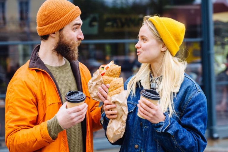
Photography has also been overhauled to reflect King’s Hawaiian’s position at the heart of shared meals. High-contrast imagery, bright lighting, and layered compositions show off both the food and the moments it creates, whether it’s family dinners or casual get-togethers.
“Infused with the refreshed colour palette, King’s Hawaiian’s updated imagery is vibrant, bold, and unmistakably modern,” the studio notes. “Layered compositions capture the rich textures of shared meals and playful gatherings, reinforcing the brand’s inherently sociable spirit.”
Mrs&Mr reveals that this project was as much about restraint as it was about reinvention. The challenge was to keep what fans love while evolving the brand for its next chapter, which was especially important in light of the anniversary milestone.
Alongside the studio’s founders, Kate and Daniel Wadia, the project involved art director and designer David Zoppi, designer Holden Kao, and designer and lettering artist Alec Tear.
King’s Hawaiian’s new identity feels like a natural continuation of the brand’s story as Mrs&Mr has helped King’s Hawaiian find a design language that feels both timeless and timely.