Work by Tim Walter
From craft-inspired concepts to animated identities, our fictional design school brief sparked incredible creativity across our community.
We only launched Boom Briefs—a monthly creative workout designed to get your creative juices flowing—last month. But if our first challenge around creative retreats was anything to go by, we knew we were onto something special.
For our second brief, we decided to tackle something every designer can relate to: education. But not just any education—we asked our community to imagine and brand a fictional graphic design school called Northmark: School of Design, based in Manchester.
The brief was deliciously open-ended. Slick and minimalist? Loud and experimental? Brutalist? Bauhaus-inspired? It was totally up to you. We simply asked: what would your dream design school look like, and how would you bring that vision to life through branding?
The response? Absolutely mind-blowing.
Standout approaches
The #cbbriefnorthmark hashtag filled up with such diverse interpretations that it reminded us why fictional briefs can be creative gold. Every designer approached the same challenge from a very different angle, creating visual stories that ranged from craft-inspired to cutting-edge digital, from playful and energetic to sophisticated and refined.
London designer Alexander Clarke took inspiration from Manchester’s industrial heritage, weaving together themes of craft, classic architecture and creative direction. His approach centres on two interlocking N’s that cleverly represent both the school’s name and its northern location, creating a lovely visual metaphor for creative exploration.
Work by Alexander Clarke
Jesús Ulacio from Venezuela went bold with a typography-first approach that screams confidence. His work features heavy, geometric sans-serif type paired with high-contrast colour blocking—think yellow text punching through bright green backgrounds. It’s the kind of branding that would make anyone stop scrolling and pay attention, with a refreshingly playful energy; ideal for a design school.
Work by Jesús Ulacio
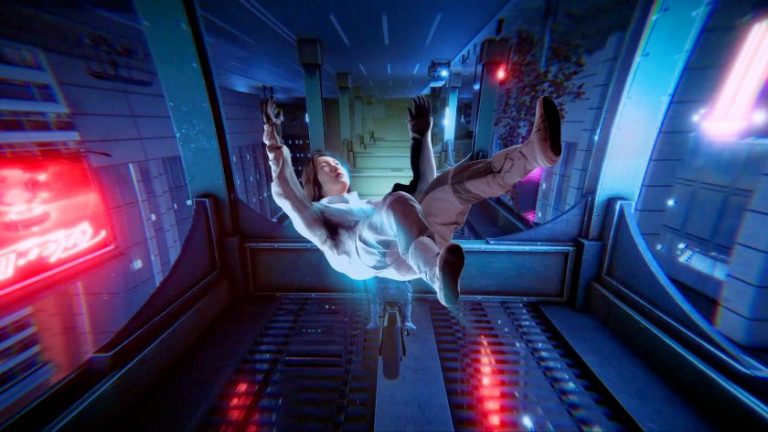
Tim Walter, fresh out of Shillington’s graphic design course, brought motion into the mix with an animated identity that’s pure joy to watch. His 18-second animation plays with a monogram ‘N’ that breaks apart and reassembles, revealing shifting geometric shapes in teal and white. There’s something compelling about watching those triangular negative spaces dance around; it perfectly captures that sense of creative possibilities unfolding.
Work by Tim Walter
Work by Tim Walter
Graphic designer Anthia Han’s entry brings a deeply considered approach that feels authentically Manchester. Her concept delves into what makes the city tick—from the music echoing through the Northern Quarter to the street art that colours every corner. What’s striking about her work is how she’s positioned the school as a place for “innovators and challengers” who won’t just follow trends but create them.
Work by Anthia Hang
Work by Anthia Hang
Zillah Hayslip, a designer from Brighton, came up with something beautifully smart in her response to our challenge. The pen tool device in her logo echoes a compass point, nodding to the “North” in Northmark while staying true to the design tools we all know and love. Her wordmark, meanwhile, exudes the kind of authority and stability that you look for in an educational institution.
Paulina Damian created a logomark that’s an eye with the North Star in place of the iris. “The eye represents the ability to see, experience, and grasp our surroundings. It is also a symbol of spirituality, truth, and wisdom,” she says. “The North Star symbolises guidance and direction, and it has long been used for navigation. In this way, the school acts as a North Star for design education.”
As for the logotype, Paulina chose the font Boldonse, as it “resembles metal signage and evokes the industrial character of Manchester”. A wonderful interpretation of the brief.
New York designer Nicole Lewis took a more conceptual route towards a school identity, designing the ‘N’ as a looping path, to reflect how design is rarely linear. This approach celebrates the unique journey each creative takes, with bold colour pairings that feel fresh and experimental.
Lastly, Stavroula Adamopoulou from Athens delivered something wholly unexpected: “robot-plant” illustrations that blend botanical forms with mechanical elements. Her concept marries timeless craft with contemporary vision, complete with the brilliant slogan “VISUALS BLOOM WILD” for merchandise. It’s the kind of branding that makes you curious, which is exactly what great design schools should strive to achieve.
A post shared by Brand Identity & Graphic Designer | Stavroula Adamopoulou (@adamstav.graphics)
How to get involved
Looking at these approaches—and indeed, every single entry to the challenge—what strikes us most is how differently each designer interpreted the same brief. And this is exactly why fictional briefs are so powerful.
Missed out on the Northmark brief? Don’t worry. There’s always a new challenge each month. In fact, Boom Brief #3 has just landed. This time we’re heading to the coast for a fictional music and arts festival called Echo Festival—a celebration of sound, creativity and community by the sea. Your task? To brand it however you see fit. Bold and experimental? Stripped back and timeless? The stage is yours.
Head over to our Instagram @creativeboom to read the full brief and get involved. No pressure, no expectations; just you, a prompt, and the freedom to create something that didn’t exist before. We can’t wait to see what you come up with.