Back Market refurbishes old tech so it can be resold and doesn’t have to be thrown away. A new visual identity helps communicate that mission and champions the concept of circularity.
It’s not just billions of plastic bottles polluting the earth and damaging our environment. The tech industry is a big culprit, too. Electronic waste contains hazardous materials like lead, mercury, and cadmium, which can contaminate soil and water if not disposed of properly. And there’s an awful lot of it that isn’t.
That’s why Back Market is on a mission to make tech more affordable and more sustainable, all without sacrificing quality.
As a global marketplace for renewed tech, its goal is to make this eco-friendly process a no-brainer while searching for your next device. They do this by refurbishing devices and making them accessible to consumers at a price point of up to 70% less than the cost of brand new. So it’s both kind to your pocket and the planet: a win-win.
To help communicate this mission more effectively, Back Market’s core team recently worked to rethink their brand identity and build out a full brand design system that incorporates these values.
The brief
Rasmus Wängelin, in collaboration with Studio Herrström, led by Erik Herrström, and Back Market’s in-house design team led by senior lead art director Victor Antonelli, defined the visual identity and design system. This foundation set the stage for a cohesive and impactful brand presence that reflects Back Market’s values.
“In our early conversations with Back Market, we observed how they had evolved as a company and now needed to evolve their visual brand to keep pace with their growth,” recalls Rasmus. “Their brand personality embodies optimism, exists as a challenger to big tech, and balances an offbeat yet premium aesthetic.”
“We set out to craft a new identity that resonates with these attributes and effectively communicates their essence through brand and product communications, packaging, photography, illustrations, and partnership engagements. We took a holistic approach to redefine the visual world for the brand that aims to set new global standards.”
Logo and graphics
The new identity needed to feel effortless, like purchasing refurbished tech at the click of a button. So, the team redrew the logotype to enhance clarity and approachability, ensuring that it now communicates ease and modernity.
Motion played a crucial role in amplifying this message through animation: the revolving logo provides an immediately comprehensive link between the Back Market brand and its mission to promote circularity in tech.
The design also introduced circular patterns to symbolise revival, lifecycles, and circularity. These patterns are integral to illustrating the ongoing process of tech rejuvenation that Back Market champions.
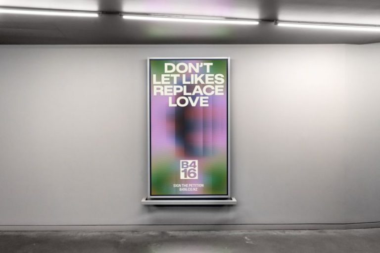
Diagonal patterns were also incorporated to complement the circular motifs. These graphics are designed to convey optimism and movement in the right direction, seamlessly connecting with the Back Market “chevron.”
This dynamic visual language reinforces the brand’s progressive and forward-thinking ethos. In motion, patterns reinforce this optimistic feeling with outward radial movements and bursts of energy.
Colours and typography
Evolving from the existing black-and-white scheme, the team identified a new colour palette that brings vibrancy and life to the brand. By integrating gradients, they injected a fresh and dynamic feel into the colours, reflecting renewal and energy.
For the typography, they chose a friendly and warm tone by leaning into Letters of Sweden’s Ivar Soft to make the brand more approachable and human. The idea was to create a more humanistic feeling in contrast to many of the sans serifs used by major tech companies.
This was paired with a geometric sans serif, Duplet Open by Indian Type Foundry, to align with the circularity theme, creating a harmonious and coherent visual identity.
Motion design
To maximise the impact of the identity Vucko, led by Andrew Vucko, in partnership with Back Market’s in-house agency, created a motion system that helps to convey what the company stands for. Inspired by circular tech and the circular economy, a sweeping revolving motion lies at its core, lending heightened meaning to messaging and imagery.
Paired with animated patterns, typography and other key brand elements, this system gives Back Market a distinctive foundation for building consistent, compelling brand experiences and grabbing people’s attention.
“Passion is at the core of everything Back Market does,” says Rasmus. “And with the ambition of getting the message across with a bit more attitude, we also helped create a graphic style that’s more direct, on point, and with clear statements that can be used in a more activistic manner.
“To bring the rebrand to life, we identified our brand image characteristics of being confident, optimistic, human, and authentic and fostered collaborations with artists worldwide. This collaborative approach enriched Back Market’s visual world, emphasising the global and inclusive nature of their mission to promote circularity in tech.”

