For its 20th anniversary, YouTube looks to bring unity, energy and motion to its expanding ecosystem, signalling how far the platform has evolved from a video-sharing site to a full-scale entertainment brand.
Two decades after its first upload, YouTube is entering its next chapter with a refreshed global marketing identity developed in-house by YouTube Creative Studio. Rolling out across Shorts, Music, TV, Premium and Kids, the system is designed to unify a brand that now lives across formats, screens and cultures, while staying rooted in the content that made it a cornerstone of the internet in the first place.
The rebrand responds to a familiar challenge facing today’s content platforms. As products multiply and audiences fragment, brand expression can easily splinter too.
YouTube’s visual language had grown in different directions across teams and markets, and so the task was to bring everything back together without sanding off the personality that creators and viewers recognise.
“When a brand lives everywhere, it risks feeling like nowhere,” says Kieran Mistry, who led the project during his tenure at YouTube’s in-house Creative Studio EMEA. “Our task wasn’t to reinvent YouTube, but to design a system that connects its many sides – unified but never uniform.”
The central idea behind the new identity is quite simple: Alive. Content is YouTube’s heartbeat, so the brand needed to move with it rather than sit alongside it. That thinking underpins a reactive, dynamic system that responds to real content, real culture and real moments, mirroring how people actually experience the platform.
Crucially, the team resisted the temptation to start from scratch. “YouTube didn’t need to throw everything out and start again – it’s already a cornerstone of the internet,” says Kieran. “Our job was to evolve what people know and love, and make it feel expressive and connected for what’s next.”
In line with this, the identity builds on familiar YouTube cues, such as the iconic red, white, and black palette, UI elements like the play bar, and the language of ‘like, subscribe, share’. What’s changed is how these elements behave, as they now feel more expressive and in tune with the content they frame.
A brand new display typeface, YouTube Display, has been developed in collaboration with Sharp Type. Drawn from the geometry and equity of the YouTube logo itself, the typeface provides a consistent yet characterful voice across touchpoints. Crafted in nine global scripts, it’s designed to scale across markets without losing its identity.
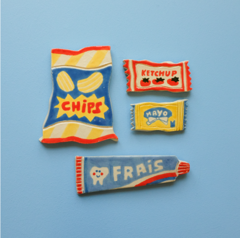
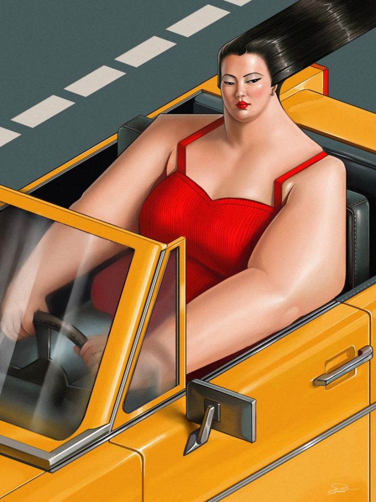
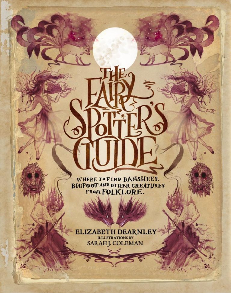
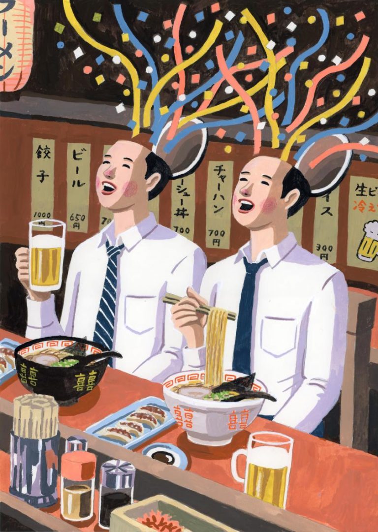
Illustration has also been rethought. Working with Gesture Systems, the team developed a bespoke illustration style that balances clarity with curiosity. Simple, bold forms sit alongside playful, offbeat details, echoing the platform’s diverse content while maintaining a coherent visual thread.
Perhaps the most significant shift comes through motion. For the first time, YouTube has introduced a motion identity that reflects the rhythm of real content. Behaviours like ‘Camera Shake’ mimic natural handheld movement, capturing the spontaneity that defines so much of what people watch and make on the platform.
“The brand isn’t static anymore,” says Matt Saint, who led design alongside Kieran. “It reacts to real content and culture. Evolving alongside new products, technologies and audiences as YouTube continues to grow.”
Understandably, each product in the YouTube ecosystem needed to speak to its own audience, but now it can do so within a shared framework that feels connected rather than competitive. Looking more broadly at where content brands are heading, it’s clear that rigid consistency is out, and flexible, culturally current systems are in.
According to Kieran, building the identity in-house was central to its success, not to mention, incredibly rewarding. “It’s shown what’s possible when a small, close-knit team works with focus and belief, building a system that’s not just beautiful, but genuinely useful for everyone who touches the brand,” he says.
Matt agrees, adding, “This was never about decoration. It’s about creating a design system that works, uniting YouTube’s ecosystem and empowering teams everywhere to build from it confidently.”
Now rolling out globally, from New York to Mumbai and Kyoto to London, the new identity marks a defining moment for YouTube at 20, reflecting a platform that has grown up, broadened out, and learned how to keep pace with culture. It’s an identity where content, design and motion finally move as one.