Drawing on the heyday of the tabloid press and the inspiring archives at St Bride, the all-caps variable font marks the launch of D8’s new type studio – and a break from spiralling licence fees – ahead of its debut at Birmingham Design Festival.
Any discerning designer will tell you how expensive typography can get. Not to mention the minefield of licences and usage. And when the fees on your headline font keep on climbing, and that typeface is the backbone of your visual identity, there comes a point where owning one outright makes more sense.
That’s why Anne Ward, CEO of Newspaper Club, has teamed up with old pals D8 to create a bespoke typeface, NC HEADLINE, that is uniquely theirs and no one else can use. It’s the first of many typefaces for the creative agency, which this week has launched abcD8 – its new foundry that designs typefaces clients own outright, with no licence fees attached, ever.
Newspaper Club is its first customer, and what they’ve created will be revealed this week at Birmingham Design Festival, where a type specimen printed on the company’s own tabloids – plus a short film documenting the process – will put the new font through its paces.
To inspire its design, Anne and the D8 team went through St Bride Foundation’s archives – the home of the printing press in London, and a brilliant place to visit if you haven’t already. “Initially, we looked at the sophistication of broadsheet mastheads, but it felt like it really lacked the energy that Newspaper Club has,” says Anne. They turned instead to the heyday of tabloids, when typefaces like Interstate (Daily Mirror) and Franklin Gothic (The Sun) ruled the front pages. “Rather than simply copying the tabloid look, we wanted to refine it a little more and so combined it with more vintage styling, helping to make it more our own.”
The archives turned up many surprises, shaping the direction of the design. Show posters and how they handled certain character shapes, for instance. “We liked how they used variable-width characters to shout about something while using all available space on the poster. That wasn’t something we’d expected to study initially, but it ended up having a real impact on the design,” says Anne. “Those references helped us round out and refine the typeface, giving it more personality and helping us resolve some of the character forms in a way that felt distinctive while still being rooted in print culture.”
Creating something with heritage whilst remaining forward-looking and modern is no easy task for any designer. Rules will inevitably be broken to accommodate both print and digital demands. “From our perspective, we wanted to evoke the confidence and character of classic newspaper headlines, but we also needed something that could work seamlessly across all of our channels,” adds Anne.
“One of the biggest departures from our historical references was the emphasis on flexibility. Traditional newspaper headline typography tends to be quite static, designed for a specific context on a printed page. We needed something much more dynamic: a typeface that could work across social media, video, print and large-scale applications, while still feeling unmistakably rooted in the world of newspapers.”
That thinking led Anne and D8 towards a variable design with no fixed widths – one that can expand, condense and adapt to different formats. Despite this, they deliberately kept one restriction: they didn’t build a lowercase alphabet. “We wanted the typeface to remain all caps, reinforcing its role as a headline typeface,” explains Anne. “We stack our headlines a lot, so having the ability to adjust the width gives us much more flexibility. Depending on the space available, we can make the type incredibly condensed or much wider and more expansive, often even within the same headline.”
The new foundry abcD8 has launched, promising to design typefaces that brands can own outright, “free from fees or ongoing licences”. But how does that model work commercially, and why go against the standard licensing approach?
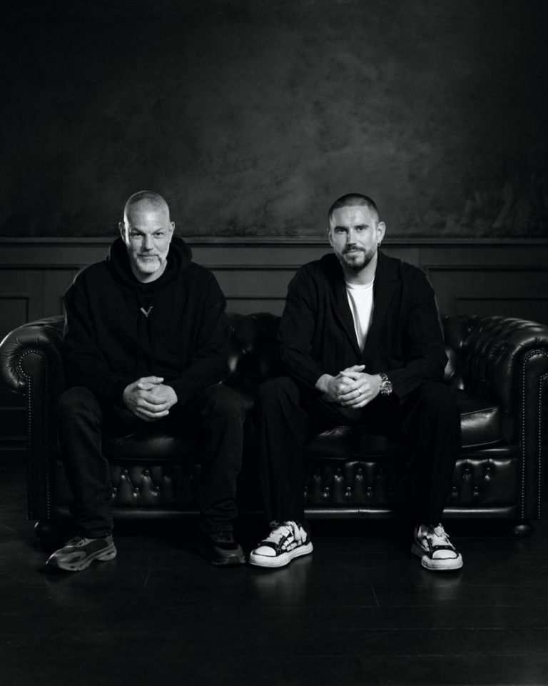
Steven Bonner, creative director at D8 and abcD8, says: “We treat the way we work with type in exactly the same way that D8 does with other design projects. This means using a transparent pricing structure where the client pays for our time. We don’t charge for licensing design work anywhere else, so why do it with type?
“We’ve found that the pricing structure for type has left a lot of our clients more than a little confused and struggling to navigate a complex world of licences across a host of touchpoints, so we want to make it simple. If we provide good service, we hope clients come back to us the next time they have the same need, rather than charging them over and over for the same work.”
It makes total sense. Which raises the question, whose idea was the typeface for Newspaper Club? Did Anne go looking for one, or did abcD8 propose it as a launch project? It was Anne who approached D8 after working with them for over a decade. “During that time, we’d seen font licence fees rising and rising,” she says. “Our headline font had always been such a huge part of our identity; it just made more sense that we should own it outright.”
Along with the launch of a newspaper specimen at Birmingham Design Festival this week, Newspaper Club has released a film about the making of the new typeface. “We didn’t just want to say ‘here’s a new typeface’ and walk away,” says Anne. “We know how much our community loves to see the work that’s gone into something. People always ask to see behind the scenes at the printing press, and we thought this was a fun way to bring that energy to this project.”
Anne explains it’s important for them to showcase not only the design process but also the collaboration and teamwork that goes into creating a typeface so fundamental to their brand identity.
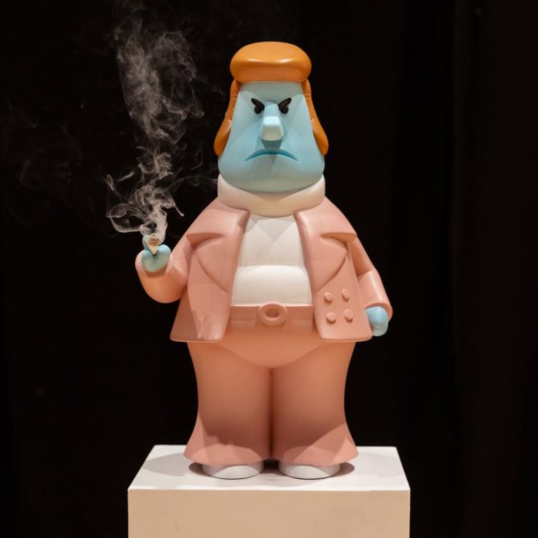
The popular Netflix series Abstract: The Art of Design was a major inspiration for the film, which features an animated version of Newspaper Club’s brand mascot, Russell. Worth a watch.
Can you get your hands on the typeface or the specimen? Not NC HEADLINE, no. But you can get your hands on the specimen by visiting Newspaper Club’s stand in the Analogue District at Birmingham Design Festival this week. They’re also hosting a talk about print on Friday, and will be handing out copies of the type specimen, which doubles as a pretty gorgeous poster.
If you can’t make it to Birmingham, don’t worry… Newspaper Club will be taking the specimen on tour at future events, so look out for where they’re heading next.