On San Francisco’s waterfront, 10 established artists get free studios and, in return, teach 20 emerging ones. Macfadden & Thorpe and Anisha Sachar have given the mission an identity based on the flow of water and ideas.
I’m one of the last generation to get higher education for free. I can’t imagine how much it would cost to go to university these days. In the US, a Master of Fine Arts can set you back as much as $400,000 (roughly £300,000). Blimey. So it’s no surprise that writer Dave Eggers and artist JD Beltran wanted to offer an alternative.
Art + Water is an art space and cultural hub in San Francisco inspired by the classic artist-apprentice model. The format is simple: 10 established artists get a free studio at Pier 29 and, in exchange, teach a cohort of 20 emerging artists, who also get free studios. Alongside this are exhibitions and public programming, designed to bring a long-dormant stretch of waterfront back to life for the local community.
I’ve cycled along that very front. I was staying in the Tenderloin district in 2015 after another Adobe MAX. The hotel lent out bicycles, so off I went. (Funnily enough, that’s exactly how Dave found the place – out on his bike, spotting that the enormous pier was sitting empty.) It struck me then just how much it could do with some creativity. It felt touristy, more than anything. Not what I expected. So I’m happy to hear of this new scheme.
Its identity comes from San Francisco studio MacFadden & Thorpe, working with independent brand designer Anisha Sachar – both of whom we’ve not yet featured on Creative Boom. I’ve noticed much more traffic from that part of the world lately, so maybe they’re part of that. Anyway, I digress. “Art + Water’s spirit of openness, exchange and shared knowledge was the starting point,” says Anisha. “We wanted to create an identity that rejects institutional stiffness and instead feels flexible, alive and unapologetically vibrant.”
The big idea behind the brand is “flow”. Yes, that’s partly a nod to the water surrounding Pier 29, where the studios are based, but “more importantly”, as Anisha puts it, “to the flow of knowledge between the artists inside it”.
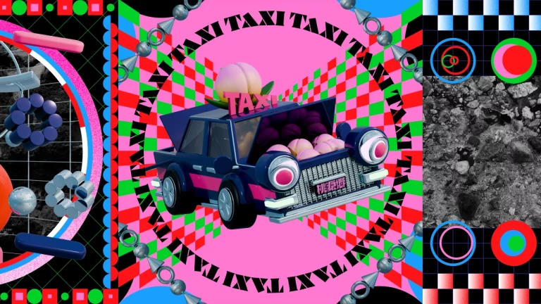
That means a custom-drawn wordmark with fluid, bendy letterforms. And typography that wanders along winding paths within layouts. Nice. Images, meanwhile, sit inside fluid frames that “swell, contract and shift shape”.
The motion design works hard here, too. It’s loose, with no single prescribed behaviour. Sounds a bit like a few people I know. “Things oscillate, stretch, travel or flash,” says Anisha. “Words are at times enormous and at times scaled down and repeated around imagery.” It makes sense. Because if you’ve ever tried to get a bunch of artists to follow one set of rules, that feels accurate.
Then there’s the vibrant colour palette. It was developed to feel “unexpected, bold and just a little salty from the bay”. Hot fuchsia and electric aqua are the hero hues, and they’re backed by a range of supporting colours.
After looking at MacFadden & Thorpe a bit more, I can see it’s the work you’d expect from the multidisciplinary studio, as they usually focus on the cultural and tech sectors. SFMOMA, YBCA, Airbnb and LEGO are among their past clients, after all.
Interestingly, the identity for Art + Water isn’t meant to be finished. Anisha says it’s “a visual language that can keep being reshaped by the people using it”. Much like the pier itself, and the way artists tend to work. I look forward to visiting San Francisco in future and popping my head in to say hello.