The original Vancouver Canucks logo was designed in 1970 by freelance graphic designer and lifelong hockey fan Joe Borovich. Joe heard rumours that the Canucks would be entering the NHL, so he crafted a new team logo and took it to the Canucks’ stadium office for consideration. About a month later Joe got the approval call and was invited back to design tickets and various promotional items. The stick and rink design has proven timeless, combining the shape of a hockey rink with a hockey stick to form a C for Canucks.
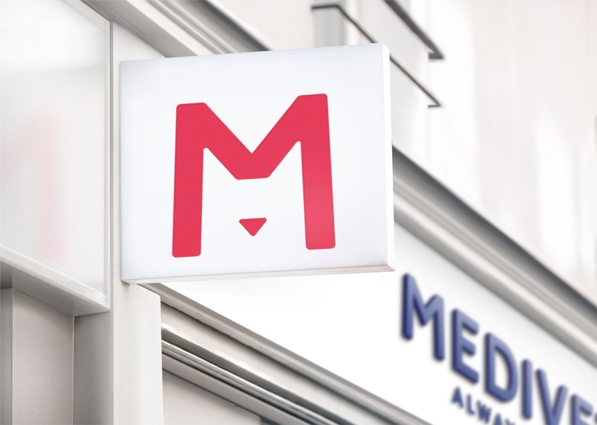
Medivet was founded in 1986 with to raise standards of veterinary care. With plans for expansion across the UK, Medivet hired Turner Duckworth who redesigned the visual identity with an unmistakable M icon. It’s the simplicity that makes this a memorable veterinary mark.
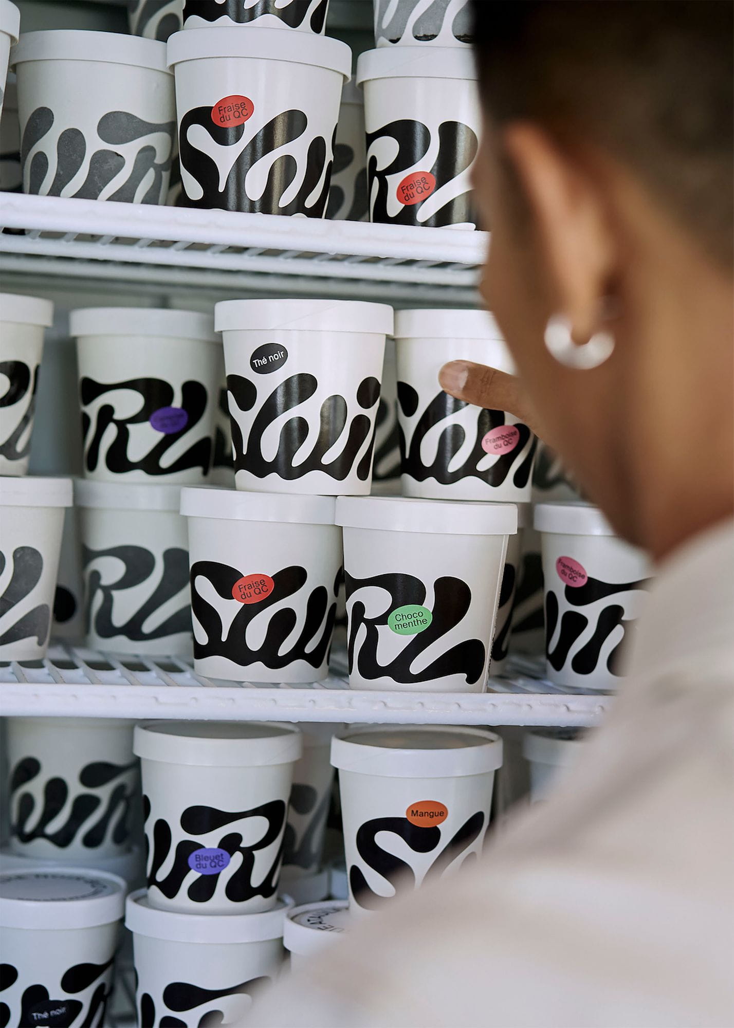
Swirl is a vegan ice cream shop in Montréal. The tasty, flowing wordmark, designed by Montréal-based Wedge, was inspired by the product’s smooth creamy texture and trail left by a spoon.
The three founding partners of Cubic Metre Furniture all had names beginning with M. The wonderfully fitting idea was conjured by Minale Tattersfield in 1981.
Dutchscot’s fitting logo for Feed — a new content creation agency — is “a living, breathing representation of the word, constantly in a state of transition, scrolling as a user would on their phone, tablet or computer.” Excellent animated context on the Dutchscot website.

The Guild of Food Writers is an established organisation dedicated to excellence in food writing and culinary education. This spoon inside a pen nib is timeless, crafted in 2005 by the gone-but-not-forgotten 300million. “What you take away is just as important as what you keep,” said Katie Morgan, senior designer at 300million.
The CultureBus monogram was designed by Kit Hinrichs while at Pentagram (created in 2008 as far as I can tell). “The logo brings together the letters C and B in a form that resembles a route.” While the bus service wasn’t a hit, the mark certainly was.
Positioning a woofer and tweeter to form a stylised letter g helped Goodmans Loudspeakers leave their mark. Designed in 1992 by Associated Design Consultants.
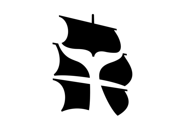
In 2005 Malcolm Grear Designers came up with this intelligent use of negative space for the New Bedford Whaling Museum. The logo reflects the idea of “whaling in the age of sail.”
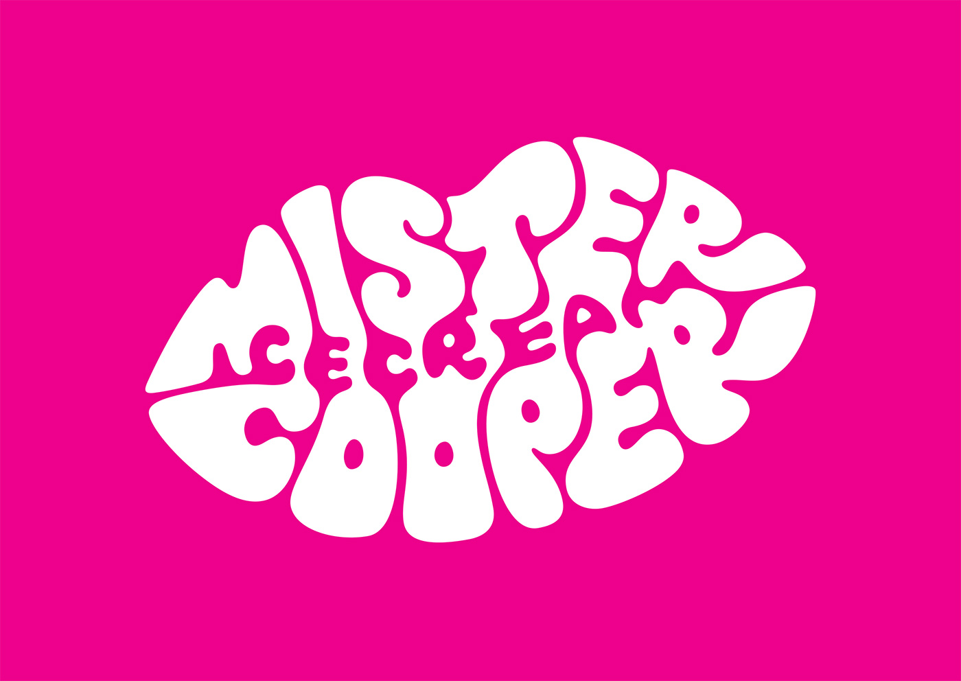
Mr Cooper is an an ice-cream business specialising in alcoholic and gourmet flavours. The challenge (in 2015) for Johnson Banks was to use positive and negative space to spell out the brand name and the words “ice cream” within their idea of a typographic lipstick mark. Type specialist Rob Clarke was brought in to add some finesse. Kath Tudball (then Johnson Banks, now creative director of Superunion) narrated an intriguing design walkthrough.
More in the series:
Marked with thought #1
Marked with thought #2

