Over two decades ago, a new Danish newspaper called Dagen was born. An ambitious project by Peter Linck and editor Kresten Schultz Jørgensen, it reinvented the printed press with quality journalism, pleasing layouts and beautiful typography. But it went bust after just 41 days. Now independent foundry, Playtype, is bringing its bespoke typeface back to life.
Dagen was the first newspaper to launch in Denmark for almost 50 years and was aimed specifically at a new well-educated generation who would gladly pay for the best quality journalism in an age disrupted by the digital revolution. With refined writing and expert pieces throughout, its design was a major highlight, something that Danish designers still love and appreciate today.
Within its first month of production in 2002, it amassed 13,000 subscribers and 20,000 buyers, who were all happily paying to access the publication that broke existing norms of style, form and journalism. “I believe we added new momentum to a petrified market, despite the short presence,” Kresten Schultz Jørgensen remarked, almost a decade later.
Dagen ceased to exist after a mere 41 days in print, declaring bankruptcy the same year it was introduced. Even though it’s been over 20 years since its launch, it continues to be the subject of many dinner party and creative networking discussion and is heralded as representing a groundbreaking vision of what newspapers could look like with a higher purpose: aesthetically, politically and journalistically.

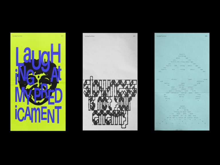
Earlier this year, Playtype – an independent foundry based in Copenhagen – decided to resurrect Dagen’s custom typeface, Publish Gothic. Originally designed by Jonas Hecksher at Danish agency e-Types, it was impactful, instantly iconic and attracted the attention of the design industry all over the world, winning awards along the way. “We were inspired by old newspapers, which were set with wood types,” says Jonas, reminiscing the process. “The wood types were cut a bit crooked, which showed in the newspaper typefaces. We took that same aesthetic and applied it to the Dagen newspaper. The typeface couldn’t be perfectly drawn since the idea was that uniformity and traditions didn’t belong in Dagen.”
Despite the newspaper’s short lifespan, Jonas kept Publish Gothic in the back of his mind, always feeling its timeless character could lead to its resuscitation. And here it is seeing the light two decades later, marking the latest addition to Playtype’s growing catalogue. Updated and refined for the modern-day, the Publish Gothic family includes a total of 54 individual styles, divided into three distinctive widths: Condensed, Normal and Expanded. As a result, the typeface is extremely versatile; making it just as suitable for characterful headline messaging as it is for functional body copy. In addition to its huge range of weights and widths, a number of stylistic sets allow the typeface to be personalised further to fit the required application.
For the launch of Publish Gothic, Playtype partnered with the outlandishly fun Weekly World News, to create a series of posters presenting some favourite headlines from the iconic publication to “connect the typeface back to its short-lived newspaper origins,” as Playtype puts it. Grab yourself Publish Gothic today, available from €50.