Logos are an essential part of any brand. They are the first thing people see, so brands and companies must make an excellent first impression. But what kind of impression do logos give?
For example, how do you feel when you look at Apple’s logo compared to the Toys R Us logo? One seems confident, while the other seems immature. With one, you’ll get classy tech vibes, and the other will look like it’s childishly entertaining.
A logo should be designed in such a way that it is memorable and easily recognizable. It has to be just right! If a logo is too complicated, people will not remember it, but if it’s too simple, people won’t take the company seriously.
What Should Logos Be Like?
Logos are a crucial part of any brand. They can be used to create a company’s identity, convey a message, and help consumers remember the company.
A logo should make an impression and tell its target audience about the company it represents. A good logo has seven qualities that can make people think positively about the brand.
- Logos should be simple yet memorable.
- Logos should be easy to read.
- Logos should be versatile.
- Logos should have personality.
- Logos should stand out from others.
- Logos shouldn’t take up too much space.
- Logos need to have their unique style.
7 Impressions Logos Have On People
Logos are an essential part of a company’s branding. They give people an impression of the company and how it stands out. A logo can say a lot about the company and its products.
Logos can give people many different types of impressions, but these seven impressions stand out most.
Mucho Credible
Have you ever considered a brand trustworthy only by looking at its logo? If yes, the reason is that the professional logo designer has used elements and principles of logo design that showcase characteristics like trustworthiness, reliability, credibility, and security.
Regarding fonts, both serif and sans serif can help achieve these features, but one needs to be careful with color. For example, how would the IBM logo look in baby pink compared to blue? Not serious.

Image Source: wikipedia.org
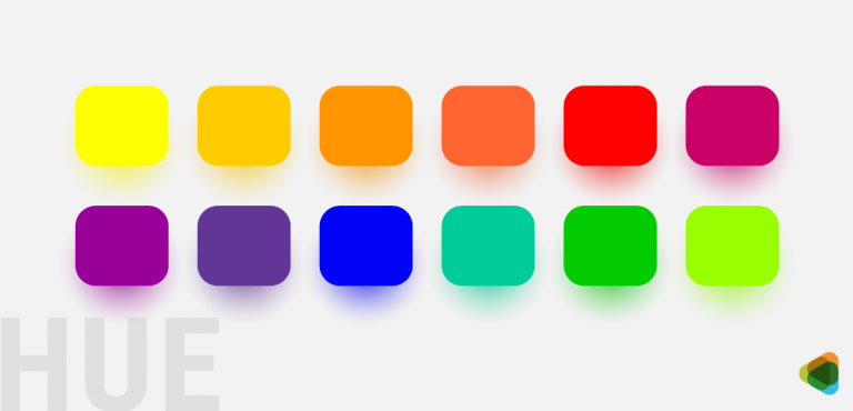
We now know colors have moods in graphic design, and designers must be careful when picking a color palette for a logo. Colors have meaning and use, and each color represents a different set of feelings and emotions. Red is for passion and warning, while shades of blue are for intelligence and honesty.
The question in mind:
What should you do to look credible?
Solution:
- Select an appropriate color palette.
- Pick a logo style that suits the brand.
- Keep it simple, not crowdy.
Professionally Capable
You might disagree with me, but the logo design of FedEx looks more professional than the Verizon logo. Let me elaborate. The FedEx logo is compact, and the designer skillfully used negative space to convey a message. On the other hand, the previous Verizon logo looked tacky and amateurish. The redesign is still better but not stellar than the evergreen FedEx logo.

Image Source

Image Source
A logo is a visual tool that represents your company, so it is vital to get it right. There are many ways to start creating a professional logo and the impression that you want to give off.
You can use a combination of fonts and colors to make your logo look professional. There are tricks to choosing the right font; if one learns those, picking a typeface becomes less challenging. You can also create the impression of professionalism by using a font that is not too fancy or out there.
The question in mind:
What should you do to look professional?
Solution:
- Strategically place elements.
- Select a befitting typeface.
- Be minimalistic but clever.
Fashionably Sophisticated
Fashionable logos are the new trend in logo design. The logos are aesthetically pleasing and convey a sense of sophistication. We have seen many trendy logos created in the last few years, and it is time to make a sophisticated and fashionable logo.
These traits are primarily found in luxury brand logos from the jewelry, fashion, and beauty industries. For example, the Alexander McQueen logo is a logotype in a serif font, but the way it is written gives a classy and high-end look.

Image Source
The logos of expensive brands like Louis Vuitton, Chanel, and Hermes are all exquisite, classy, and stylish. These logos are sophisticated because they have not only a timeless appeal but also a luxurious feel to them.

Image Source

Image Source

Image Source
The question in mind:
What should you do to look fashionable and sophisticated?
Solution:
- Prioritize the style of logo design.
- Focus on typography.
- Pay attention to the overall composition.
Seriously Straightforward
When visiting a company’s website or social media page, people first see a logo. It is the first impression of your company, and it should be designed to represent the company’s values, goals, and objectives.
A straightforward logo will make it easier for people to understand what your business does without spending time figuring out what your company does.
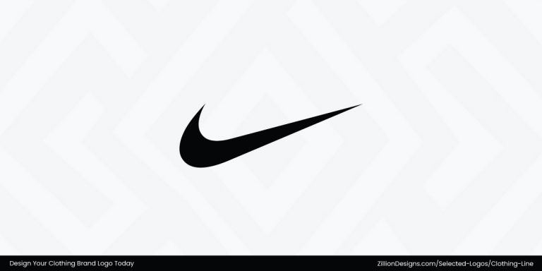
You will, however, note that most famous logos are not straightforward. For example, instead of a shoe, there is a tick mark on the Nike logo. Another example is that a well-known tech brand uses fruit for its symbol.
Compared to this, the Instagram logo suggests that the company has something to do with photography.

Image Source: wikimedia.org
Most logo designs that have established a reputation in the market are not easy to understand unless you know what the brand sells. Wendy’s is a burger joint, but instead of a burger, there is a girl’s face.
The question in mind:
What should you do to look straightforward?
Solution:
- Be literal with the brand name.
- Use visuals that represent your vision.
- Keep the appearance simple.
Joyfully Playful
A playful logo is an essential component of any brand that wants to be memorable and fun. There are many ways to make a whimsical logo, including incorporating humor, using bright colors, and making an easily recognizable logo.
For example, the Twitter logo has a tweety bird. Lacoste logo has an alligator. The Android logo has a bright green robot symbol. Apart from these famous logos, many startups also have joyful logo designs.
Designing a playful logo is all about having some fun and being creative. It means using shapes, colors, and fonts that make people feel happy or excited. A playful logo can be created by combining two or more forms. Let’s take a look at some such logos:

Image Source

Image Source

Image Source
Truly Trendy
A trendy logo should be able to stand out from the crowd. Let me tell you, “standing out” is easier said than done, but if you can distinguish the brand with trends, then you’re good to go for social media, contemporary merchandise, and even the metaverse.
The one thing you can’t be here is ‘ignorant.’ To make a trendy logo design, you must first look out for industry trends. The more you explore, the more you create.
Some of the most recent logo design trends revolve around geometric shapes, negative space, typography, minimalism, and gradients.
Trendy logos change as the trends change. Logo trends change every few years, so staying on top is essential to maintaining your competitive edge.
Let’s take a look at some examples:
Casually Creative Fonts

Image Source
Image Source

Image Source

Image Source
Spin It Up With Lines

Image Source

Image Source

Image Source

Image Source
Just Playing With Shapes

Image Source

Image Source

Image Source

Image Source
For more trends, check out our infographics on logo design trends in Part 1 and Part 2.
The question in mind:
What should you do to look trendy?
Solution:
- Use a trend or two in your logo.
- Keep an eye on the latest trends.
- Be experimental and creative.
Always In Action
By now, you know that a brand’s logo can have all sorts of impressions on people. Here I’ll be discussing one last impression you can have on people. Let’s take the example of a simple yet powerful logo of the sports brand Nike. It is only a tick mark, but the identity attached is beaming with action, which has animated the symbol in peoples’ minds.

Image Source: wikimedia.org
There are many tricks to creating an action-filled logo. Many companies that belong to industries like sports have logo designs that suggest movement, activity, and exertion. Another example of this is the Puma logo. The leaping cat is its part that represents action.

Image Source: wikimedia.org
The question in mind:
What should you do to look active?
Solution:
- Use direction and repetition.
- Add icons that depict action.
- Focus on warm colors.
So this is it, folks! This was my list of the impressions your brand’s logo can give people. Now it’s up to you what you want to show people. Which side of you is worth displaying? Once you have the answer to this, creating a logo for your brand becomes easier.