Keeping customers loyal in the energy industry involves more than simply maintaining their electricity supply. You need a brand that demonstrates the reliability and innovation of your energy company if you wish to establish a connection with your customers. With a logo that is as powerful as your company’s work, your brand can grow.
However, creating a logo is a challenging task, there are many things to consider like color, imagery, and more importantly the font. As a designer, you’ll find this guide helpful because we’ll highlight different font styles and resources you can use in energy logos.
If you are designing one for energy companies specializing in sustainable power generation, nuclear energy, or oil and gas, you can find just the right font for your logo!
4 Types of Energy Logos to Design
When you are designing your energy logo, you can choose from four different types. It is important to have a clear understanding of each of these types to design an effective logo.
Let’s discuss a few of these briefly:
1. Wordmarks
There are font-based logotypes in which the name of the company appears in the design of the logo. A company with a distinctive name would benefit most from the logotype. Suncor Energy logo as shown below is the perfect example.
Image Source: lobbymap.org
2. Letter marks
A monogram logotype consists of the initials of the company’s name incorporated into the design. If you have a long business name then this type is suitable for you.
3. Symbol/ Icon
As with a name, these are logos that represent a brand using an image associated with that brand. Creating a brand symbol for a business in the energy sector is challenging since it must convey not only the values, promises, and objectives of the company but also create a recognizable image. Here is an example for you.
4. Combination Logos
When it comes to choosing a type of logo for your brand, these can be a great option. Combination marks tend to incorporate both text and images. Among graphic designers, this type is quite popular as it allows the use of both or either of the files across different platforms.
25 Energy Logo Font Resources for Companies
As part of the energy logo design, the fonts play an important role as they convey more than just the name of your company, but also the message you want to convey. The curves, angles, and lines in a font convey subtle messages that evoke emotions and influence how your audience sees your brand. Let’s take a look at energy company logo designs and their font styles.
Electrical Company Logos
The design of a logo, especially one related to an electrical company, should be simple. A simple, sleek, and clear font, as well as large graphics, suggest order and precision, which are consistent with the nature of electricity. By using an image such as lightning, power lines, or circuit boards in your logo, you can instantaneously convey the notion of electricity, ensuring that the logo is easily recognizable and memorable.
To illustrate the concept of power, the logos of electrical energy use bright and strong color combinations. Black and white are used to make the design more elegant and clear, while blue and yellow are used to create a sense of credibility and positivity.
Fonts are important when it comes to giving the overall impression of reliability and innovation, so it is advisable to use modern fonts without serifs. In capital letters, for instance, large and thick letters give the impression of power and protection, while thin and smooth fonts give the impression of order and precision.
Electrical energy logos can be beneficial to a wide range of companies, including electrical engineering, power generation, new energy renewable industries, electric car makers, home appliance manufacturers, and companies that make smart technology, etc.
Best Fonts for Electrical Companies
Fonts such as Calibri, Gotham, and Nexa, Unison Pro Bold are best for electrical logos because they give a clean and modern look and also reflect the innovative ideas a company might have for its electric services.
Font Resources
Fonts.com
MyFonts
Adobe Fonts
Google Fonts
Font Squirrel
Wind Energy Logos
When designing logos for companies in the wind energy generation sector, it is recommended to use natural, round fonts to achieve the desired balance with nature. To make texts appear more personal and to evoke positive emotions with logo designs, consider calligraphic or script fonts.
Generally, wind energy logos are designed to mirror the effect of movement and represent sustainability. There is a representation of progress and advancement in the provision of renewable energy through the use of circles, curves, moving lines, and the depiction of wind turbines in a manner which depicts wind motion or even words like wind, turbines are also sufficient.
Businesses and industries with a need for wind energy logos include wind farms, renewable energy businesses, ecological organizations, green energy start-ups, environmentally friendly products, and sustainable construction firms.
Green, blue, and brown are shades associated with wind energy logos, as these are natural colors. In addition to expressing a connection with the natural world, these colors also convey a sense of serenity, calm, and harmony.
Best Fonts for Wind Energy Company Logos
Fonts such as Open Sans, Signque Medium, Helvetica Neue, Handel Gothic Bold, and Raleway are used for wind logos because of their light and modern appearance, suggesting movement and efficiency.
Font Resources
Dafont
Cufon fonts
Fontsgeek
FontShop
Behance
Green/Sustainable Energy Logos
Green energy logos represent sustainability, creativity, and a commitment to the long-term health of the planet. Each of these logos is associated with biofuels and hydroelectricity, and all of them convey the concept of a green future and an efficient use of energy.
Font styles with rounded corners and minimalist design look friendly, while bold and thick fonts look reliable.
With the use of graphic elements in eco-friendly logos such as leaves, drops of water, and turbines, it is possible to convey the renewable energy concept, while also reminding the audience about the company’s environmental and sustainability efforts.
Businesses and industries that might use green energy logos include; biofuel companies, hydropower plants, non-profit environmental organizations, and electric vehicle (EV) manufacturers.
In green energy logos, green, blue, and yellow colors are usually used as references to the sky, the earth, and the sun. Colors like these also give the audience a feeling of progress and vitality, while also reminding them of the brand’s environmental commitment.
Best Fonts for Green Energy Logos
Fonts like Ecofont, Verdana, and Georgia are used to convey sustainability, trustworthiness, and a connection to nature
Font Resources
Adobe Fonts
FontShop
TypeTogether
Fontspring
Dribbble
Solar Energy Logos
Solar energy means using the sun to generate power. We can say it comes under a green and sustainable form of energy. Most solar companies use solar panels, solar farms, and photovoltaic cells in their logos to show the concept of clean energy.
Common font styles for solar logos should be rounded, friendly, and innovative along with modern imagery. You can use Century Gothic, Avenir, and Lato. No need to be too bold.
Businesses and industries that commonly use solar energy logos are solar panel manufacturers, solar farm operators, renewable energy consulting firms, and green energy companies. In solar energy logos, colors like yellow, orange, and blue are commonly used to symbolize the sun, warmth, and clear skies.
Best Fonts for Solar Energy Logos
The best fonts to use in solar logos are Adobe Caslon, Century Gothic, Avenir, Central Bold and Lato, and Levenim MT Regular. There might be plenty more, however, you have to decide which one gives a modern and unique look.
Font Resources
Fontspring
Fontfabric
Creative Market
Open Foundry
Lost Type
Oil and Gas Energy Logos
Oil and gas are traditional sources of generating energy. For many years people have relied on them for power and the majority still do. Most oil and gas company logos have pipelines, drilling machines, oil rigs, and flames which show efficient ways of delivering energy safely and reliably.
Businesses that use such logos are mostly oil extraction companies, gas pipeline operators, gas plumbing services, energy infrastructure firms, and petrochemical manufacturers.
The font styles should be bold, strong designs and clean lines indicate authority and stability. Modern fonts like Gothic Cond Bold, HS gold, Trajan regular, and Unison Pro Bold also suggest technological advancement and innovation within the industry. You can also use them across websites created by professionals and marketing materials to maintain brand consistency.
As far as color is concerned the oil and gas energy logos use black, dark blue, and red ones because they indicate the fire, and earth which are often associated with burning. These colors not only show the
These colors not only highlight the main resources used in the industry but also convey a sense of power, dependability, and the brand’s commitment to meeting global energy needs.
Best Fonts to use in Gas energy logos:
Fonts such as Gothic Cond Bold, HS gold, Trajan regular Unison pro bold, and Times New Roman are used in oil and gas logos to convey strength, stability, and authority.
Font Resources
Font Fabric
Font Bundles
Urban Fonts
Befonts
Typedepot
How to Design an Energy Logo?
Designing the best energy logo requires taking into account the following five factors. Each of these is important and you can’t skip them.
Create a brand identity for your business. It is important to define the company’s values as the first step. A brand identity allows us to understand what services and products we are offering and how to reach the target audience which helps to create loyalty, awareness, and excitement.
Research the competitors. The next step is to research the market see competitor logos and get a know-how of the industry trends being followed and what makes a unique and attractive logo.
Developing a concept. The first thing you need to do is collect and sketch several of your logo concepts which will help you to express the type of energy-related services that you provide. You can do a rough sketch or ask a designer to present several ideas.
Make a simple, versatile design. A simple, but flexible design, which can be easily applied to different situations and formats, like digital prints, Ads, and on company merchandise is the best choice.
Feedback. Show the initial logo design to friends, colleagues, and business partners to get their perspective and make other changes in the design if required.
Key Design Elements in Energy Logos
A logo designed for an energy company must be very sensitive to capture the essence of the energy sector. It is important to consider these factors to ensure that the energy logo conveys the right message to the target group of consumers and is visually appealing.
Symbols and elements. Consider incorporating items that relate to energy, such as lightning bolts, sun, leaves, or fires that show the type of service the company offers.
The psychology of color. For your audience to be attracted to you, choose colors that make them feel energetic and alive. These might vary from company to company. We have highlighted above clearly what color schemes are best for different energy logos.
Typography. You should select a font that is formal, but not too formal or boring. Further, it ensures that the text is legible when printed in other sizes and on different types of media. See our font suggestions above for each energy logo and design accordingly.
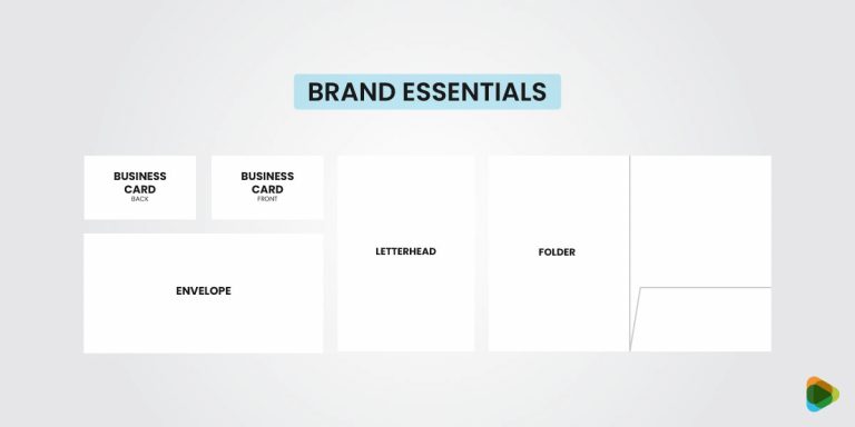
Ability to scale. Make sure that your logo is scalable and can be enlarged or shrunk without losing clarity, so it can appear on anything from business cards to billboards.
Conclusion
Energy logos are very important business assets. A well-designed logo will help set your business apart in a competitive sector and will leave a lasting impression on your clients. The font you use in the design helps to communicate brand personality and values. It plays an integral role in building a brand identity and getting the message across to the audiences.
We hope you got the idea of how to use the best font for energy company value according to the services.
The post 25 Energy Company Logo Font Resources for Professionals appeared first on ZD Blog.