Art director Dana Davis reveals how she helps shape the New York Times website’s unique aesthetic with her inspired polymer clay illustrations.
Remember how newspapers used to be a thing? We all like the idea that they still exist (just). But be honest, though, when was the last time you bought one, either in print or digitally? If, like us, your answer is “I can’t remember”, then imagine what it’s like working at one of these esteemed yet commercially precarious institutions.
Yes, we all like the idea that, somehow, they can cling on to life, thanks to subscriptions. But if we’re unwilling to pay for news, why should we expect anyone else to?
Well, The New York Times has come up with some pretty good answers to that in recent years. To begin with, they realised that traditionally, many people bought newspapers not for the news itself but for peripheral things like the crossword. Hence, in 2022, they acquired Wordle, a decision that’s proved to be pretty successful. They’ve also drawn on their reputation for fair and balanced reporting to lure people in for their product reviews via a website called Wirecutter.
Making things beautiful
Most Brits won’t have heard of Wirecutter, but it’s fair to say that it’s become somewhat of an institution among educated Americans. Founded in 2011 by Brian Lam, it’s essentially a curated guide to help you make informed purchasing decisions. You’ve probably seen a million of those, but what’s special about Wirecutter is how, well, beautiful it looks.
That’s partly down to the exquisite design, drawing on the best of the New York Times’ graphic traditions. And it’s also because of their thoughtful approach to imagery. Which is where art director Dana Davis comes in.
A visual designer with experience in advertising, branding, publishing, and tech, Dana provides Wirecutter with some of its best editorial illustrations and infographics, including her distinctive work with clay. So, we chatted with Dana to find out more.
Career trajectory
First of all, Dana explains how she got to where she is today. “I started out as a marketing designer at Wirecutter in 2021, working on creative campaigns helping build awareness and offer consumers a clearer understanding of our brand,” she recalls. “I’d occasionally fill in for graphics and illustration assignments until there became a more pressing need for a person to step into the role full-time.
“Three years later, I work alongside a talented team of creatives helping bring Wirecutter journalism to life through engaging visual formats: charts, diagrams, illustrations and most importantly, clay!”
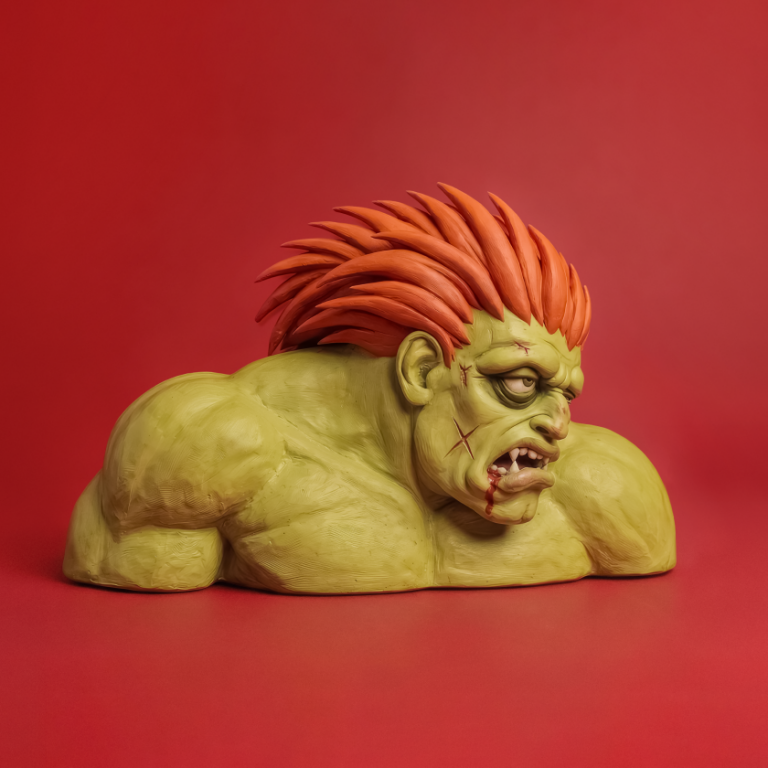
It turns out, in case you hadn’t noticed, that polymer clay is not a random gimmick. Instead, it’s “a consistent ingredient that serves as the foundational glue for Ask Wirecutter’s visual identity. Having this established constraint helps provide a framework for the ideation stage while still encouraging new ways to push the medium.”
The story goes that when prolifically creative deputy editor Annemarie Conte started planning for the launch of Ask Wirecutter, she asked for a visual identity that would help differentiate this work from the rest of Wirecutter’s coverage.
“The intimate scale of clay miniatures seemed like a suitable visual expression for the subject matter,” explains Dana, “because the queries addressed in Ask Wirecutter relate to domestic topics.”
Fear and flexibility
With Wirecutter covering so many disparate topics, Dana has to be flexible with her art in more ways than one. “Panic is a routine part of my creative process and serves as a motivating force propelling the work forward,” she reveals.
“I always have a moment of fear that I won’t be able to execute the sketch and deliver results. Luckily, I can rely on a team of collaborators, including the designer, Ezra Lee, and a consistently stellar photographer, Connie Park, to help me develop the sketch and see it through to the finish line.”
She explains that the key to crafting clean-looking sculptures is to stick with using logs, spheres, or slabs as the base shapes. “I usually craft at home and have a drawer full of super glue for anything that breaks off on the way to the office.”
“For especially delicate pieces,” she adds, “I’ll wait until I get to the office to cook the clay using the oven in Wirecutter’s test kitchen. The clay takes on a whole new life in the photo studio, and Connie does an incredible job of giving the objects spirit.”
Communication skills
Besides the technical aspects, though, she approaches this imagery just like anything created in another medium. Essentially, she explains, “Effective editorial illustration works in tandem with the headline to clearly communicate the thesis of the story without giving it all away upfront.”
But that doesn’t mean she isn’t keen to push things forward artistically. “I always get excited whenever we push the medium by introducing new ingredients to the mix,” she enthuses. “The time we lit a brain on fire, this fully functioning leg lamp, sushi grass, human hair, playing with scale with a life-sized shoe and ice cubes help me from feeling like I’m copying myself and keep the work fresh.”
In that light, she pays tribute to her creative director, Julia Harris, “whom I depend on as a fair and supportive judge of the work, always offering suggestions for how to make it better.”
