Banner design isn’t just about looking good — it’s about influencing action. The right CTA enhances the effectiveness of your website banner design. Think of it as a conversion engine or a lead magnet. Get that right, and you turn casual visitors into leads, buyers, or subscribers. These FAQs cover the key design and copy strategies that get results.
Every section includes pro tips with real examples, plus a bonus checklist you can turn into your go-to reference or infographic.
What is a good CTA (call to action)?
A strong call-to-action (CTA) is the cornerstone of every modern website design. It’s not just a button but a decision trigger. Good CTAs don’t just tell people what to do; they make them want to do it. That means pairing clear, actionable language with strategic design to remove friction and spark immediate clicks.
At its core, a good CTA answers two questions in under three seconds:
What will I get?
What do I need to do?
The best CTAs lead with strong verbs and communicate immediate value. Generic phrases like “Click Here” or “Learn More” often underperform because they’re vague and non-committal. Instead, use a copy that emphasizes benefit and urgency: “Get My Free Quote”, “Start My Free Trial”, or “Book My Demo Now.”
The shift is subtle but powerful. It transforms a passive prompt into an active invitation.
Design-wise, your CTA should be impossible to miss without being obnoxious. Use bold colors that contrast with your banner background. Also, make the button big enough to tap or click easily on all screen sizes. Leave some breathing room around the CTA so it stands out, and resist the urge to add multiple buttons with competing actions. One clear CTA is better than three weak ones.
CTAs also need to match the user’s context. If someone is just browsing, offer value, not pressure. But for others further down the funnel? Nudge them into a fast lane to act.
This FAQ-style guide cuts the fluff and gets tactical so you can design impactful website headers.
1. What’s the actual goal of a website banner — and why do most fall short?
Design by Cherry Wtz on Behance
Most banners fail because they’re all style, with no depth. A banner’s job is simple: get users to act, usually via a clear CTA. If it looks pretty but confuses or overwhelms, it’s not working.
Pro Tip: Focus every banner element on one goal. Remove anything that doesn’t serve that goal.
Example: A banner with “Free Shipping | 25% Off | New Arrivals | Sign Up Today” is overwhelming. Instead, go with: “Get 25% Off Your First Order – Sign Up Now”, and make the signup button the focal point.
2. What makes a CTA conversion-friendly in terms of copy and design?
Source: ZillionDesigns.com
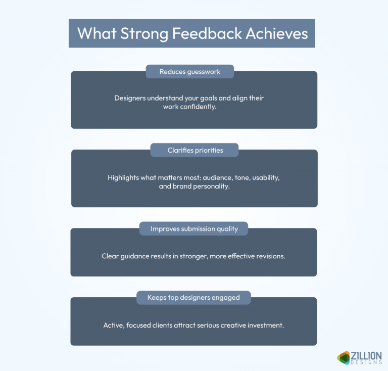
CTAs should be direct and benefit-driven. Skip vague terms like “Click Here.” Instead, use action words linked to what users get. Design-wise, use bold buttons, clear fonts, and a size to tap or click easily.
Pro Tip: Use verbs like “Get,” “Start,” “Claim,” paired with a color that contrasts sharply against your banner background.
Example:
Weak CTA: “Learn More” on a grey button over a grey background.
Strong CTA: “Claim Your Free Trial” on a bright orange button over a navy-blue banner.
3. Where should the CTA be placed for maximum visibility across devices?
Design by Kashaf Maryam Khan on Behance
Users skim fast. For high-stakes items such as an eCommerce sales banner design, your CTA should be one of the first things they see, and placed where interaction is easiest, typically in the center or right-aligned on desktop, or in the bottom center or thumb-reach zones on mobile. Your goal is to place it where the eye naturally falls. Also, avoid clutter around it.
Pro Tip: On mobile, place CTAs within the thumb’s natural reach — bottom center or right side work best.
Example: A retail app banner with the “Buy Now” button at the top right may be missed. Moving it to the bottom center, with a full-width design, significantly increases tap rates.
4. What color schemes work best for CTA visibility and why?
Designed by Victoria Borodkina on Behance
Color contrast is king. It creates clarity. Your CTA button must stand out from the background and other elements. Consider color psychology to trigger emotions: red for urgency, green for trust, and blue for calm.
Pro Tip: Run your CTA colors through a contrast checker to ensure compliance with accessibility standards.
Example: If your banner is light blue, don’t use a pastel yellow CTA button. Use dark blue or deep red instead. Those provide the necessary contrast and meet WCAG guidelines.
5. How much text is too much on a banner?
Design by Usama Qureshi on Behance
Keep text minimal — think headlines, subheadlines, and only one CTA. Avoid paragraphs or even long sentences. 6-12 words is the sweet spot. Write the copy, then cut it in half. Then do it again.
Make wise use of typography (clean font pairings) and generous spacing to avoid visual clutter. Remember what we said: users love to skim. The easier you make it for them to find the relevant info fast, the more they’ll appreciate it and repay the love by revisiting, clicking, recommending, and even buying.
Pro Tip: Stick to a 2-font max rule and leave at least 30% whitespace around your CTA.
Example: “See How It Works” for a software product page performs better than a generic “Learn More,” — which, by the way, is the most basic, boring, and interest-killing CTA copy ever. Don’t go near it.
6. Can animations or motion effects help banner conversions—or hurt them?
Subtle animations tell stories and draw attention without distracting users. But always use them sparingly. Too much motion overwhelms and distracts, so avoid flashy or fast movements that irritate. Simple fade-ins or slide-ins work best.
Pro Tip: Keep animations subtle — 1-2 second fades or slide-ins to avoid annoying your audience.
Example: A gentle shimmer or pulse on the “Start Free Trial” button gets clicks. A full-screen looped animation ensures your button never gets any action.
7. Should every banner have a CTA?
Source: ZillionDesigns.com
Yes. Even if it’s a branding banner, it should guide the viewer somewhere — whether it’s to explore a product, see a demo, or simply to contact you. The goal of a banner is to attract attention, but what good is the attention if it doesn’t turn into action? Your CTA’s job is to drive that action, in a clear direction to a specific goal.
Pro Tip: If it’s not a “buy” CTA, make it educational or engagement-driven.
Example: “Book a free consult ” performs better than a generic “Click Here.”
8. What’s the difference between a hero banner and a promo banner — and should they be designed differently?
Design by Nida Aftab on Behance
Hero banners are big, brand-focused, and set the site tone. They’re your brand’s long-term assets and always remain consistent with your overarching brand identity. Promo banners are smaller, more direct, and push specific offers or actions. Short-term and driving niche-messaging. Design hero banners for emotion and brand identity; promo banners for marketing and action.
Pro Tip: Use larger, impactful imagery for hero banners; prioritize button size and CTA clarity on promo banners.
Example: Hero: “Built for Bold Ideas – Explore Our Platform” vs. Promo: “20% Off Today Only – Get Started Now.”
9. How do I make my banner design mobile-friendly without sacrificing conversion?
Design by Nikita Khandelia on Behance
Responsive design is essential for high conversions since more than half of all internet traffic comes from mobile devices. To create a mobile-friendly website banner, think vertical and simplify the layout. Optimize for smaller screens with bigger buttons, less text, and thumb-reach spacing. Test on multiple devices to ensure legibility and ease of tapping.
Pro Tip: Make tap targets at least 44×44 pixels for finger-friendly interaction. Also, preview on at least 3 phone sizes before publishing.
Example: A horizontal banner may work on a desktop but fail on mobile. A tall layout with large text and a centered CTA always wins the day on vertical viewing.
10. What’s the best banner layout for conversions?
Design by Hiren Pipaliya on Behance
Top-performing layouts prioritize headline, CTA, and visual hierarchy. Use a Z-pattern or F-pattern to guide the eye.
Pro Tip: Place the headline in the top left, image on the right, and CTA just below the headline for a strong F-pattern flow.
Example: Landing pages with this layout often outperform centered headline designs.
11. Should I design separate banners for different buyer stages or traffic sources?
Source: ZillionDesigns.com
Yes. Tailor banners for awareness, consideration, and decision stages. Use language and design that speak directly to each audience’s mindset. There are many ways to personalize banner ads which not only help drive specific action but also boost customer loyalty.
Pro Tip: Map banner messaging to your sales funnel stages for higher engagement.
Example:
Cold traffic: “Explore What We Do.”
Warm lead: “Get 10% Off Your First Project.”
Returning buyer: “Join Our Rewards Program.”
12. What kind of images help banners convert? Stock vs. branded vs. illustrated?
Design by Tanya Jain on Behance
Branded materials always outperform generic stock. Relevant visuals get 94% more views on content than text-only material. They inspire authenticity and credibility. Essentially, saying that not only is this business real and legitimate, but it also has the expertise and the smarts to do what they are saying they can do.
Illustrations can clarify complex ideas, but they must align with the brand style.
Pro Tip: Choose images that evoke emotion and support your CTA message—avoid generic stock clichés.
Example: Instead of a generic laptop image, show your actual team using your tool on-brand.
13. Can banner design affect trust?
Absolutely. All the time. Sloppy design screams “scam.” Clean design with brand-aligned fonts, consistent spacing, and no visual noise inspires trust.
Pro Tip: Use grids to align content and maintain spacing. Keep font pairings limited (max two).
Example: A banner with 4 fonts, no margin, and stocky visuals loses credibility. A clean, white-space-heavy banner with 2 fonts and one focal image builds confidence.
14. Can I use directional cues on the banner design?
Design by Mehmet KOC on Behance
Absolutely. Elements that make your CTA pop or direct the user’s eye to it are going to win the day. Sure, you can use basic tricks like color, contrast, and spacing to make the CTA stand out, but additional cues such as an arrow pointing to it further emphasize the message.
Pro Tip: Ditch subtle directions. Go big so users can’t miss this important cue on your banner.
Example: A person looking or pointing toward the CTA button increases click rates.
15. What types of banners drive conversions?
Top performers include:
Limited-time offers
Product launch highlights
Lead magnets/freebies
Personalized banners (based on behavior/location)
Pro Tip: Test urgency and personalization together.
Example: “Only 2 Days Left – Get Your Free Guide Now” performs 2–3x better than generic banner CTAs.
16. What’s the role of whitespace in banner design — and how do I use it strategically?
Design by Divyansh Verma on Behance
Whitespace helps isolate your CTA, improves readability, and focuses user attention where it matters. It helps organize elements and reduces cognitive load, whereas clutter kills conversions.
Pro Tip: Leave at least 30% of your banner area empty around key elements for maximum impact.
Example: A banner with room around the CTA draws clicks. One packed with icons and badge drops the ball on scannability, and conversions follow suit.
17. How often should I update or A/B test my banners?
Regularly — at least quarterly or seasonally. Especially if your traffic changes or campaigns shift. Even small tweaks in CTA wording or layout can deliver big gains. UX design improvements resulting from A/B testing have proven to increase conversions by 400%. So, run A/B tests on copy, color, and placement to continually optimize.
Pro Tip: Test one element at a time to identify clearly what drives results. CTA text, color, placement, and then layout.
Example: Swapping “Start Trial” to “Try It Free for 7 Days” boosted clicks by 27% on a SaaS homepage.
High-Converting Website Banners Checklist
If your banner’s not converting, it’s probably missing one of these. This checklist keeps your message focused, your design intentional, and your CTA ready to pull its weight. Use it before you hit publish — or hand it to your designer to keep the project on track.
Now that you know what separates scroll-past banners from high-converting ones, it’s time to put that insight to work. Whether you’re launching a PPC campaign, revamping your site, or just tired of flat click-throughs, a great banner isn’t optional—it’s essential.
You’ve got two smart options:
Hire our team to design banners that perform by working closely with a dedicated designer in a collaborative environment.
Run a custom design contest to crowdsource creative design ideas tailored to your niche.
Either way, you’ll get banner designs ready to bring clicks from day one. Get started today.
The post How to Design Website Banners That Drive Conversions With CTAs appeared first on ZD Blog.
