Just think about what you notice most about Amazon’s logo first for a moment. Is it the arrow or the brand name? For me, it’s the colors that draw my attention before anything else. The black and orange contrast is one of the most striking elements of the logo. Now, this is an ecommerce giant, so their brand identity is quite recognizable. Can ecommerce logo colors have a similar impact for smaller businesses or startups too? The short answer here is yes.
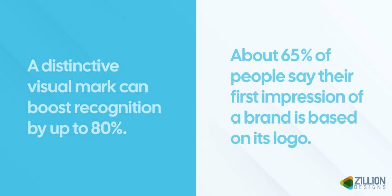
An appealing combination or gradient does have a strong impact in any type of e-commerce logo. And up-and-coming ecommerce brands can leverage that to raise brand awareness and generate higher sales. Here’s why. A study conducted by Touro Law School showed that color can boost recognition for businesses by 80 percent. But is that the only way they influence consumer perception? Not exactly. Let’s dive into how they work in ecommerce logo designs!
Key Takeaways
Ecommerce logo colors play on emotions and create urgency to act
An attractive contrast or gradient builds a positive perception
The right logo colors in ecommerce positions brand as expert
Memorable combinations earn customer loyalty
Bright colors or vivid gradients hold attention for a long time
Unique choices bring recognition in first 5 seconds
Colorful ecommerce logos increase social visibility
What Colors Work for Ecommerce Logos?
Solid colors and gradient colors both have their own visual impact in e-commerce logos. The colors have certain emotional associations and play a key role in drawing a response from the audience. And you may find this a bit surprising here but the right color combination or hues in a logo can get potential customers to actually buy. Just think of the red bullseye of Target.
While it’s an established brand, the vivid color has a strong emotional association for a lot of people and their families. It’s the same with Walmart’s blue and yellow. You can look at the logo and think of something you may want to purchase. While this works for recognized brands, it can be slightly different for startups and small businesses in the ecommerce industry. Do colors convince people to buy or think of your business later?
Simply put, yes. Anything like a bright red, orange to a yellow hue can bring out emotions like excitement, urgency or joy. And for an e-commerce brand, this can be ideal for driving recognition and sales too.
Gradients are also an option and have been in use for a long time. The slight color differences are visually appealing and make the design pop out more among others. Gradients will arouse an emotion and trigger trust to be activated, and even control the decision to buy without you noticing it.
How Colors in Ecommerce Logos Influence People
Let’s take a look at some of the most important ways that you can leverage colors to convert customers with a professionally designed logo.
1. Create Urgency for Action
A bright red, blue or yellow paired with a neutral or a lighter hue could influence viewers to check out the e-commerce platform and make a purchase as well. Colors create an urgency among potential customers as their psychological associations are quite strong. Even if someone’s intent is not to buy, they may consider taking action based on how a combination of hues makes them feel.
Gradients also work well in ecommerce logos. The Lazada logo (leading ecommerce platform in the ASEAN region) consists of an isometric 3D box with a gradient alternating between warm orange-yellow and warm hot pink.
The orange shows enthusiasm and is ideal for bringing out feelings of joy and excitement. Pink is more lighthearted, welcoming, and more contemporary, with a young and diverse offering. The warm-cool gradient forms dynamic motion and urgency, which causes impulse and action.
So, if you are even confused between static or dynamic ecommerce logo designs, consider how it will appear in solid colors and gradients.
Image Source: 1000logos.net
2. Build a Modern, Tech-Forward Perception
What is the first word that comes to mind when you see the Onboard logo? It is, I guess, something such as modern, fresh or tech-savvy, right?
Research on color theory has found that a few colors, like blue, black or soft, pastel hues are strongly aligned with innovation and technology. For ecommerce businesses, consumers must feel that they are shopping with a brand that is tech-savvy and focuses on security. Just consider this logo for Onboard Sportswear, where the neon yellow paired with the neutral shows both innovation and creativity.
The logo appears quite modern, and you instantly can guess that the brand must have an established presence online.
Image Source: onboardsportswear.com
3. Show Expertise and Niche
Just like various colors bring distinct feelings, they can also position an ecommerce brand according to its expertise and niche. Blue for instance, is associated with a feeling of trustworthiness and calmness. And it makes businesses come across as dependable and secure. Hues or shades of blue in a logo could show expertise in household products or clothes.
Any platform that is looking to sell multiple products at one place could go with the color in their ecommerce logos. Milkrun, owned by Woolworth’s Group has a striking blue in their logo that stands for the dependability the company is known for. When working on a design, it’s important to think of all the dos and dont’s of ecommerce brand designs. Choose a color carefully that can represent the niche closely and showcase relevant expertise well.
Image Source: milkrun.com
4. Increase Visual Interest and Attention Span
According to one research done by Microsoft, the human capacity to focus has reduced to a miserable 8 seconds, which is less than that of a goldfish. And this is getting shorter with time. What then are the ways to compete for those valuable few seconds by ecommerce brands? Unique colors.
Lime green is one such choice that reminds one of nature, vitality and organic energy. It can get people interested almost immediately and hold their attention for some time as well. In ecommerce logos, this means you get the memorability you want to attract more customers and increase sales.
Kraken Kratom has gone with an attractive green hue that represents their organic botanical products. The color palette highlights freshness, growth and potency, further supporting the plant-based sources of kratom. These stimulating greens also convey activation and health.
Image Source: krakenkratom.com
5. Earn Long-term Loyalty and Trust
It is important to go with colors that combine or contrast well, maintain their appearance in print and digital, and show what you have to offer. But these are just the aesthetics; colors also need to have a deep emotional impact. Your choice in colors for an ecommerce logo also needs to draw in loyalty and consumer trust.
Think long-term goals here. To keep your business going and make your brand into a lasting one, it is key to have visual assets that have high recognition value. The right colors can make people think of your business and recall it when they are looking for certain products.
Consider this as an example. If you are looking for food items and try to think of options, a specific color combination (Think McDonald’s Yellow!) could just pop up in your mind. Fishwife does it so well with their quirky illustration and the harmonious colors set against a bright red that may get people in the mood for seafood.
Image Source: eatfishwife.com
6. Improve Instant Recognition
For e-commerce businesses, competing in a competitive market, it all depends on being memorable. Consider the number of online retailers that deal with phone cases, jewelry, or home furnishings. With a distinctive hue or gradient, you can get people to recognize your platform in the first three to four seconds.
There is a psychological term that defines this as the Von Restorff Effect. It simply means that we mostly remember unique elements that stand out from others. I’m going to add one of our logos here that stayed in my memory after I came across it first. While the red and blue may be common, the gradient as an accent is an unusual choice.
Hues of gold and orange make you think of something bright right away. And most people will be able to recognize the combination when they come across it even if they have not seen the logo too frequently.
Image Source: ZillionDesigns.com
7. Increase Social Shares and Credibility
On social media platforms like Instagram or TikTok, your ecommerce logo can make or break your brand. Yes, the product and content are important. It can get eyeballs from potential customers, but what will make them stay and convert? Your brand’s visual appearance, which includes the logo as your profile display, along with banners and posts.
Think of it this way. Relevant colors in an icon improve credibility, and once you can establish that, it is easier to earn the trust of potential customers. If they think your brand or product is worth a try, your audience, especially Gen Z, will likely recommend your business to their friends or family. Your social media profile could be shared by micro-influencers or recognized personalities, too.
All these factors tie back to the perception you create. And colors take center stage there. The black and white color palette of Dossier may appear simple but it works wonders for the brand’s credibility on social media. With a following of more than 700k, the e-commerce business immediately gets quite a lot of social shares and leads from the platform.
Image Source: Edible Arrangements
Edible® (@ediblearrangements) • Instagram photos and videos
8. Establish Authenticity for Gen Z
According to statistics from BigCommerce, Millennials and Gen Z constitute a majority of online buyers, and their tastes are influencing the ecommerce design trends. Today, authenticity in branding matters more than anything, and logo colors can help establish that.
Be it a solid color, monochromatic, or gradient, the choice can influence your audience to become a customer or move away. Mostly, a younger demographic is attracted towards colors that build on an aesthetic (Think Pinterest moodboards!). This tells them what your business is all about and its core values are.
Take Olipop’s distinct dark green wordmark as an example here. The rebranding in 2024 was a success and brought in millions in sales. They realized what their customers were looking for and adapted to show them their most authentic variation. Olipop’s logo, packaging and marketing campaigns all make an impact with Gen Z and have led to the viral popularity of the brand.
Image Source: Drinkolipop.com
9. Differentiates USP from Competitors
Consider that you are opening an online business with plant-based supplements. An immediate Google search reveals dozens of competitors, with most having logos with common colors like green, earthy brows, or neutrals. You can position your e-commerce store as a likely option with a different spin. Go with a color scheme that has pastel greens or butter yellow both of which hint at sustainability.
It would show your USP while also maintaining the creative aspect. Potential customers might be likely to remember a distinctly colored design in a sea of black and white minimalist logos. Now, you can be different but don’t go completely off the mark. Your color choice to have a red logo, for instance, needs to align with the brand’s purpose and mission. If you go for something that’s not relevant, it could confuse people as to what you have to offer.
One ecommerce business that is easy to differentiate for its unique color choice is Bittermilk. They specialize in cocktail mixers that are handcrafted, and their logo pays tribute to their brand story as well as origins. The color choice aligns with the slightly vintage appearance of the logo, but is quite distinctive in its niche.
Image Source: shop.bittermilk.com
10. Integrate with Immersive Brand Experiences
I may not be the only one here who loves pop-up marketing! If the lines outside Rhode’s pop-ups are anything to go by, there are many people who appreciate the immersive experiences that brands are creating. And logo colors are a huge part of those. When a brand invests in pop-up marketing, they have to stay true to its branding as well. So the aesthetic has to follow the style guide and incorporate the colors that remind people of their purpose.
Successful campaigns have been run by Rhode, Glossier, Dior, and Nike, to name a few. And one of the reasons that people remember these is the immersive brand experience. Take the example of Glossier here, the beauty brand went all in on its branding as well. The brand has made millennial pink quite popular since its launch. It’s one of the primary colors for their logo and closely represents the feminine, playful traits associated with the brand.
For its pop-ups, Glossier integrates the colors to make the experience holistic for its audience. It not only skyrockets the EMV across socials but also generates higher brand awareness and ultimately sales.
Image Source: glossier.com
Image Source: glossier.com
Gradients or Solid Colors: What Works for You?
Now, it can be a bit tricky to decide on the colors for your website or estore. Mostly, you might find yourself confused between gradients or solid combinations. This is where you need to do extensive analysis of similar businesses in the industry. Look closely at the icons and understand the why behind their choices. You’ll find that many businesses go with solid colors that scale well.
This is mainly because bright reds, yellows and blues easy to identify as app icons and help create a minimalist appearance too. You can also consider gradients but think of how they can represent your product first. Hues of orange or pink can look quite similar to social app icons and you may end up confusing your audience. Lighter gradients of purple or green could be a good choice if you are selling organic food items or apparel.
In the end, the choice comes to what your audience expects from you and what works in the niche. Being distinctive or unique is great but you need to consider how the audience will perceive your brand and whether it will last for a long time.
Bottom Line
If you are looking to launch your e-commerce brand, begin by researching the color combinations that appeal to your values and target audience. Experiment with various solid colors or gradient styles to figure out which one looks the best on different devices. It’s always a good idea to collaborate with a professional graphic designer and get an e-commerce logo that is timeless and grabs attention at first glance.
The post How Colors in Ecommerce Logos Influence Consumers appeared first on ZD Blog.

