Amperspam 2.0 by Allen & Gerritsen
The decorations are packed away, we’re halfway through the first month of the year, and normal life has resumed. Here’s what the type world’s been releasing in the meantime.
Right now, no one’s quite sure if we should still be saying ‘Happy New Year’ or not. But one thing’s for certain, January’s releases have properly impressed me. There’s a refreshing lack of faff here; these are typefaces that know exactly what job they’re meant to do, and they get on with it. No apologies, no hedging. Just confident, well-considered design that actually solves problems.
Many of these fonts engage with history in meaningful ways. We’ve got a 126-year-old script that’s been lovingly resurrected from archival specimens; a serif based on the typography of an 1830 abolitionist manifesto… and these aren’t just aesthetic nods to the past. They’re active conversations with it; preserving something important whilst making it relevant for today.
There’s also a lot of sheer practicality on show. A corporate sans that somehow manages to feel warm and human. A comprehensive serif system spanning 224 styles (yes, really). A display face inspired by ocean waves that actually captures that sense of organic movement. These typefaces work hard, but they’ve all got personality in spades.
What ties all this together is a refusal to choose between functionality and character. Every font here proves you can have both: that being useful doesn’t mean being boring, and having a distinctive voice doesn’t mean sacrificing versatility. Which, frankly, is exactly what good type design should be about.
1. GT Canon by Grilli Type
GT Canon represents Grilli Type’s answer to a deceptively simple question: what should a contemporary serif be? Rather than reaching for stylistic reinvention or nostalgic reference points, the foundry has delivered a comprehensive system built around pragmatic functionality and modern requirements.
The family’s scope is genuinely impressive: three optical sizes, seven weights, five widths, italics and a monospaced companion, totalling 224 styles. This isn’t expansion for its own sake, but a deliberate architecture designed to handle whatever contemporary design demands. Together with GT Standard, its sans serif sibling, GT Canon forms a complete typographic ecosystem.
Most of all, what distinguishes GT Canon is its refusal to achieve versatility through blandness. The design maintains personality across its extensive range—movement and liveliness are embedded in the letterforms themselves, creating what Grilli Type describes as being “free of nostalgic connotations”. This is a serif firmly rooted in the present tense, addressing what digital contexts require of typefaces today rather than what they needed yesterday.
The accompanying minisite frames the release through an alphabet of aesthetic terms, functioning as both specimen and theoretical exploration. It’s an approach that mirrors the typeface itself: systematic without being sterile, functional without compromising character. GT Canon succeeds as both a workhorse and a voice, demonstrating that contemporary type systems can serve multiple roles whilst maintaining a coherent identity throughout.
2. WTF Forma by W Type Foundry
Magdalena Arasanz and the team at W Type Foundry set themselves a challenging brief: create a typeface for big corporations that actually feels human. WTF Forma is their solution: a sans serif designed specifically for the complex communication needs of large organisations, yet one that avoids emotional sterility.
Drawing inspiration from DIN’s clarity and structure, WTF Forma balances professional maturity with genuine approachability. It’s designed to work across the full spectrum of comms: long-form copy, short copy, lists, titles, presentations, and everything in between. The foundry describes it as a “true solution”, and that utilitarian framing proves accurate. This is a typeface built to handle real problems.
The family’s 50 styles, including italics, span from Compressed through Condensed to Regular and Expanded to Wide. This range isn’t mere expansion but considered variation, each width serving specific spatial and hierarchical needs. The result is a system that remains easy to navigate despite its breadth, offering what W Type Foundry calls “endless possibilities” without overwhelming complexity.
What makes WTF Forma compelling is its recognition that “legible and formal” need not mean cold or impersonal. The typeface maintains warmth and human character whilst delivering the reliability multinational brands require. In an era where corporate communication increasingly demands both authority and approachability, WTF Forma demonstrates how contemporary type design can serve both needs without compromise. It’s professional typography that doesn’t feel like it’s apologising for having a personality.
3. Cassis by Nina Stössinger
Cassis marks a big moment for both its designer and Frere-Jones Type: Nina Stössinger’s first solo release with the foundry. The typeface itself embodies what that milestone represents—confidence in one’s own voice, willingness to embrace imperfection, and the understanding that personality often matters more than polish.
Begun in 2014, Cassis’s development traces Stössinger’s journey from Europe to New York City, and this transAtlantic character permeates the design. Drawing from early- through mid-century lettering and sign painting traditions in Switzerland, Belgium, and the United States, Cassis achieves something rare: a genuine synthesis of European restraint and American energy without feeling derivative of either.
The typeface is built on geometric logic and historical precedent, yet refuses to be constrained by either. Swelling curves, reaching terminals, and a deliberately precarious balance of stroke weights infuse its geometric structure with what the foundry calls a “compelling density and flavour”. At larger sizes, Cassis projects affable confidence; it’s comfortable in its own skin, unafraid of its quirks.
Available in seven weights from Thin through Black, with support for over 200 languages covering major Latin-alphabet regions and Vietnam, Cassis offers both technical completeness and expressive character. It succeeds because it prioritises authentic voice over systematic perfection, demonstrating that contemporary sans serif design can celebrate rather than eliminate individual character. For branding, identity, and titling work that require genuine personality, Cassis delivers without pretence or apology.
4. Pennline Script by The Northern Block
Some typeface revivals feel like academic exercises. Pennline Script is not one of them. Tasos Varipatis’s meticulous resurrection of Bulletin—a script first cast in 1899 by Philadelphia’s Keystone Type Foundry—demonstrates how historical preservation and contemporary utility can coexist when approached with respect and imagination.
Varipatis originally discovered Bulletin via a Facebook post showing relief prints of 36-point metal type from the Nickel Plate Press archives. What followed was six months of rigorous work translating extremely limited source material into a fully functional digital typeface. The scarcity of surviving specimens meant Varipatis had to reimagine spacing, kerning and entire character ranges whilst maintaining fidelity to Bulletin’s expressive, brush-inspired character.
The result balances historical authenticity with modern functionality. Pennline Script preserves the lively irregularity of the original design—the pooling of ink, the organic flow, the human imperfections—whilst delivering over 1,050 characters supporting 304 Latin-based languages. Extensive OpenType features include contextual alternates, ligatures, localised forms and eight stylistic sets, enabling both faithful period recreation and contemporary customisation.
What truly elevates Pennline Script, though, is its emotional resonance. This semi-connected script pulses with early Americana, carrying the energy of Philadelphia’s golden age of printing and publishing. Varipatis hasn’t simply digitised historical letterforms; he’s captured the spirit of an era when typography was both industrial craft and expressive art. For headlines, packaging, and editorial applications that require warmth, nostalgia, and genuine character, Pennline Script offers something genuinely rare: a 126-year-old typeface that feels entirely alive.
5. We Appeal by WeType
Some typefaces carry weight beyond their visual characteristics. We Appeal, from the newly launched WeType foundry, is explicitly designed as an act of historical preservation and cultural reclamation. Based on characters from David Walker’s “Appeal in Four Articles to the Coloured Citizens of the World”—an 1830 abolitionist manifesto—this revival serif transforms a pivotal document in American history into contemporary typographic form.
The original publication was remarkable for its time: a 6×9-inch booklet, 87 pages, set in 7-point type designed to be portable and distributable. The typesetting itself was intentionally expressive, using spacing and punctuation to excite and incite readers; a genuine feat considering its audience and era. It was likely printed in the same Boston shop as Freedom’s Journal, the first Black newspaper in the United States, where Walker was a writer.
WeType’s revival honours this charged historical context whilst creating a functional text-weight serif for modern applications. The foundry positions itself at “the intersection of Western and Eastern cultural heritage”, committed to amplifying typographic voices too often overlooked. We Appeal embodies this mission directly, demonstrating how type design can actively engage with cultural preservation and historical recognition.
Practically speaking, We Appeal serves as a capable text serif suitable for contemporary use. It’s a typeface that invites contemplation of typography’s relationship to power, voice and representation. For designers and institutions working with themes of social justice, historical documentation or cultural preservation, We Appeal offers more than aesthetic choice; it provides typographic voice with genuine historical resonance and purpose.
6. Bárur by MNDT Type
Bárur announces itself through movement. Named after the Old Norse word for “waves”, this display serif from Sarah Marder’s Mindt Studio embraces rhythm and flow as fundamental principles rather than decorative flourishes. Originally developed from a bespoke wordmark for a wellness brand, the typeface has evolved into a fully realised family defined by organic character and fluid grace.
The design balances expressiveness with clarity through rounded, gently sculpted serifs that guide the eye fluidly across uppercase letterforms. Whilst rooted in historical serif traditions, Bárur avoids ornamentation in favour of a cleaner, more geometric structure. This restraint prevents the design from feeling nostalgic or precious; instead, it projects contemporary confidence with genuine tactile warmth.
Select letters—including C, G, O, and S—feature optional serif-less alternates, allowing designers to modulate texture and rhythm within compositions. Combined with 39 ligatures, numerals, punctuation and multilingual Latin support, these features provide considerable flexibility despite the typeface’s focused display intent. Currently available in Light and Regular weights, with Bold in development, Bárur is released as an early-access typeface that will continue evolving through free updates.
Though legible at smaller sizes, Bárur’s strengths emerge most powerfully in large-scale applications: logos, branding systems, packaging, editorial headlines and posters. As Mindt Studio’s first type release, it sets an intentional tone: expressive, tactile, unmistakably fluid. This is display typography that feels alive, carrying the pulse of natural rhythms into contemporary design contexts.
7. Setar by Dogray Type Foundry
Designed by Sahar for the newly launched Dogray Type Foundry, this Arabic Naskh typeface unites Brutalist utility with calligraphic spirit; a brief the designer describes as asking for “a perfectly logical algorithm that chooses to output confetti, but make it fonts.”
The family matches its Latin companion, Sets Grotesk, in breadth: nine weights across four optical sizes. Whilst smaller text sizes recede appropriately into background readability, the large optical size undergoes a complete personality transformation. Character skeletons widen, connections shorten, counters expand. The result is typography designed to capture attention and stand out, with long teeth, larger dots, and wider proportions that create a distinctive presence.
What’s impressive is Setar’s technical sophistication in handling the potential pitfalls of Arabic type. Larger teeth often create problematic character clashes, but Setar contains comprehensive contextual alternates ensuring these collisions don’t occur (unless deliberately desired). For final forms with bassinets—seen, sad, noon characters—the typeface includes versions with elongated tails, addressing practical justification needs whilst enabling dramatic stylistic options.
Supporting 20 languages including Standard Arabic, Persian, Urdu, and various regional Arabic variants, Setar demonstrates how simplified Naskh designs can maintain calligraphic spirit whilst embracing Brutalist functionality. It’s a typeface that refuses the typical binary choice between traditional elegance and contemporary utility, instead insisting both qualities can coexist productively. As one half of Dogray Type’s founding release—one designer from Arabic tradition, another from Latin—Setar exemplifies how cross-cultural typographic dialogue can yield genuinely innovative results.
8. Former Pro by Typofonderie
Designed by Raphaël Ronot and refined over five years with Typofonderie, this neo-grotesque draws inspiration from Gestalt theory and the qualities of early industrial type, creating an aesthetically pleasing typeface that makes text genuinely easy to understand.
Former Pro denies the rational aesthetic of modern sans serifs whilst embracing a certain frugality. The design stands out through carefully selected details rather than overt originality, creating a workhorse typeface that blends mechanical rationalism with noticeable human touch. Significantly narrower than contemporary neo-grotesques influenced by the 1950s International style, it sits between “perfectly regular” and “really condensed”; qualities of an economic typeface.
Combined with relatively loose spacing, this gives text a texture reminiscent of early IBM Selectric typewriter faces, lending authentic character to contemporary design. The contrast between thin and thick strokes goes beyond mere optical compensation to become an intentional characteristic, whilst slightly flared, V-shaped curve endings evoke the analogue warmth and imperfection of the earliest metal types.
The italics deserve particular mention: they haven’t undergone excessive normalisation in either angle or weight contrast, embodying what Ronot calls a “Frutigerian” philosophy. The italics are noticeable, fulfilling their functional emphasis purpose rather than simply echoing the Roman as slanted text. With six weights from Regular to Black, including a slightly darker Book cut for extended reading, Former Pro includes small caps, alternates, ligatures, and various sets of numerals and fractions.
As typography trends toward simpler, larger, straighter forms, Former Pro stands as slightly rebellious, celebrating the quirks, charm, and authenticity of early sans serifs whilst remaining entirely contemporary.
9. Se Macro by Gallery Type
Se Macro announces Gallery Type’s arrival with considerable ambition. Founded in late 2025 by Berlin-based German type designer Daniel Perraudin, the foundry positions itself deliberately toward design and brand agencies, combining typographic excellence with a deep understanding of branding processes; a combination Perraudin argues remains surprisingly rare in type design.
The font itself is described as blending functional versatility for global use with subtle French elegance. Spanning 10 weights and 3 widths—60 styles including italics—the family delivers architectural clarity with expressive warmth. Available from feather-light Hairline to bold, powerful Ultra, Se Macro balances clarity and elegance whilst capturing minimalist design spirit between modernism and postmodernism.
The design combines a monolinear structure with a high-contrast model, visible particularly in junctions where straight and round shapes meet. Dynamic contrast distribution in letters like “s”, combined with gracefully sculpted italics, adds further distinction. This isn’t merely functional typography; it’s typography with identity built in.
Designed specifically for the visual language of contemporary brands, fashion labels, cultural platforms and design-driven products, Se Macro offers structural integrity and stylistic impact simultaneously. It’s part of the comprehensive Se Collection, which will be accompanied by Se Micro, Se Mono, Se Soft, and Se Rounded—all set for release through 2026-2027. As a foundry launch and first major release, Se Macro sets confident expectations for what’s to come.
10. Weymann Serif by Typemates
Firm, spacious, and clear, Weymann Serif represents a meditation on the act of writing itself. Designed by Marc Weymann for Typemates, this is a typeface for text meant to last—to be read not just once, but well. Drawing breath from the hand whilst speaking with the composure of type, Weymann Serif balances typographic discipline with something more fundamental: respect for the reading experience.
Contemporary and classical elements coexist naturally. Bracketed serifs nod toward manuscript traditions whilst an open structure brings editorial grace and what Typemates describes as “stonecut clarity”. Wide letterforms and open counters provide lucidity in both headings and footnotes, whilst its rational precision never tips into coldness.
Weymann Serif’s character emerges most clearly in larger sizes, where subtle details (the dance of curve and serif, tension between sharp and round) come fully to life. Yet it remains comfortable at small sizes, demonstrating the kind of genuine versatility that comes from thoughtful design rather than digital scaling. The strokes are gentle yet deliberate, shapes composed rather than cold.
Expressive without extravagance, Weymann Serif performs without performance; engaging eye and page quietly, unmistakably. For books, journals, catalogues, essays, and editorial work, it offers the kind of reliability that becomes invisible precisely because it works so well.
11. Amperspam 2.0 by Allen & Gerritsen
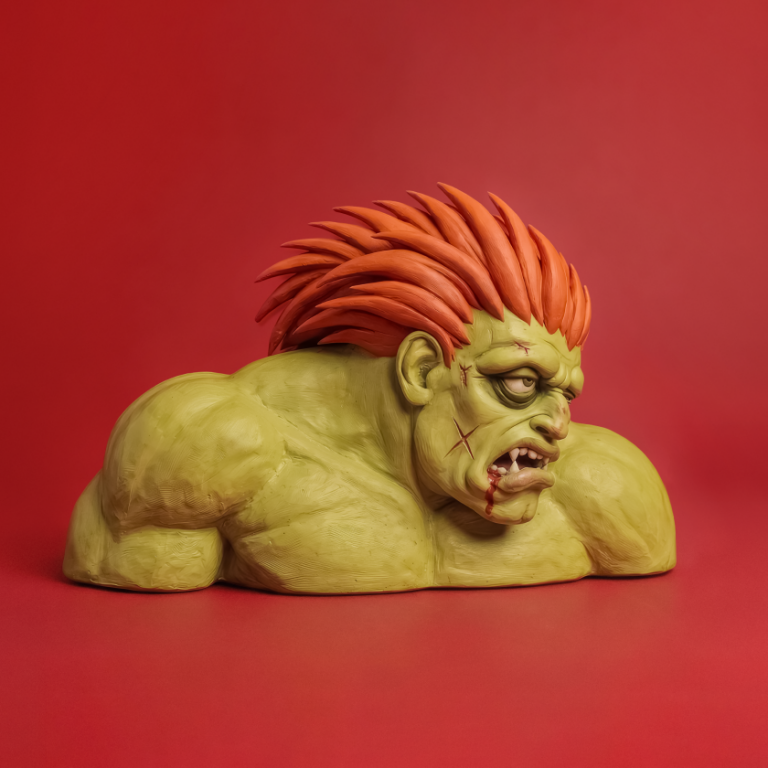
Some typefaces exist purely for aesthetic pleasure. Amperspam 2.0 exists to fight food scarcity, and that genuine purpose elevates it beyond clever novelty. Building on last year’s successful holiday fundraiser, Boston and Philadelphia agency Allen & Gerritsen has returned with an expanded release: three new fonts joining the original, plus a full merchandise collection, all supporting local food banks.
The concept remains delightfully straightforward: fonts handcrafted from spam (the tinned meat variety, not the email kind). Last year’s Amperspam raised over $1,000 for Greater Boston Food Bank and Philabundance. This year’s release—Amperspam Grilled Bold, Amperspam Nibbled Neue, and Amperspam Out The Can, alongside the original—aims to do significantly more. Chris Fernandez, creative SVP at A&G, describes it as a passion project demonstrating the difference creativity can make when put to work solving community problems.
The meat-inspired merchandise deserves mention: T-shirts declaring “This Is My Meat Shirt”, socks, hats, and sticker packs, all available through donations. Yes, it’s silly. Yes, it’s memorable. And yes, it’s effective, which ultimately matters considerably more than typographic purity when the goal is raising funds and awareness for food insecurity.
12. Stróc by Designomatt
Matthew Gallagher’s Designomatt foundry launches with a distinctly historical approach. Stróc represents the first of several families based on centuries-old sign painters’ manuals and samples, offering a contemporary update on early 20th-century commercial lettering traditions whilst maintaining a clear connection to its source material.
Created using only a few key strokes in Illustrator—a constraint that echoes the sign painter’s limited gestural vocabulary—Stróc is an updated modern sans serif that’s bold, clean, and refreshingly straightforward. The initial release contains a few weights and styles with alternate glyphs and discretionary ligatures, providing flexibility from decorative applications through to body copy.
What’s compelling about Stróc is its unpretentious functionality. This is a simple sans serif designed to convey intent clearly, whether that’s in headlines, signage, packaging, or running text. The connection to sign painting tradition gives it character without affectation: you can feel the brush strokes and manual craft informing the digital forms without the design becoming nostalgic or self-conscious about its heritage.
Gallagher notes that many more families are in the production pipeline, suggesting that Stróc is merely the opening chapter in a larger project to preserve and update commercial lettering traditions. For designers seeking typefaces with genuine historical grounding that still function in contemporary contexts, Stróc offers an appealing balance: enough character to feel distinctive, enough restraint to work hard across varied applications. It’s sign painting for the digital age, honouring its sources whilst serving modern needs.
