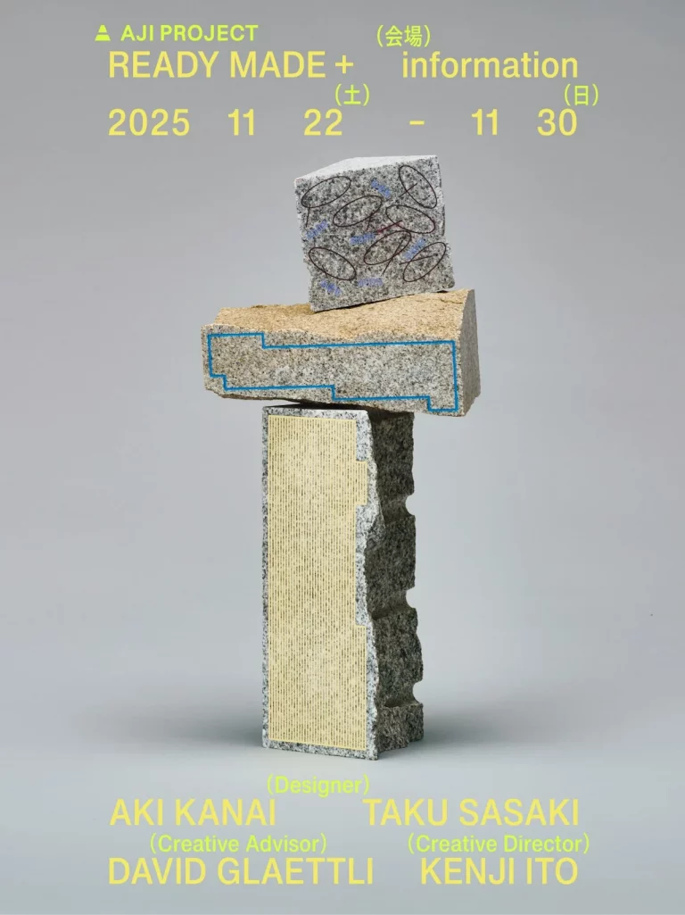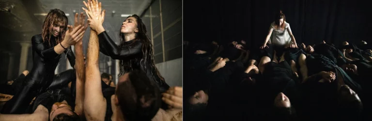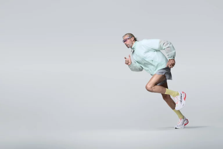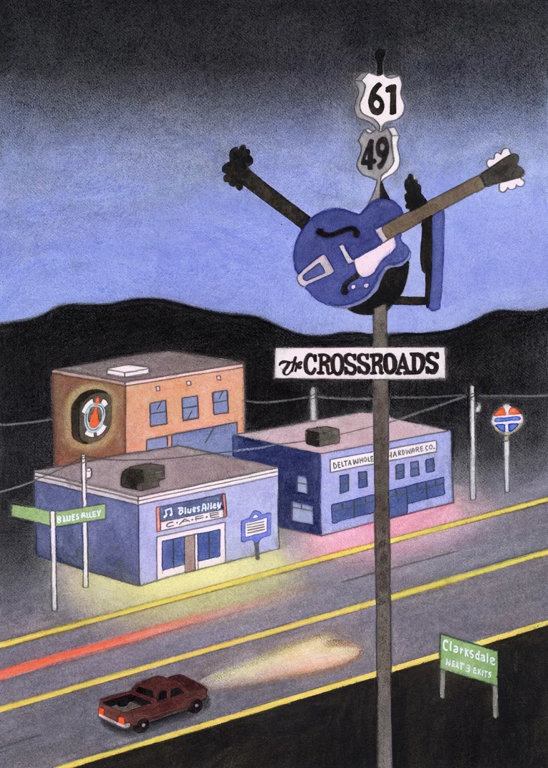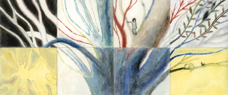
IconPapers © Mathilda Mutant
The Mainz designer on packaging obsession, a pseudonym that got out of hand, chocolate shaped like breasts, and why she’s best in the in-between.
Ask most designers where they go looking for ideas, and you’ll hear about galleries, sketchbooks, and a long walk. Ask Mathilda Mutant, and she’ll point you towards the frozen aisle.
She once spent an afternoon in a Whole Foods in Williamsburg photographing every shelf in the place, and she’s never really stopped. These days, the pilgrimage sites have moved on a bit. “My current favourite grocery stores in New York are Happier Grocery on Canal Street and Pop Up Grocer in West Village,” she says. “Both feel like museums for designers.”
It’s a good line and a fair description of how she works. The Mainz-based designer has spent 14 years running her own studio, and for the last two she’s focused on one thing: corporate design with a particular love of packaging and print. Boxes, bottles, paper stock, Pantone hues, print finishing. The stuff you can pick up, turn over, and hey… sniff.
So what makes a really good packet worth photographing? “I think what fascinates me is seeing design that breaks away from the norm – design that goes beyond what people expect,” she says. “In Germany, we’re unfortunately still not as bold in many ways, or we’re simply slower to embrace new ideas. And consumers are still not being challenged enough.”
Baby Got Business © Mathilda Mutant
Which is where the suitcase comes in. Because she brings the good stuff home. “Bringing packaging back from my travels and showing clients what’s actually possible has become a huge source of inspiration for my work.” Cue a designer arriving at a meeting with a carrier bag of foreign shampoo, making an argument no mood board ever could.
Not actually called Mathilda Mutant
Here’s the thing she’ll happily admit: there is no Mathilda Mutant. “At school, everyone called me ‘Mati’,” she explains. “At some point, people started assuming that ‘Mati’ was short for Mathilda. That’s how Mathilda came to be.” The rest arrived later, during her studies, when she had to give a presentation on Mutants in Design and Art. The word stuck, the two halves fused, and social media did the rest.
“Over time, people began to think it was actually my real name: Mathilda Mutant. Because that’s how I introduced myself on social media.” She’s fine with it. Better than fine, really. The only slight casualty has been the pronunciation. “A lot of people also assumed I was French and pronounced it like, ‘Mathilda Müüttton.’ Haha. Oui, c’est tout!”
Hees Wein © Mathilda Mutant
Rosevita © Mathilda Mutant
Gut Wine © Mathilda Mutant
The bit in the middle
Ask her whether she’s a starter or a finisher, and she’ll shake her head at both. She’s best, she reckons, in the in-between. “Before every new project, I’m terrified of the blank page,” she says. “I also tend to work at the last minute. ‘No pressure, no diamonds.’ Haha.”
But once the foundation is down and the structure holds, something switches. “Once the overall bones are in place, I get to focus on all the little details that ultimately make the design. That’s my favourite part. The sketch is done, and now it’s all about refining it, whether it’s choosing the final colour palette, perfecting the typography, selecting the right paper, or obsessing over all those tiny details. I love it.”
She reaches for Eames on this, and who wouldn’t: “The details are not the details. They make the design.”
“This is so you”
Mathilda works as both an illustrator and a graphic designer, and merges the two so there’s a bit of Frau Mutant in everything. The odd part is that she can’t see it herself. “I never really recognise my own signature style,” she says. “Over the years, people have often said, ‘This is so you’. And I always found myself wondering, ‘What does that even mean?'”
Kultursommer © Mathilda Mutant
Kultursommer © Mathilda Mutant
Jokolade © Mathilda Mutant
Walter © Mathilda Mutant
The best clue she’s been given is colour. “One thing I’ve been hearing a lot lately is that it’s the colours. Maybe it’s the way I use colour and combine unexpected palettes. But still, I can’t tell.”
There’s a lovely contradiction underneath all this. Her work is bunt und flächig – bold colour, flat shapes, volume up. Her actual taste goes the other way entirely. “When it comes to clothes, I’m actually quite restrained and minimalist,” she admits. “If you described my personal style and translated it into my design work, you would probably think I only create in black and white – and boring. Haha. My work-self, however, is much more of a maximalist.”
Her explanation for the gap is my favourite thing she said in this whole interview: “Somewhere inside me, there’s a grown-up Pippi Longstocking who is trapped and needs to let loose with a paint pot in my work. Maybe that’s the Mutant in me. The playful part that comes out through my designs.”
A little pink never hurt anyone
Given a billboard and the whole world to put it on, she’d write: “a little pink never hurt anyone”. This is not a whim, you understand. It’s data, of a sort, gathered over years of photoshoots with her photographer, Elisa Biscotti.
Walter © Mathilda Mutant
Studio Biscotti © Mathilda Mutant
Studio Biscotti © Mathilda Mutant
“Elisa and I noticed during every shoot that, no matter what the project was, every piece looked good on pink,” she says. “It’s a go-to feel-good colour. It creates a sense of harmony and instantly lifts your mood. And when you think of spring and cherry trees turning pink, who could possibly feel bad?”
The dream brief
She still names Manti Manti, the children’s eyewear brand, among her bravest works – an identity built with 12 Pantones, a few Aperols and an entire underwater world. But she’s careful to say it wasn’t a one-off. “Many more amazing clients have joined over the years, bringing the same courage and openness to new ideas that Manti Manti did.”
Case in point: the ICON PAPERS project for paper company Igepa, which came with a brief most designers would frame and hang on the wall. “Here is the paper. This is the event. We want to show what can be done with our papers. Go wild.”
“A dream brief,” she says. “When you have all doors open, like in this case, and you’re free to play and explore, it’s a jackpot for any designer. That’s when the fear of the blank page disappears, because you can approach a project with a completely open mind. You can experiment, combine ideas, and enter a creative flow without being limited by overly strict briefs.”
Manti Manti © Mathilda Mutant
Manti Manti © Mathilda Mutant
IconPapers © Mathilda Mutant
IconPapers © Mathilda Mutant
How BOOB was born
Then there’s the project that has no business working as well as it does. For Walter Confiserie, in partnership with Discovering Hands – a cause she’d give her last €1,000 to – Mathilda made chocolates shaped like breasts, to raise awareness of breast cancer, with a typeface called BOOB made of two letters.
It arrived, as these things do, in the middle of the night. “The idea for the BOOB chocolates actually came to me overnight,” she says. “I thought, how funny would it be to have little round chocolates shaped like breasts? And then I thought: it would be even better if they could be used to raise awareness for something important.”
BOOB © Mathilda Mutant
So she took it to both parties herself and got them in the same room. “They were both instantly excited about it. And that’s how BOOB was born. Sometimes humour is the best way to make people pay attention to serious issues.”
The notebook
She keeps naming her own side projects as her bravest work, which tells you something about where the good stuff happens.
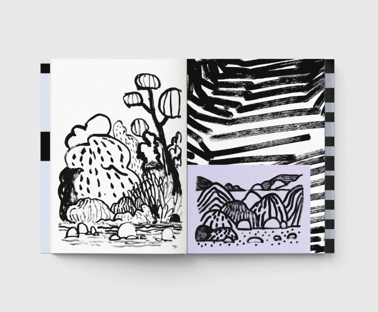
“My own little projects usually start with funny little ideas that somehow cross my path,” she says. “I write them down in my notes and, years later, turn them into personal projects. There are always those moments when I can simply create whatever feels right to me, without having to sell an idea or design to a third party. Using colours that feel right, exploring unusual shapes and colour combinations, and getting into a playful creative process.”
Own Projects © Mathilda Mutant
Own Projects © Mathilda Mutant
And then the warning, which is really for all of us: “It’s something we sometimes unlearn because, in the working world, everything is often overthought and strategically analysed. We sometimes forget that little playish moments can lead to great ideas.”
Nobody believes she’s introverted. The colours are too loud, the internet presence too cheerful. But she is, and running a one-woman studio has turned out to be the workaround.
“I think one of the beautiful things about being self-employed is creating a bubble of clients around you where you feel comfortable,” she says. “When I feel comfortable, I become extroverted. You can often sense during the first conversations whether it’s a good match. Many of my clients have stayed with me for years. And that’s just so nice.”
Just our type (except she isn’t)
One correction she wanted on the record. She draws letters; she does not design typefaces, and she’d like the distinction respected.
“I wouldn’t consider myself a type designer at all. I just draw a few letters from time to time. I have the greatest respect for type designers. They are truly the heroes of our industry. A good typeface is key to good design.”
That instinct – towards the people who make things by hand – shapes how she reads the AI question too, not as a fight, but as a pendulum.
Own Projects © Mathilda Mutant
Einfach © Mathilda Mutant
Own Projects © Mathilda Mutant
“Whenever one side becomes very strong, like the digital world and artificial intelligence, a desire for the opposite naturally emerges,” she says. “A longing for craftsmanship and the tactile experience.”
She’s watching it turn up everywhere she looks. Haute couture, and Mathieu Blazy at Chanel, where the focus is very much on craftsmanship. Music, where “the longing for live concerts feels stronger than ever this year.” Books: “It feels like everyone in my bubble is reading much more again instead of watching Netflix. And when we do watch films, we seem to be returning to cinemas much more often again.”
So, what’s next?
If time and money were no object, she’d go and study fine art. That’s still the dream, more or less – “being able to create freely and simply create for the joy of creativity itself would be a dream. I still have so many ideas in my notebook”.
In the meantime, there’s the studio, now 14 years old, still one woman, still busy. Focusing on packaging and print two years ago was, she says, the best decision she’s made. “Haptics, paper, print finishing, Pantone colours, and seeing your work in supermarkets. This is happiness × 3000! Haha.” Which brings us back to where we started: the shelves. Anyway, I digress.
As for the plan, there isn’t one, and that’s on purpose. “My main plan was always to have no big plans. So, what’s next? We don’t know.”
Although. “If I had one wish, it would be to work for Beyoncé. Haha. Okay, Harry Styles too. And the Kardashians – branding machines.”