A fresh visual identity for the payroll platform uses banknote colours, a stackable cube and a chunky new wordmark to make global payroll exciting.
Payroll isn’t the most glamorous subject for a brand designer. Tax rules, deductions, filing deadlines: these topics are never going to be the sexiest. Then again, when payroll goes wrong and we don’t get paid on time, we soon realise how important it is.
Headquartered in San Francisco, global payroll and employment company Remote began life in 2019 by helping businesses hire people in other countries. It’s since grown into what it calls “the financial operating system for the global workforce”, and it now pays people in more than 150 countries for tens of thousands of companies.
Having passed $300m in annual recurring revenue, the company felt its old look no longer reflected what it had become. The new identity, developed with brand consultancy Collins, features a new logo, typeface, colour palette, imagery, tone of voice and website.
Focus on infrastructure
“Our mission is distilled into three words: pay the world,” says Job van der Voort, co-founder of Remote. “A few months ago, we announced we were going all in on building the infrastructure to solve the really hard stuff: hiring and paying people compliantly, globally. Today, our brand matches the ambition and innovation of what we’re building.”
That word “infrastructure” is key. Collins wasn’t trying to make payroll look fun or friendly. It wanted to make it look solid, dependable and big.
A recurring element you’ll see in these designs is a cube. According to the company, it’s a tribute to infrastructure itself. The thinking is that infrastructure is typically made up of a repeated unit, such as a brick, a shipping container or a pallet. Each is unremarkable on its own, but together they become something very powerful.
The cube can be drawn in three ways. Flat line drawings are used for diagrams and data. A one-point perspective version has the back of the cube stretching away towards a vanishing point. An isometric version maintains its shape in every dimension.
Cubes can rotate, snap together, stack and merge, making the visual system as flexible as Remote aims to be in its service provision.
There’s one strict rule, though: however many cubes appear, each perspective edge has to converge on the same vanishing point. In Remote’s own words, it’s “many parts, one system”.
Logo and colour palette
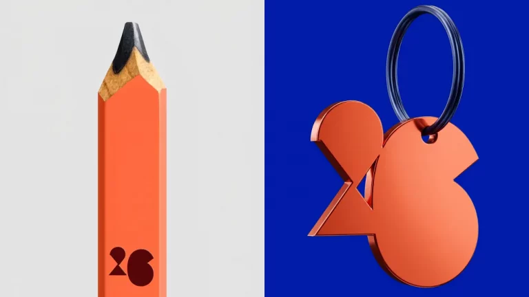
The logo, meanwhile, has had a total makeover. The old version paired a rounded “R” monogram with the word “remote” in a lowercase sans serif. The new logo drops the monogram altogether, replacing it with a heavy, custom-drawn wordmark built from blocky geometric shapes: all half-circles, flat tops and chunky stems.
It’s certainly distinctive, and it echoes the cube concept via individual letters that interlock to form a single, solid unit. The vertical version, in particular, makes a big impact on tall outdoor screens. The identity also features a new typeface, Rotina, which Remote calls a sturdy modernist sans built on utilitarian fundamentals.
The colour palette, meanwhile, takes its cue from international banknotes, with gradients of reds, oranges, greens, blues and violets. It’s a long way from the one signature colour a lot of financial brands opt for, but it works well as a subtle nod to more than 77 currencies Remote moves money through every day.
Ad campaign
The introduction of the new brand coincides with Remote’s largest-ever ad campaign, under the tagline ‘For a World That Works’.
Rather than focusing on software, it puts the spotlight on the good bit: people being paid. While it might seem like stating the obvious, people like being paid, much more than they like using software, so this feels like a smart move.
Each image in the campaign pairs a worker with a three-line caption that traces their work across borders: “Coded in Amsterdam / Deployed in Nairobi / Paid through Remote”, or “Engineered in Copenhagen / Operated in Hamburg / Paid through Remote”. Simple but effective. Each one is paired with a different colour from the palette, so the campaign feels varied while staying unmistakably Remote.
The campaign will run across digital and outdoor advertising in Amsterdam, Frankfurt, Madrid, New York, London, San Francisco and Paris through the fourth quarter of 2026, ending with a hero film produced with Stink Studios.
Overall, Collins has met a unique challenge here — finding a visual language for something most people never see — and met it in style. Payroll infrastructure is something you only notice when it breaks, so giving it an attractive visual form is no mean feat.
It’s succeeded, in the main, by keeping things simple. The cube gives the identity a shape. The banknote palette gives it colour and meaning. The ad campaign gives it a human face.