Founded in 2022 by Andree Paat and Aimur Takk, Tüpokompanii is embracing an unusual approach. Blending local heritage with experimental design, the duo creates unique typefaces that push the boundaries of traditional type design.
Based in Tallinn, Estonia, type design studio Tüpokompanii prides itself on a “mistake-driven” approach, thrives on seeking out letterforms’ “unexpected qualities”, and is a “design-driven” studio.
The studio was founded in 2022 by Andree Paat and Aimur Takk, thanks to the co-founders’ “shared passion for type design and the desire to create a space where we could fully explore our creative ideas”, they say.
Paat cut his teeth interning at Commercial Type in New York and collaborating with the likes of Berlin-based Dinamo (one of the coolest foundries around, IMO). “At Commercial Type, one of the key lessons I learned was the importance of quickly formalising ideas visually rather than over-conceptualising them at an early stage,” he says. “It’s crucial to put your concept on paper or screen as soon as possible so it can be analysed and refined by everyone. Abstract discussions are valuable, but real progress happens when you have something concrete to work with. This approach taught me how to connect the conceptual with the practical, allowing for faster iteration and more effective collaboration.”
The studio’s other half, Takk, graduated from the renowned Swiss design school ÉCAL in 2020 and, prior to opening the studio, had created custom typefaces for IDA Radio, Tallinn Music Week and the ERKI Fashion Show. “For me, typefaces and visual identities are inseparable. A typeface can define the character of a brand just as much as a logo or colour palette,” he says. “One project where this intersection stood out was the custom typeface I created for Tallinn Music Week. The type had to reflect the eclectic nature of the event, balancing modernity with tradition. By designing a typeface specifically for the festival, we were able to infuse the brand with a unique visual voice that extended across all its materials, from posters to digital interfaces.”
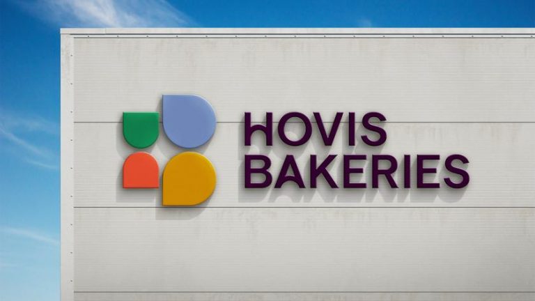
Tüpokompanii works across pretty much all things letter-based: designing and publishing retail fonts, logomark design, typeface modifications and language extension, research and consultation, Opentype feature programming, and offering custom type design services to clients such as the second-largest in Estonia, Tartu. Paat and Takk also do a fair bit of work with students, offer a range of type design workshops, and have been involved with Estonia’s design and type-focused summer school since it started out in 2019.
Underpinning the studio’s range of type work is a constant drive to “merge the technical demands of professional type design with the creativity and experimentation needed to develop something unique,” it says.
This ethos informs the breadth of Tüpokompanii’s output, but when it comes to creating custom typefaces for clients, there’s another key consideration – context. Sometimes, that might mean referring that client to one of the foundry’s existing fonts; at others, it’s about a bespoke solution. “It’s important to ask the right questions early on—what role will the typeface play, and how does it fit into the larger visual identity?” the studio explains. “Our process typically begins with a conceptual or formal idea, which we apply systematically to each letter. The goal is to craft something that not only fits their identity but also adds a unique typographic voice that strengthens their overall branding; we often reference local elements or heritage that resonate with the client’s vision.”
Heritage is often mentioned: Takk and Paat delight in the space where tradition and innovation meet. That often means looking at Estonia’s fascinating typographic history, such as Soviet-era street signs, which directly informed the font Ladna. Meanwhile, Trafarett—a strikingly playful, blocky, stencil-like typeface—was influenced by traditional DIY silkscreen techniques.
Tüpokompanii sees the interplay between historical reference points and contemporary design practices as crucial to creating typefaces that “resonate on multiple levels”. It says, “We aim to maintain a playful yet respectful balance, often incorporating deliberate quirks that reflect our roots while inviting users to engage with new visual languages.”
So, what exactly do they mean by a “mistake-driven” approach? “It was born from our desire to question the boundaries of type design by viewing mistakes as opportunities for innovation rather than setbacks,” says Tüpokompanii. “Both of us had experiences in education and design that emphasised experimentation and unconventional thinking.
“In our creative process, we allow ourselves to freely explore and break the traditional rules of type design, and from those “errors,” we find new aesthetic possibilities. It’s about turning a problem into a potential solution, or at least a starting point for further exploration.”
The studio’s predilection for experimentation and error played an important role in Tüpokompanii’s work with Tartu, which was commissioned by the design collective AKU in 2022. The design concept focused on Tartu’s unique academic heritage, with particular focus on the Tartu–Moscow Semiotic School. “This led us to play with flipping and rotating letters to create alternate forms that change meaning, inspired by semiotic principles,” the studio explains. “Additionally, we drew inspiration from Tartu’s hand-painted enamel street signs, embracing their imperfections. These quirks became a core part of the final design, resulting in a typeface that feels distinctly local and unconventional, blending historical and cultural influences in unexpected ways.”
There’s a real sense of dynamism to be found in that tension between old and new, local and global, traditional and futuristic. That sense of dialogue is also what Paat and Takk love about working with students as visiting teachers at EKA GD (Estonian Academy of Arts Graphic Design). “Instead of formal lectures, we engage in ongoing discussions that evolve as students progress with their projects,” the pair explains.
“This approach allows us to address specific questions and challenges as they arise, making the learning experience more relevant and dynamic… students approach type design without preconceptions. Their views aren’t shaped by rigid ideas of the ‘correct way’ to do things, so they don’t have to unlearn anything. Their fresh perspectives and willingness to experiment push us to think differently and keep our approach flexible. It’s a mutual exchange that fuels both their growth and ours.”