After two decades of shaping the visual identities of brands like Nike, Airbnb and The Guardian, Commercial Type is launching a brand design studio that puts typography front and centre.
For the past two decades, Commercial Type has built its reputation as one of the most respected type foundries in the world. From The Guardian’s iconic 2005 rebrand to custom typefaces for Nike, Airbnb, MoMA, and The New Yorker, the foundry’s work has quietly shaped some of the most recognisable visual identities of the 21st century.
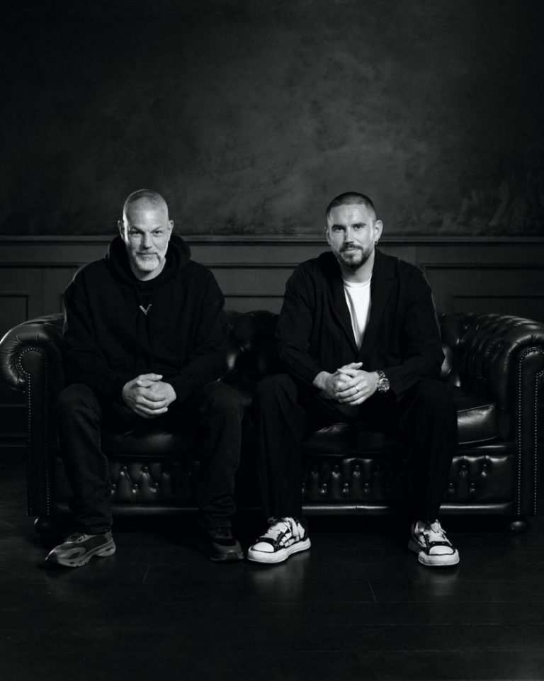
Now, on the 20th anniversary of their landmark work for The Guardian, founders Christian Schwartz and Paul Barnes are flipping the script and launching a brand design studio to sit alongside their renowned foundry.
The idea for the studio had been bubbling under the surface for years, although Schwartz admits that he and Barnes were adamant that they just wanted to design typefaces at the start of their partnership. He explains: “We even turned down logo projects – but eventually, we realised logos were actually fun to work on.
“Then clients started asking, ‘Since you’re doing the logo, could you also do the full identity?’ and, at first, we said no. But eventually, we thought — what if we said yes?”
That simple shift sparked Commercial Type Studio, a creative practice that treats typography as the foundation for everything a brand does visually. “Type defines voice, shapes perception, and builds trust,” Schwartz adds. “It made perfect sense to build a design studio around that.”
To help make it happen, Schwartz and Barnes brought in Dino Sanchez, a design industry veteran with agency-world credentials and a knack for tackling everything from hospitality to corporate branding. “When Christian and Paul approached me, it instantly clicked,” says Sanchez. “Why shouldn’t a branding studio grow from a type foundry? It’s like starting a restaurant with the ingredients, not the menu, and we’re the farm, growing those ingredients. That’s the natural starting point.”
Why typography is in the DNA of great brands
At the heart of Commercial Type Studio is a refreshingly simple principle: typography isn’t just the cherry on top of a brand identity — it’s the cake itself.
“Sometimes type is all a brand has,” Sanchez says. “When all you’ve got is a PowerPoint deck with words on it, does your brand still look like you? Does your visual voice still come through? That’s why type matters.”
This philosophy gives the studio a distinct advantage over traditional brand agencies, blending typographic craftsmanship with holistic brand strategy. Every project starts with the core ingredients — letterforms, language, tone of voice — before moving into logos, colour palettes and design systems.
Crucially, this approach is about precision, not excess. “We’re not tweaking typefaces just because we can,” Sanchez explains. “It’s about knowing when a small typographic intervention will unlock something big. That’s the advantage of having type designers in the room from day one.”
This bespoke-first mentality runs counter to the increasingly templated world of modern branding, where off-the-shelf design systems dominate. “There’s a reason identities with custom type or lettering stand out,” says Sanchez. “It’s not just about being fancy — it’s about making sure the typography feels authentic to the brand.”
Proof of concept
Before its official launch, Commercial Type Studio quietly tested its ideas on a handful of projects, each one a masterclass in type-led branding.
For Life Science Logistics, a B2B firm in the arguably unglamorous world of supply chain management, the studio leaned into typography to express precision and authority. “They wanted to project confidence through an academic lens,” Sanchez explains. “We drew from old Scientific American journals and used editorial-style type to give them that credibility.”
To reflect the company’s precision and rhythmic efficiency, the team also introduced a monospaced typeface, evoking the steady cadence of trucks leaving a depot. “It’s subtle, but that sense of order and data-driven precision comes through,” says Sanchez. “Even if the audience doesn’t consciously notice it, they feel it.”
For The David Prize, which celebrates bold New Yorkers with visionary ideas, the brief was to create a brand as fearless as the winners themselves. “The type had to make a statement — but it also had to give space to the real stars: the winners,” Sanchez says. “That balance of confidence and flexibility was key.”
In every case, typography wasn’t an afterthought; it was the central storytelling tool. “Because we’re working directly with Commercial Type’s foundry team, we can tweak, adapt and evolve the type itself to fit the brand’s voice,” Sanchez explains. “That’s not something most studios can do.”
Overlooked industries need design too
When it comes to dream clients, Sanchez and Schwartz are more interested in complexity than cool factor. “We love working with editorial and hospitality brands because we understand those worlds so well,” Schwartz says. “But honestly, some of the most rewarding projects are for businesses you’d never describe as ‘sexy’.”
Sanchez agrees, saying: “There’s a whole universe of companies that desperately need design but don’t think of themselves as design-forward — logistics firms, management consultancies, anyone whose biggest asset is a PowerPoint deck.
“Those are the projects where good design can make the biggest difference.”
But that doesn’t mean they’re turning down trendier clients. “We’re more than capable of doing a skincare brand or a matcha brand,” Sanchez jokes. “But there’s something more creatively fulfilling about making a B2B logistics firm look amazing. That’s the challenge we get excited about.”
The joy of starting something new
At its heart, Commercial Type Studio is about more than design—it’s about building a creative culture where people love what they do.
“We’ve been doing this since we were 18,” Sanchez says. “The companies we admired growing up were all built by people who wanted to work with their friends, and it doesn’t always work out that way — but we’re lucky enough to be building a studio where collaboration, curiosity and fun are part of the culture.”
Schwartz adds: “It’s rare, this far into a career, to still feel a bit terrified when you start something new, but that’s how you know you’re doing something worthwhile.”
With a typography-first approach, a belief in the power of good design for every industry, and a leadership team that thrives on curiosity, Commercial Type Studio is set to reshape how brands — from cutting-edge start-ups to overlooked industries — think about their visual identity.