Tasked with turning a niche motorsport into a global cultural force, Zag crafted a brand strategy and identity for the World Supercross Championship that’s as gritty, distinctive and fan-driven as the sport itself.
Sport is a crowded business, and while global leagues like the NFL and Premier League enjoy billion-pound broadcast deals and cross-generational fandom, emerging competitions like the World Supercross Championship have to build from the ground up. That means more than a new logo or colour palette. It means rethinking what a sports brand is and who it’s really for.
When the World Supercross Championship approached Zag, the brief wasn’t to “modernise” or copy the big leagues. The goal was to create a brand that could grow with its audience, rooted in culture rather than convention, and appeal to both long-time fans and those just discovering the sport.
“The breakthrough came when we stopped thinking of World Supercross as a traditional motorsport and started seeing it as a global subculture,” says James Hurst, partner and chief creative officer at Zag. “The existing fanbase wasn’t looking for polish or prestige — they wanted authenticity, adrenaline, and identity.”
Rather than begin with legacy sports models, Zag’s strategy team cast the net wide. They reviewed 31 brands and interviewed investors and insiders, not just in sport but across entertainment and creator culture. They drew inspiration from newer, fan-first formats like Kings League and Fan Controlled Football, as well as the expressive visual identities of music and streetwear, and from live experiences like Burning Man that blend performance and participation.
These references helped the team understand what modern fans want: shorter, sharper bursts of entertainment; multiple ways to engage with the action; and a sense of direct connection to the athletes themselves. The goal wasn’t to sanitise the Supercross identity for the mainstream, but to amplify what made it magnetic. “We realised this wasn’t a sport that needed to be massified; it needed to be magnified,” says James.
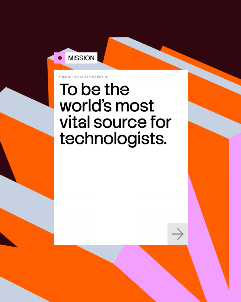
The result of that thinking is a brand that’s unapologetically itself, starting with the strategic platform “Make Dirt Fly.” More than a slogan, the phrase became a creative and commercial North Star.
“It captured the visceral thrill of the sport, it celebrated the subcultural swagger of the community, and it signalled the global ambition to take this experience to new audiences,” explains James. “It became more than a line — it was a filter for every creative decision.”
That positioning needed an identity system to match, and so Zag made a point of avoiding tired motorsport tropes. “We began with a banned list: chrome gradients, checkered flags, carbon fibre textures, italicised speed fonts — anything that felt predictable or performative,” James recalls. Instead, they built from the dirt up: tyre treads, terrain marks and motion behaviours formed the basis of a design language that’s both raw and expansive.
The new logo takes its cues from the track, incorporating a semiotic metaphor in the form of a knobbly tyre tread “W” mark. A custom typeface, reworked from Space Grotesk, anchors the visual identity with confidence and clarity. The photography style favours fisheye perspectives, dynamic crops and gritty textures, leaning into the visual heritage of extreme sports while making room for fresh storytelling.
One of the most distinctive components is what Zag calls “The Global Canvas.” It’s a modular system combining circular motifs (echoing planetary motion and the sport’s global reach) with tactile graphics built from tyre textures and dirt trails. The effect is flexible but cohesive and easily adapted across live events, social content, merch, broadcast graphics and beyond.
“Every asset º from arena graphics to motion tiles – can be built from the same system, with just enough flexibility to reflect local energy and individual style,” says James.
This was crucial for a competition with global ambition. The 2025 season kicks off in October and will see races in Kuala Lumpur, Vancouver, Buenos Aires, Cape Town and the Gold Coast. The new identity helps bridge audiences and geographies while staying rooted in the culture of Supercross itself.
“We wanted to build something that felt grounded in the dirt but designed to travel,” says James. “The more we leaned into the authenticity of the community – their language, style, rituals – the more distinct and exportable the brand became.”
That sense of specificity has a commercial purpose, too. In a sports media environment shaped by free-to-air content, creator-led leagues and audience fragmentation, Zag’s strategy goes beyond aesthetics. Their discovery work explored new revenue opportunities, the future of broadcast formats, and fan engagement models inspired by esports and digital-first brands. The identity system is built to flex alongside these ambitions.
For Luisa Fernandez, chief product officer at the World Supercross Championship, the process was about more than surface-level rebranding. “The Zag team were incredible at helping us not just create a new brand for our sport, but helping us achieve our long-term product and growth ambitions,” she says. “They brought niche but relevant analogues, were always open to challenge, and were a true partner throughout.”
As more challenger leagues look to scale without simply mimicking the big players, Zag’s approach offers a blueprint for building sports brands that are expressive, culturally literate, and designed to feel alive.
“The next generation of sports brands will be built less like institutions and more like movements,” says James. “Supercross isn’t trying to be for everyone – and that’s exactly why it has the potential to go everywhere.”