After years of running her studio under the name CZYK Design, Anna Wanczyk has relaunched as Anna&. The new identity is about clarity, honesty, and a commitment to collaboration — with clients, partners, and the wider creative community.
Anna Wanczyk first set up her own business in 2019, and at the time, she didn’t give too much thought to the name. She had “CZYK Design” already from side projects and used it by default, but found that it never quite fit.
“No one could spell CZYK Design. No one knew how to say it. No one ever tagged me with the right business name. I hated saying it, and it didn’t sit right with me,” she admits. “I never really intended it to be my company name; I just had it already from occasional side projects when I first started my current business.”
The name also missed the mark in describing what she actually does, as Anna’s practice has always been rooted in collaboration. Sometimes that’s between her and a client, sometimes with a network of other creatives, and sometimes in partnership with agencies. Now that ethos is front and centre, and her studio has been reborn as Anna&.
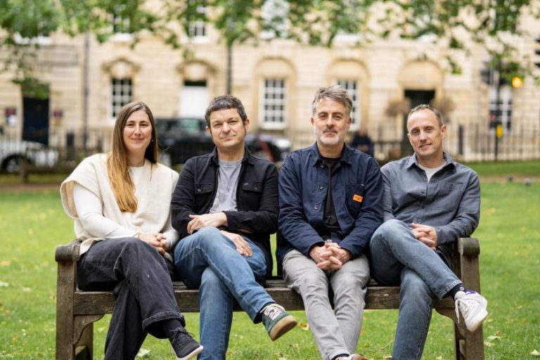
Anna Wanczyk, second from left, at Creative Boom IRL Leeds (Photography by Michael Godsall
For some agencies, finding a new name comes from hours of strategising and endless workshops. However, the idea that led to Anna& came from a pint with a friend, Eleanor Calsy-Harrison (who also happens to be a strategist and writer).
Anna had been wrestling with whether to strip her surname out of the brand or present herself as a “collective”. Eleanor cut through the noise, suggesting “Anna&,” for its simplicity, flexibility, and open-ended nature.
“My eyes filled with tears. I was like, ‘That’s it!’ and realised it was my new name,” Anna recalls.
It was immediately clear that this new name was what she’d been looking for. “People are very much buying into me & the people I work with,” says Anna. “I didn’t want to take myself out of the situation and come up with something that felt meaningless, so I could look like a bigger studio or whatever.
“I really wanted to champion and celebrate collective working, independents coming together to deliver projects, to show people it is an option.”
Although the seed was planted back in 2022, the rebrand was delayed when Anna found out she was pregnant with her second child. Rather than rush, she sat with the idea during maternity leave and gave herself time to properly think through the new brand.
“Knowing I couldn’t get it all done before my maternity leave forced me to think it through properly and gave me time to launch the right thing,” she says.
Now she has a studio identity that finally feels considered, aligned, and totally fits her offering.
As well as inspiring the name, collaboration also shaped the visual language. Anna experimented with patterns at first, but quickly realised they felt trend-driven. The more natural fit came in the typography, as she saw the mix-and-match potential of different typefaces as a metaphor for different kinds of creative partnership.
“Every project is different. Every client has different needs. The combination could be different for any project,” she explains.
This led her to Kyiv Type Foundry, whose fonts she had bookmarked years before. With Ukrainian heritage on both sides of her family, Anna wanted to weave in something personal and lasting.
Many of the fonts she chose come from the Kyiv Metro collection, created by students who based letterforms on type found in the metro system during the early months of the war. Sales of the fonts support Ukrainian refugees.
“It’s incredible what they’re doing,” she says. “Using those fonts was an opportunity to celebrate what they’re doing and bring some of my heritage into my brand.”
The ampersands themselves are deliberately unusual, drawn from type rooted in Cyrillic signage and newspapers. “It just all looks a bit different and I’m a bit like that – a bit untraditional,” Anna adds.
The way Anna speaks about her work, and to her audience, is equally important and has undergone a slight refresh. Her announcement of the rebrand was strikingly candid as it was direct, funny, and free of the kind of jargon that clutters design industry posts. This was deliberate, according to Anna.
“I’ve always been like that, really – a little bit too honest, sometimes. I value honesty,” she says. “Things have been grating on me since I entered the design industry in 2006. There’s a lot of bullshit in the industry, and I don’t think any more needs adding to it. I want to change some things.”
Working with her husband, copywriter Mark Johnson, she found a way to translate her natural voice into something authentic for the brand. “I am a human and I’m trying to speak to other humans. I think in a sea of AI-generated posts and LinkedIn slop, it’s even more important to sound like a human, even (or especially) if that means letting a few rough edges show. We ain’t selling to robots!”
Anna& is deliberately unfinished, with a name that leaves room for whatever comes next, whether that’s a digital-first rebrand, a campaign, or an exhibition. “I think the options are endless! I’m not afraid of a challenge, I love learning new things, and I could partner with anyone with any expertise to produce whatever the project needs,” she says.
For clients, the aim is to feel involved rather than sidelined. “I want people to feel like Anna& is open, like they are part of the process and the project. This isn’t something that’s being done to them, it’s a collaboration with me, or with me & other experts.”
While the immediate focus is on building momentum for Anna&, Anna is also thinking longer term. Alongside client work, she wants to create pathways for diverse creatives, particularly those from working-class backgrounds, to access opportunities in design.
“At some point, and this is a way off, I would like to be able to help them with the barriers into the industry and provide them with the opportunities that you don’t always get if you’ve been brought up in the north, with the wrong accent, by a welder and an NHS admin worker, without the right connections and lots of money,” she says.
“It’s something I got to touch on a bit when I was working with Eve Warren on the Yorkshire chapter of Kerning the Gap, but I want to explore it more directly.”
Those ideas are still bubbling away, but the intention is clear. Anna& is not just a new name, but a platform for collaboration in the broadest sense.