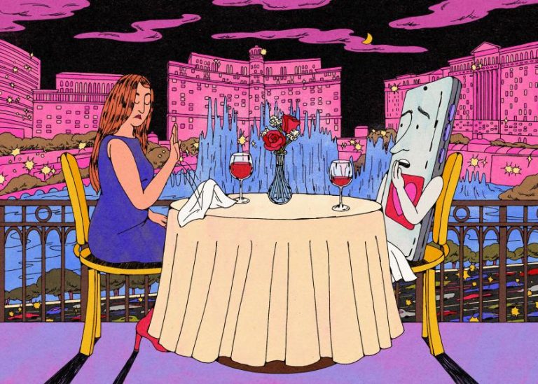
“I have a good eye for colour and usually go with my gut,” says this inspiring young illustrator from southern Spain.
Let’s take a moment to enjoy some illustrations by the Spanish artist Sara Maese. Light-hearted and rendered in perfectly balanced pastel palettes, her images take us away to a simpler place. This is Sara’s creative world, where seemingly naïve blobs of colour suddenly become people, one or two fat lines define light and shadow, and whimsical scenes jump to life thanks to her animation skills.
“At first, my work wasn’t focused on simplicity or colour, it was about expressing myself through small characters,” says Sara. “I’ve always been drawn to illustrations full of details and figures, which inspired me to start building my own internal universe.”
From a suite of packaging and cards created for Paperboy London.
Cover art for The Malagueñer
Sara’s unique style breaks out in all sorts of places, with clients in fashion and beauty, food and drink, lifestyle, homeware, events, editorial, and more. One of her favourites is a recent project entitled Coneheads for Glug, the wine magazine. The main artwork features dozens of characters cavorting among huge wine glasses, surrounded by giant portions of food. Then, four spot illustrations zoom in on enormous desserts accompanied by further wine options.
“It was a lot of fun, and I loved the colour palette. Sometimes, when the colours work well, the whole piece just comes together. The project itself wasn’t too difficult, and working with the art director, Ashley Johnson, was really easy. The only challenge was the tight schedule, but I’m used to working around that.”
Gentle colour palettes are something that sets Sara’s work apart. Warm and comforting, they bring just the right amount of energy. With each project, Sara follows her gut, and it never seems to fail her. Across her portfolio, the colours are consistent, giving the impression of an artist comfortable in their style, which instils confidence in clients.
Coneheads for Glug
High Five ski festival merch.
De Tuin Der Lusten
One of Sara’s most interesting and humorous artworks is a personal piece inspired by Hieronymus Bosch’s The Garden of Earthly Delights. Sara loves creating scenes where a lot is going on, but does so using the most basic forms and line work. Juxtaposed with Bosch’s intricate Gothic style of painting, the results in Sara’s De Tuin Der Lusten are fascinating, yet it is clear that this is a faithful – if amusing – recreation of the original.
“I’m very drawn to works full of characters and objects, which is why The Garden of Earthly Delights is one of my favourite pieces of art. Since I started illustrating, I’ve wanted to recreate it in my own style – I just needed the time and courage to go for it,” she laughs.
Working mainly in Illustrator and using Procreate to generate GIFs, Sara’s ideal next project would be makeup packaging – or any form of packaging, really. In addition to illustration, she’s a surface pattern designer and holds qualifications in Fine Art, as well as graphic and web design.