The town made headlines after a local by-election made Andy Burnham Prime Minister. But the real story was already happening behind the scenes – a car park becoming a public square, with an identity by StudioDBD inspired by making.
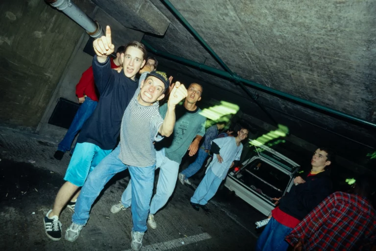
Earlier this summer, Ashton-in-Makerfield found itself at the centre of a media storm. TV crews and journalists from around the world descended on the historic market town in Wigan to cover the by-election that would eventually make Andy Burnham the UK’s Prime Minister. Some of their reports were quite patronising. They talked of post-industrial decline and vape shops. And just like that, they packed up and left.
They came with their “angles” but totally missed what was already happening in the area. Right in the middle of town, a car park is becoming a square. It’s on the site of Ashton’s historic market ground, which was granted its charter in 1284.
The outdoor shopping hub on Garswood Street traded happily for over a century before closing during the pandemic. Now the space is being rebuilt as ‘Ashton Square’ with £6.6m of government funding. It will be a flexible public space with kiosks, greenery, market stalls and room for events. It’s due to be complete next year.
For such a brilliant rise from the ashes, the square needed an identity. Wigan Council turned to David Sedgwick of StudioDBD, and his approach is unconventional on purpose. In a word, it’s unfinished. Deliberately. And there’s a reason why.
Ashton-in-Makerfield got its name from making things. Hinges, locks and files during the Industrial Revolution. Then coal from the Lancashire Coalfield, weaving and ironwork as the town expanded. It’s a proud spot with a northern soul. And while some designers might lean into that coal-dust heritage with pared-back palettes and sepia photography, StudioDBD went the other way.
When Wigan Council consulted local people, the resounding feedback was that Ashton was looking “dated and tired”, and it needed to be more confident and bold. Locals wanted the town on the map. They wanted to celebrate their home. David realised that the solution was already in the name.
At the heart of the identity is ‘Made in Makerfield’, a storytelling platform built on the simple premise that Ashton’s making never stopped when the pits and factories closed; it carried on in its people. “It is about the people, experiences, memories and moments that make a place meaningful,” David explains. “The things people make, the things they do and the things they share.” Local businesses, community groups and events can all use this new platform to share their own updates. It means the brand grows every time somebody new uses the square.
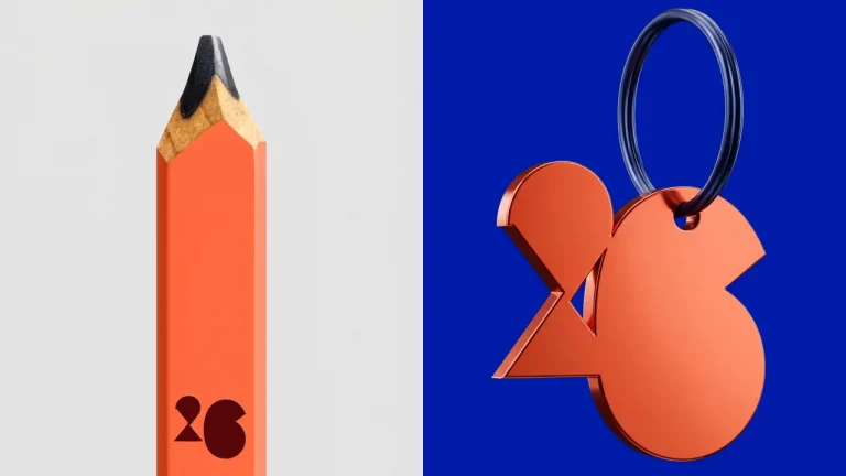
As such, the visual language features bespoke typography inspired by mechanical forms, tools and crafted components. Warm colours and “people-first” photography add softness, so the whole square feels more like a friendly community than a factory floor. “It’s confident without being corporate,” explains David. “Crafted without feeling precious and proudly northern without resorting to cliché.”
A lovely feature in the identity comes from Walking Day, a civic tradition that once filled Ashton’s streets with churches and schools, banners and brass. Its roots begin on the exact site of the new square – families would gather at the market to buy ribbons from the stalls, then take them home to make the dresses, banners and other decorations for the annual celebration.
So, you see, Ashton’s market wasn’t just a shopping destination; it was where the “making” began. StudioDBD took that and wove ribbon-like forms through the brand, bringing movement and colour throughout. It’s nice little details like this that mean so much to locals. Knowing David, I can understand why he went down this route – it has real heart.
There’s a new physical space, too. Art Corner (thanks to Outhouse and Everyday Wigan) is where locals can drop in, join a workshop, share an idea and have a brew while the square is being built outside. Yes, it borrows from the wider identity. But it’s got its own personality, too, including a playful set of illustrated icons that show everything you can make there.
It might be a small thing, this Art Corner, but it’s got a lot of responsibility. It’s designed to give people a say in the regeneration works, long before any final ribbon is cut to pomp and ceremony.
And so we come back to the theme of “unfinished”. This is an identity in the making. As David puts it, “It creates a brand that isn’t finished on launch day. It’s designed to be made by the people who use the square.” That includes all the market stalls and community events… even the school banner becomes another layer of the brand, now and in future.
So yes, the world’s media came to Ashton-in-Makerfield hunting for a story about Britain’s future and found it in Andy Burnham entering Number 10. But the bigger and better angle, in my opinion, was missed entirely. What they didn’t see was an evolving bit of land where families once bought ribbons. “The square has always been somewhere things are made. Now it can be a place where new stories are made too,” David says.