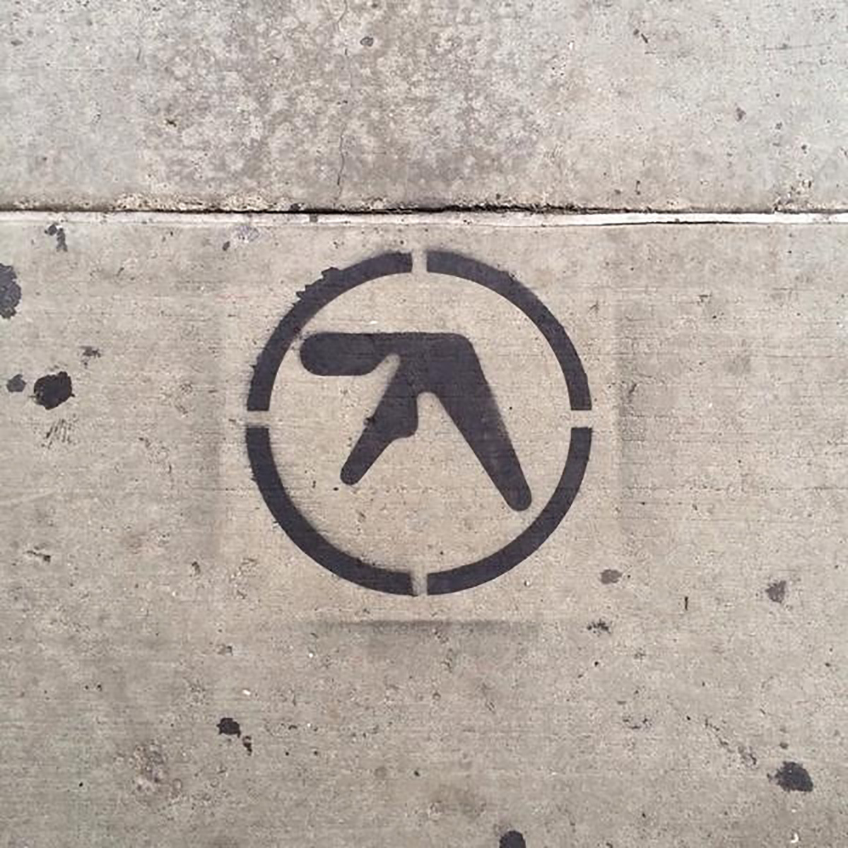
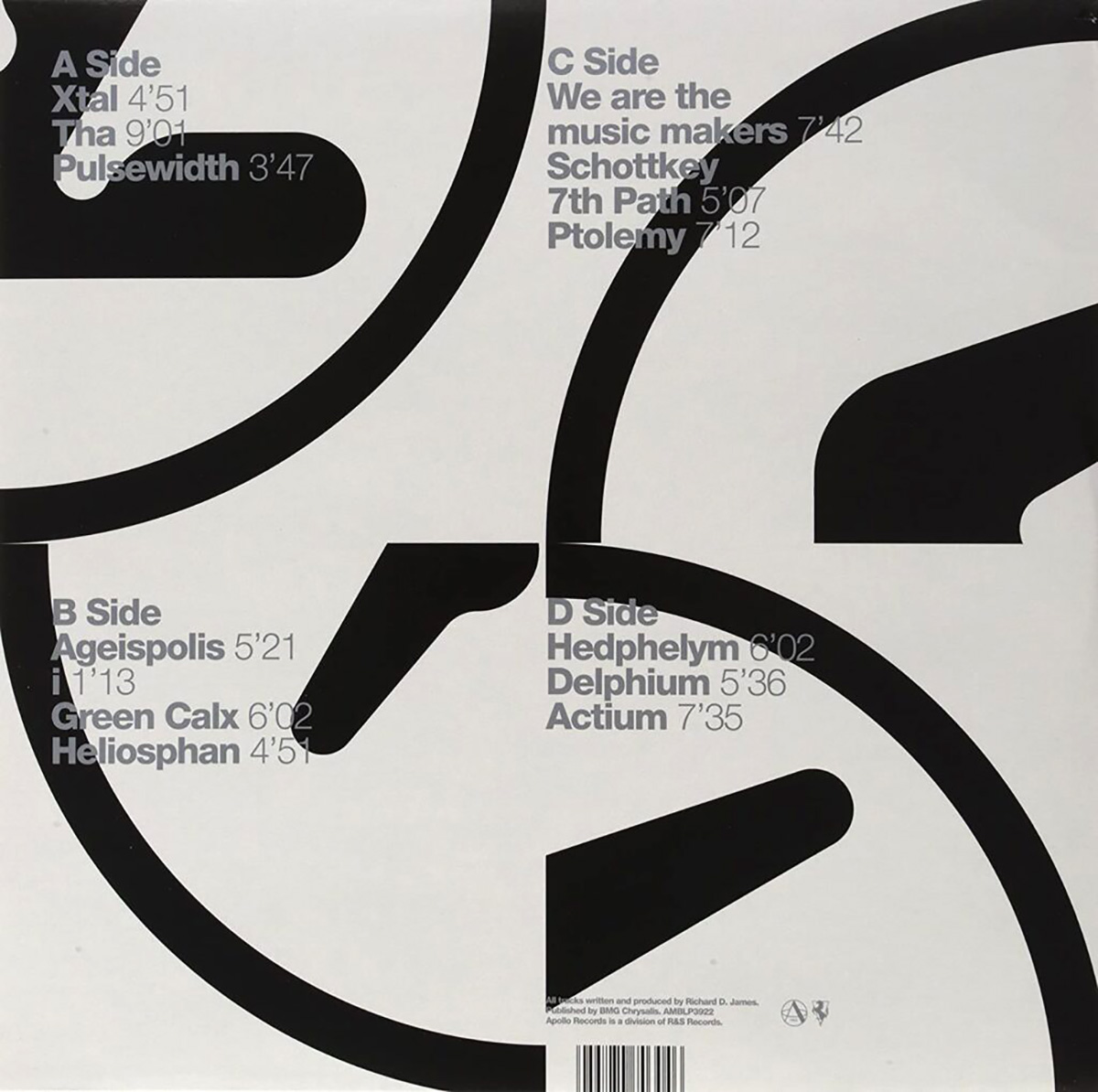
There are few more memorable logos in the music profession than the alien-like ‘A’ of Aphex Twin. It was designed in 1991 in time for the 92 release of Irish-born music producer Richard David James’ seminal album Selected Ambient Works (the first track, Xtal, brings back some fine, fine memories).
Paul Nicholson is the graphic designer behind the mark (site under construction at time of post), and a few years ago he shared these logo sketches and construction images on his Instagram profile.
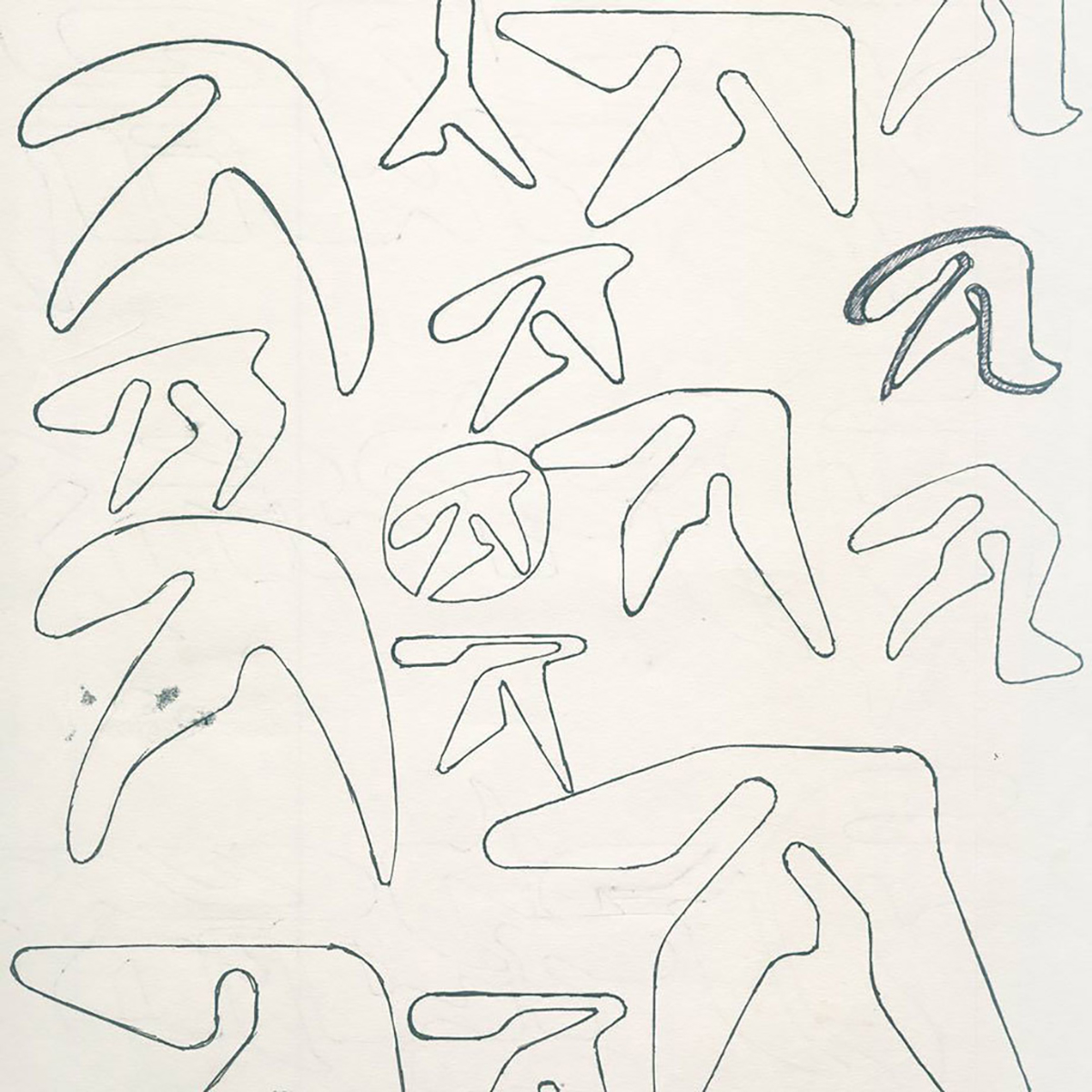
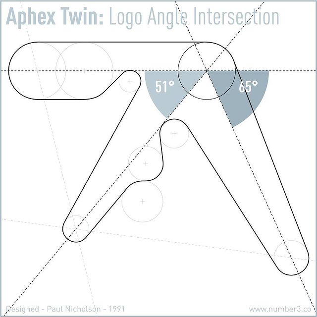
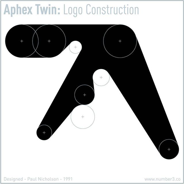
“The original Aphex Twin logo was drawn by hand using circle templates and rulers in late 1991. With there being many incorrect versions of this logo floating about, I thought it about time to release the definitive logo construction. Enjoy.”
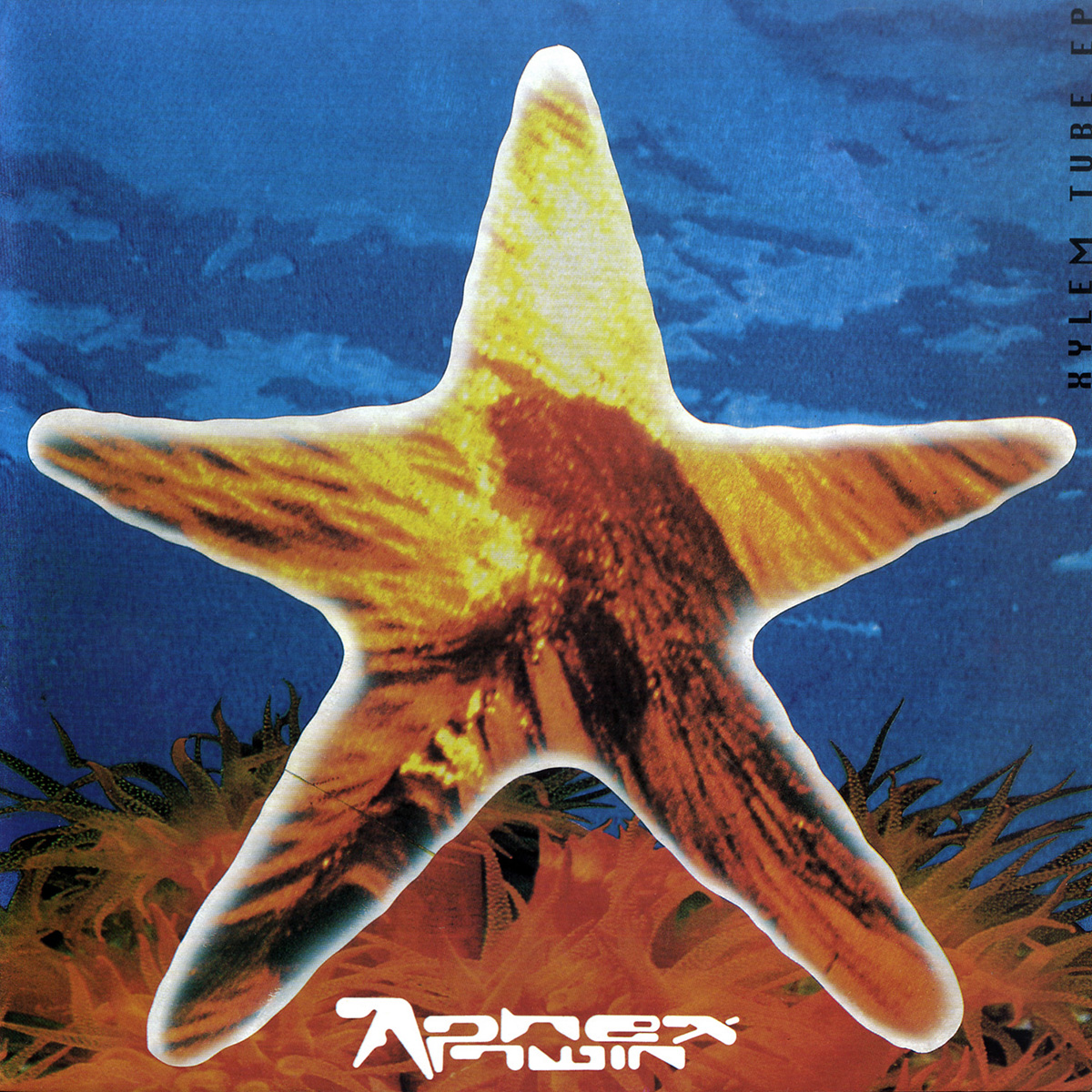
“A little piece of trivia about the logo: at the time I met Richard, I had being doing artwork for a San Francisco-based skatewear label called Anarachic Adjustment. Their ‘thing’ at the time had been the whole “alien” vibe (remember, we are talking 1991). So, I had been creating loads of designs based around the letter ‘A’ which got knocked back. Richard, having seen the work in progress, liked where I was going with the amorphic shape and from these I developed what is now the Aphex ‘A.’ The logo was finished early 1992, in time to appear on the ‘Xylem Tube’ sleeve.”
Quote source.
The monogram was lifted from a larger wordmark in the same style, but it was always the symbol that was star of the show.

Nostalgia.