When you think about some of the most famous logos in the world, what comes to your mind? Can you visualize the colors, fonts or icons clearly? Chances are that you can probably recall every detail in brand designs of companies such as Nike or Apple. The elements in logos are incredibly important and play a huge role in branding. It is important for businesses to focus on choosing the right fonts, color palettes and shapes or imagery for their logo design.
If you take the example of a few top brands across the globe, you will realize that their symbols or icons have a wide appeal. This is mainly because most of these companies incorporate unique elements into their brand identity designs. Let’s take a look at some of the best logo design elements favored by the top brands in the world.

– Geometric Shapes
You may be surprised to know that certain shapes in logo designs can have a positive or negative impact on the viewer. Geometric shapes such as triangles, squares or a rhombus are associated with different meanings or traits. If you take the first one for example, they can represent power, stability and strength. Many top brands such as Adidas, Delta and Airbnb have chosen to include triangular shapes in their logo designs.
When it comes to the meaning of various other shapes in design, these are a few things to keep in mind:
– Rectangle
This is a popular geometric shape that has been used in logos of brands such as Supreme and Ikea. It can bring stability and strength to the overall design, and also create a positive perception in the minds of the audience.
– Squares
As mentioned below, some of the most famous corporations across the world have chosen to incorporate the shape in the brand designs. It is mostly associated with trust and reliability in graphics. Since squares also have four sides, they are used to communicate direction and growth as well.
– Circles
While it’s not exactly a geometric shape, you can find it in a lot of different logo designs. This is mainly because the circle represents freedom and creativity. It also brings a sense of community within the consumers.
Similarly, corporations like Microsoft and Uniqlo have opted for squares to highlight balance and structure. In the end, the effect that a brand identity design has on the viewer also depends on the placement and other elements. For instance, there are a lot of ways to creatively use triangular shapes in logos. Some brands also incorporate straight lines or spirals to convey the right message.
This can add to the appeal of the logo and make a positive first impression on potential customers as well. Geometric shapes are one of the best logo design elements favored by top brands since a long time.


– Negative Space
This is another logo design element that you will find in many popular ones. Negative space can be used in different ways to create a meaningful or clever design. Consider the example of one of the most creative wordmarks that uses negative space to send out a strong message. FedEx has created an arrow between its last two letters to highlight speed and reliability.
The design is subtle and instantly recognizable by a global audience. Toblerone is another top brand that has created a unique logo by using negative space cleverly. Take a look at their logo and you will be able to find a bear climbing a mountain that seems to be covered with snow. You can find quite a few examples of companies or brands using negative space to make an impact on their audience.


– Abstract Icons
With time, this has become a favored element by various brands, particularly those in the tech industry. Abstract icons are used to create mystery and keep people guessing about the logo design. Sometimes, you may also see brand symbols that are clear, and immediately tell you what the brand or company has to offer. There are quite a few abstract icons or symbols that you might be able to recognize immediately on any digital or print mediums. Spotify, Pepsi and Mitsubishi are some examples of brands that have chosen abstract icons to engage their audience around the world.
If you take the example of Pepsi, it’s a globe and represents different things including the magnetic field of the Earth and balance of elements. You can experiment with abstract icons and opt for a simple one to make it easier for the audience to differentiate your products or services from others.
You can also choose a symbol that has a hidden meaning and generates interest among the viewers. Spotify’s logo for instance has three curved lines in the circle that appear like a Wi-Fi signal but represent connectivity and sound.


– Solid Colors
In logo and graphic design, colors play a huge role in creating a perception of the brand. You will find that many top brands favor a solid color palette in their designs. Levi’s, NBC and Subway are a few companies that have chosen a minimalist palette to highlight their brand values and attract a wide audience. Take the example of Levi’s, which has kept its logo simple with a red and white color palette that easily draws attention on their items and promotional materials.
Red is associated with excitement and energy so the brand has managed to connect with a younger demographic over time. Similarly, Adobe is a software company that highlights its message with a solid red and black color palette.
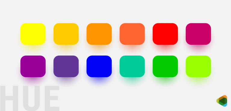
In logo design, the colors are chosen according to the mood and feelings they can bring out. Here are a few important ones to keep in mind:
– Warm Colors
These include tones in the red section of the color gradient. Colors such as red, yellow and orange can represent both positive and negative emotions.
- Red: It can make people excited and confident as well. Brands prefer to use it to grab the attention of potential customers instantly and encourage them to make a purchasing decision.
- Orange: This is considered a friendly and energetic color that can make people feel good. It can stand out instantly against any background so companies prefer to add a pop of orange in their logo designs.
- Yellow: The color is associated with happiness and fun. It is used to encourage people to take action and enjoy the experience.
– Cool Colors
The other side of the color spectrum has cooler ones such as blue, purple and green. They can make people feel calm and relaxed.
- Blue: It represents traits such as trust and reliability. Lighter tones can help the viewer feel secure and inspired as well.
- Green: This is mostly associated with growth and nature. It can make people feel hopeful and calm or close to their environment.
- Purple: The color is considered royal and luxurious. It is associated with spirituality and courage too. Brands use it in logo design to make the viewer feel energetic and connect with them easily.


– Free Flowing Fonts
This is also a popular element that is used by brands in various industries to convey the right message. Free flowing fonts are used to give an impression of creativity and motion as well. Companies such as Disney and Baskin Robbins have opted for custom font styles to attract the attention of their target audience. With a free-flowing typeface, companies can create an appealing design that appears friendly and unique too.


– Mascots
You will find that mascot logos are still favored by quite a few top brands in the world. Pringles is one example where the corporation has continued with their famous mascot over time. People across the globe recognize the brand instantly and pick out their products from the competitors anywhere. The mascot that is known as Julio also has a face that looks like some of their chips. One of the most famous mascots was Mr. Peanut, launched by Planters.
While it’s no longer active, many people still associate the brand with their iconic design instead of the minimalist wordmark that is used today.


– Visual Effects
Given the rising competition in different industries, it can be difficult to stand out quickly. This is where brands can get creative and add various effects to their logo designs. Some of the most popular ones include gradients and 3D elements.
Explore: 10 Awesome Illustrator Hacks To Add Depth To Your Logo Design
• Gradients in Logos
Consider the example of Instagram which has one of the most recognizable logos for its application. The company has managed to grab the attention of their target users by incorporating gradients in its symbol.
• 3D Logos
AT & T is a brand that creates a 3D effect with its globe logo that has lines going around it. When you are looking to create a brand symbol for your website or print materials, it is a good idea to focus on elements that are relevant and appear clearly on each platform.


Wrapping Up
These are some of the best logo design elements favored by top brands in the world. If you are looking for inspiration, you can certainly check out the symbols to get an idea of how to use each element in the best way.