Logos are commonplace in everyday life. Look around your home or workplace, and you will probably see a couple of them just several feet from you. Such ubiquitous things are easy to overlook, but brand logos are a lot more intricate than what they portray at face value.
For businesses, an impressive logo has the potential to enhance reputation by creating a long-lasting positive association with its audience. Sure, iconic brands like Coca-Cola or Apple have reached and stayed at the top largely because of consistency in exemplary products, but you cannot downplay the impact their company logos have on their respective markets.
As the legendary Lebron James puts it;
“There are some logos you see, no matter where you are in the world, and you know exactly who they are and what they mean.”
Your brand image is the first thing a customer encounters, and that means the impression you make right off the bat has a big role to play in determining whether you will stick around for the long run or sink in the mud.
That said, finding the right logo for your business can involve a million decisions. Every aspect, be it the font, images, layout, or color palette needs to be well thought out so that it perfectly communicates the personality of your brand to your customers.
Even the most talented and experienced designer will rely on your vision for your brand to understand the design requirements you need.
So, whether you are designing it yourself or are entirely dependent on your designer, it pays to know the visual hierarchy of logo designing.
The Elements in a Logo
Before jumping into the different types of designs you can choose for your new logo, let us learn the key elements that make up a brand logo.
The design you choose will very likely include one, two, or all three elements, depending on what you envision will work best to attract your target audience.
1. The Icon
The icon is what often stands out in a brand’s logo. It is the pictorial mark logo or symbol that the market will use to recognize your brand.
Icons can be used on their own to represent a level of awareness among customers that only comes with overall success, but this approach is best utilized by companies with well-defined brands, or international organizations that are present in markets where language could significantly undermine customer familiarity.
2. The typographic logo
The typography logo is the style in which your brand name is written on the icon. The font you use must be synonymous with your brand and the personality you want to portray.
3. The Strapline
Some logos, especially those owned by new companies include additional information on their logo, usually a tagline, that describes what they have to offer in a punchy, captivating and memorable way. If you want new customers to instantly know what you do when they see your logo, a strapline will come in handy.
Types of Logo Designs
Logos come in numerous different shapes and sizes, but did you know they can be summed up to just nine primary designs?
Although they are all a combination of words and images, each of the styles below will give your brand a different feel.
1. Monograms
Also sometimes called lettermarks, monogram type of logo designs consist of letters, usually brand initials, as the primary element. Think about CNN, HP, LG, and Louis Vuitton’s LV. Noticing a pattern?
Image Source: 1000logos
With two or three words in the name, some company brands can be less memorable in full and therefore opt to use initials for brand identification.
A lettermark is all about simplicity. By utilizing only a few letters, it can be effective at streamlining a brand. You cannot deny that saying and remembering “NASA” is a lot easier than “National Aeronautics and Space Administration.
If you reckon a monogram logo will do your brand justice, keep in mind that, since the focus will be on initials, the font you choose will be crucial to ensure that your logo design is legible, as well as consistent with what your company does.
Also, if you are just starting out, you may want to add your full company name below the logo when displaying on public media or printing on business cards so that your audience can begin to know you right away.
2. Wordmarks
Like monograms, wordmarks focus on a company’s name and play with fonts to make a unique wordmark logo. However, they use more than letters and are thus most effective when a brand has a succinct and distinct name. eBay, Netflix, and Visa are excellent examples.
Image Source: 1000logos
If your company already has a catchy name, pairing it with bold typography in your logo design can help you create a brand that is strongly recognizable.
3. Letterforms
If your brand is one word and you want your logo to be as minimal as possible, you can go with a letterform logo design. These logos are just one letter, which is often made to be bold and beautiful to convey the message as clearly as possible.
Letterform designs are easily scalable and can be stuck anywhere. Moreover, a well-designed letterform can subconsciously invoke the full name of your company in your customers’ minds.
Image Source: 1000logos
On the flip side, one-letter logos need a lot more design work to be unique and memorable, be it with a funky font, an interesting color scheme, or a dramatic backdrop. Think of H&M or Twitter’s new X logos.
4. Symbols
Letters and numbers are great when your goal is simplicity, but if you are itching to up your creativity a notch higher, think of a symbol or picture instead.
A symbol based logo – also called a brand mark or a pictorial mark – is a graphical representation of the image that presumably comes to mind when someone thinks of your brand.
Image Source: 1000logos
Apple’s apple, Target’s bullseye, and Xbox’s icon are all symbols that are instantly recognizable. However, it is important to consider that these brands have spent years climbing the popularity chain and are currently the top in their markets.
When deciding to go with a pictorial mark design, start by carefully picking the image that will stick with your company for its entire lifetime. Think about the broader implications of this symbol. Will it be a play on your name like Nike’s swoosh? Or will it have a cleverly concealed meaning, perhaps like Snapchat does with its ghost?
Symbol logo elements work best when they are both attractive and can provoke thought in a would-be customer’s mind.
5. Mascots
Mascot logos involve illustrated characters that are typically colorful and fun. They are best used by companies that want to instill as much of their personality in their logos.
The right mascot can be an effective “spokesperson” for your brand. Famous mascots like KFC’s Colonel, Planter’s Mr. Peanut, and Mozilla’s Fox have worked perfectly as ambassadors of their respective brands.
Image Source: 1000logos
Consider a mascot if your aim is to connect to families and children and create a brand that speaks to normal life experiences. Mascot logos are especially effective at encouraging customer interaction and can be great for social media marketing, as well as real-world marketing events.
However, a mascot is only part of a successful brand, and you may not be able to deploy it across all your marketing channels. A heavily detailed illustration may not print well on a tiny business card.
6. Abstract
Abstract logo designs are symbol-based, but instead of using recognizable images like birds and apples, they use abstract, geometric icons. Some excellent examples of abstract logos include the Adidas lines pyramid, Kobe Brayant, and the Lulu Lemon.
Image Source: 1000logos
Like pictorial and mascot logos, abstract marks work are effective at condensing a brand into one image. However, rather than constraining themselves to existing symbols, they allow you to create something unique.
Through color and form, you can convey what your company does and cultivate emotion around your brand, without necessarily relying on the already established cultural implications of colors or a specific image. Just make sure you get a design professional that is experienced in using color, shape and structure to create meaning.
7. Combomarks
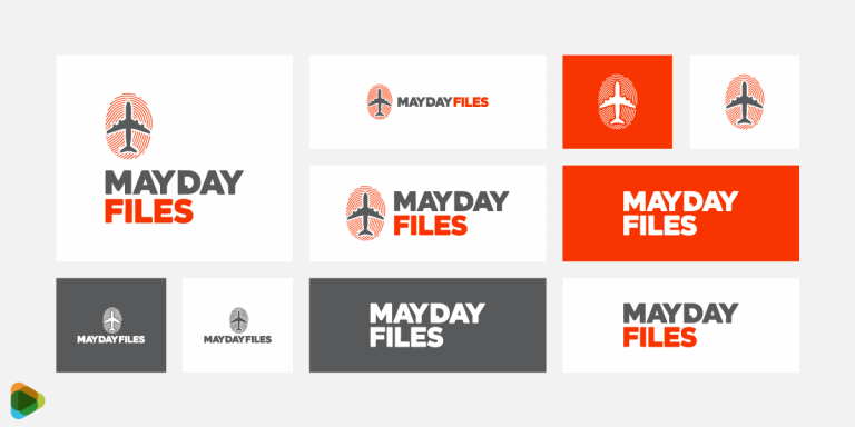
A combination or combo logo combines wordmark or lettermark and a symbol, abstract or mascot icon. The picture and text can be side-by-side, stacked on top of each other, or creatively integrated together. Some well-known companies that use combomarks include Lacoste, Doritos and Tic Tac logos.
Image Source: 1000logos
Because the brand’s name is immediately associated with the image, a combomark design can be an effective option for a logo. Your audience will instantly begin to associate your name with the symbol or mascot you use, which means that you may be able to rely exclusively on the pictorial in the future.
Furthermore, combining symbols and logos often create unique images that are easier to trademark than pictorial marks on their own.
8. Emblems
Emblem designs incorporate fonts inside symbols or icons so that the final logo resembles a badge, seal or crest. These logos tend to look and feel intentionally traditional, and that can make a striking impact depending on the target audience.
Government agencies in particular school and college emblem logos are known to be fond of this type of design, as is the auto industry.
Despite their overall classic style, emblem designs have proven they can be effectively modernized for the 21st century. Think of Starbucks’ mermaid or Warner Bros’ famous shield.
Image Source: 1000logos
That said, emblem designs entail significantly entwining a brand’s name or tagline and the symbol, which means they can be less versatile than other types. An intricate design won’t be straightforward to replicate across small brand items like business cards or display ad design.
Also, if you plan on deploying emblems on clothing, your emblem logo will need to be simple to maintain legibility while embroidered.
As a rule of thumb, design an uncomplicated emblem and you may earn your business a uniquely bold and strong logo that will resonate well with your clientele.
9. Dynamic marks
The rapid increase in the number of media avenues on which logos can be deployed has brought about a new-age logo design; the dynamic type.
Unlike other logos, this type can adapt to its supporting content. So, rather than having one standard design, you can have a dynamic logo that keeps its fundamental elements the same while the rest change from one form of media to the next, be it social media, TV or print.
The key benefit of a dynamic logo for a business is that it gives you the chance to customize your logo so that it perfectly fits the medium you are using. You can also make a slew of impressions on would-be customers to keep things interesting so that your audience is always anticipating what you come up with next.
Dynamic marks are usually less memorable, however, which makes them a lot more demanding when it comes to brand development. Because your logo will be continuously changing, you will have to do a lot more to keep your audience consistently focused on the message.
Thankfully, as AOL and Nickelodeon have successfully demonstrated over the years, it is not at all impossible to keep your market hooked to your brand, even if you have a dynamic logo.
Wrap Up
The one hard rule of logo design is that there are no hard rules in logo design. Sure, the breakdown above may seem to set things in stone, but every brand is different. When it comes to your company’s future logo, the limit is your (and your designer’s) imagination.
Among the most recommended first steps when coming up with a logo is to look at examples from companies similar to yours. Make note of the ones you are most drawn to and let them form your starting point.
Whatever logo design you choose, however, ensure the final work leaves an impression of your brand. If it stands out from the rest of the herd, it will be easier to differentiate your product and build a lasting relationship with your target audience.
Getting a logo is often a lengthy, involved process, but it can also be one of the most fun aspects of starting a business. Let your creativity run wild and get excited to see your brand come to life!
The post What Type of Logo Design is Suited for Your Brand? appeared first on ZD Blog.

