Business cards are a great way for your business to stand out, to present your company to the world, and to remind your customers of you. But how do you create business cards that are unique and catchy at the same time? Well, you can try different strategies, such as using unconventional shapes, colors, printing elements, etc.
Today, we will provide you with all the information you need regarding how to design business cards with unconventional shapes, as well as a few examples of these shapes with which to get inspired. Nevertheless, before moving forward with our guide to designing a business card with unconventional shapes, let us briefly discuss what you will need for your cards.
Elements for A Creative Business Card Design
Image Source: ZillionDesigns.com
No matter if you are a freelancer, a startup founder, or a member of an established organization, you need to finalize two crucial visual components. It is important to consider these before you proceed to design a professional business card.
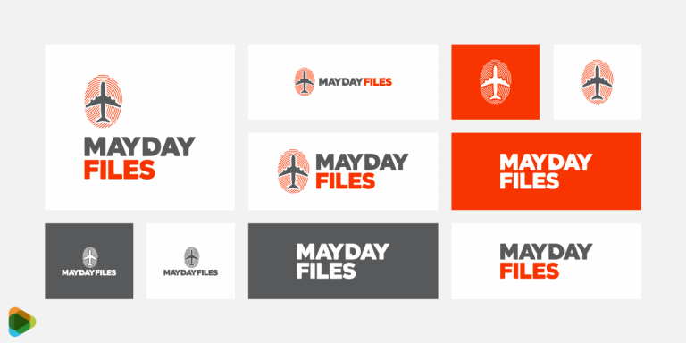
An image of the finished logo
The color scheme of the brand
Getting a professional logo designed and choosing the right color scheme are two of the most important steps you need to prioritize when branding your business. In addition to playing a crucial role in the design of a business card, these elements will also influence other aspects, such as layout and identity.
How to Design Business Cards With Unconventional Shapes
Here are some effective ways to design a business card with a unique shape that has a visual impact. We have also given some additional tips as well by which you can take your business card layout to the next level!
1. Decide on a Business Card Shape
If you have already decided to opt for a traditional rectangular shape to create business cards, you may skip to step two. However, if you would like to have a full understanding of all your options, consider a few examples given here.
Due to the advancement and affordability of printing techniques, professionals can experiment with alternative shapes more freely. By using die-cutting printing techniques, you can create any shape you desire and print in bulk at the same time, whether you are looking for a circle, geometric shape, or anything else you can imagine. There are quite a few ways to make your print marketing materials pop.
What to Do
You may want to consider rounding the corners of your business card on the conservative end of the spectrum. However, if you wish to create business cards that stand out instantly, you are free to use almost any shape, including animal mascots, sketches of products you sell, and even shapes that are unique.
Using clever cutting as the basis for your entire business card theme is even possible. A creative shape can be used to convey a specific message, depending on what you wish to convey.
You appear more fun and make an impression by using special shapes, but they may negatively affect more formal industries. Furthermore, you should consider logistics, such as how the card will fit in a wallet.
Image Source: brandly.com
2. Select a Suitable Size
The next decision you need to make is regarding the card’s size. As a general rule, this is determined by the country’s standards, which is a good place to begin. Even if you are looking to create business cards with unconventional shapes, you must know what your competitors are doing to counteract them.
Standard North American Size: 3.5 × 2 in. (88.9 × 50.8 mm)
The European Standard: 3.346 × 2.165 in. (85 × 55 mm)
Oceania Region Standard: 3.54 × 2.165 in. (90 × 55 mm)
So consider the sizes carefully if you are designing minimalist business cards or opting for an elaborate design. You want to avoid overwhelming the viewer with a lot of clutter or too much space.
What to Do
When creating business cards, focus on aligning the elements according to their size. Here’s how you can do that.
Outline the bleeding area – It’s the card’s outermost portion that is likely to be removed.
Focus on its trim line – The line on which cards should be cut.
Mark the safety line – Any deviation from this line may result in cutting errors. Ensure that no essential elements, such as text or logos, fall outside of this boundary.
Image Source: proglobalbusinesssolutions.com
3. Experiment with Visual Elements
Now that we have covered the steps for choosing a business card design and shape, we can begin plotting the visual elements, the most important one being the logo. Make sure you keep the focus on it no matter the size or layout. For a professional brand icon, you can use an AI logo maker tool.
For a unique and unconventional shape, try to utilize the space carefully to make all the visual brand elements appealing. When you are looking to create business cards with different shapes, keep in mind that the placement of your logo can be manipulated in a variety of ways. So, do not hesitate to experiment with it until you find the best one for you.
What to Do
You can take inspiration from some of the current business card trends and feature pop-ups or layered shapes. Leave a little mystery to create interest and curiosity. Go for a wordless visual accompanied by a URL is usually placed to one side, while all relevant details are placed on the other.
Here is an example you can look at. On the backside, the skyline is raised on a separately cut piece of material with all the important information. On the front, the logo is engraved into another layer of material.
Image Source: cardproonline.com
4. Choose a Complementary Font Style
Despite the importance of typography in any design, it’s especially crucial in business cards since you have a limited amount of space. You need to prioritize it to make the text completely readable for an unconventional shape like a circle, hexagon, or abstract one.
To create visually appealing business cards, consider a typography style that brings the design elements together and draws attention to the information as well. So for geometric shapes, you can choose a clean and minimalist typeface that complements the overall appearance of the business card.
When you have finalized a font style that represents your brand, it can be featured across all marketing collateral.
What to Do
There are three ways that you can pick the best complementary typography style when designing business cards with unconventional shapes.
Size: It is best if all your text is at least 8 points in size to be readable. You can decide to do different iterations on your shape design to see which one suits you best.Nevertheless, you should make your most important elements (such as your name) stand out by varying their sizes. Make sure there is enough space around each element on your card—you don’t want your card to be cluttered.
Fonts: Select a font that reflects the personality you are attempting to convey. Sans-serif fonts that are clean and modern, script fonts that are beautiful and individualistic, or classic serif fonts that are timeless.
Color: This is where the pre-existing brand color scheme is helpful. Similar colors may appear beautiful together but may be difficult to read. To increase legibility, experiment with different contrasts.
Here is a good example of a typography style that goes well with the business card design. The font is legible and can be understood at the first look. It is a great layout for chefs or businesses selling cookware and cutlery.
Image Source: qd.vc
5. Add Effects for a Lasting Impression
As you are brainstorming ideas to create business cards, do pay attention to a few effects that can be added towards the end of the design process. Some printers offer special finishes that can make a lasting impression on the recipient. You may be able to benefit from some of these “special effects” in the business card design, regardless of the shape they are in.
Think of creative ways that you can add these without overwhelming the viewer. And you’ll be surprised to see the results!
What to Do
Here are a few ideas that can enhance the appearance of your business card design and make it memorable.
Embossing: Similar to spot UV coating, this technique creates three-dimensional relief, enhancing specific parts of a card, even words.
Letterpress process: A letterpress printer pushes the paper downward while inking it, rather than raising it. Typically, a special ink is used to draw additional attention to the image, giving the appearance of an engravement. This is particularly useful for letters where you wish to give your words a more authoritative tone.
Stamping with foil: Foil stamping creates a shiny, reflective image similar to tin foil when applied to images or just part of an image. If you choose a bold enough font, you can also use this technique to emphasize text.
UV spot coating: Most cards are finished with a smooth varnish that gives them a sheen and a smooth texture. There is also a spot UV coating, which is applied to specific areas only. This means that you can apply a gloss to only your logo, a particular graphic, or even an individual word or phrase.
If you are looking for inspiration here, this Butcher Knife’s design shape and shining finish is a great example. To create business cards that have a unique shape, you can consider such an idea.
6. Limit Borders as Much as Possible
Although borders seem like an aesthetic choice for framing content in the business card, most cutting mistakes make borders less effective than they should be. Having every individual card cut to perfection is pretty much unattainable in a bulk order, which is why safety areas should be included in the design. Borders tend to accentuate tiny errors in cutting, which can detract from the overall design.
So when looking to create business cards in shapes, try and limit the use of borders. You can go with patterns to highlight important information or icons.
What to Do
Take a look at some simple graphic wonders that can tell a lot about your company. Consider the case in which you are seeking a design that is both subtle and innovative. You can, therefore, use icons to make your company stand out among the competition by adding them to your list of unique business card ideas.
Image Source: behance.net/Jordan Metcalf
7. Add Illustrations for Creativity
Sometimes, illustrations and imagery can be used to represent a brand without additional elements. The power of photos to establish credibility in the marketplace cannot be overstated. You may have seen quite a few B2B SaaS website designs that include illustrations to catch the attention of visitors. Similarly, you can use them for digital business cards or even in print.
You don’t have to go for an elaborate design. It can be a simple illustration of a figure on a neutral background. This is just one idea that you can take inspiration from to create business cards with unconventional shapes.
What to Do
Pick an illustrative design that aligns with your brand identity. So for instance, if a professional is working in a web development company, an illustration of a developer can be featured on the card. Take a look at the design below that has done this quite well.
Image Source: dribbble.com
Inspirations for Business Cards with Unique Shapes
Here are a few examples of unique and innovative shapes you can choose to create business cards with unconventional shapes. Some might suit your business style, too, so be sure to take a look at all of them.
1. Acrylic Business Card
Here is a wonderful idea for printing your business cards on acrylic. As well as catching the viewer’s attention, it seems to be durable and will retain its visual appeal for a longer period than conventional card stock.
Image Source: plasmadesign.co.uk
2. Architect Design
If you are looking to create business cards for a particular industry, this might provide just the inspiration you are looking for! It depicts a ruler on the edges, which gives the business card some utility for an architect. They can feature architect logos or construction logos that match the layout and design as well.
Image Source: blog.miragestudio7.com
3. Coffee Cup Design
An image of a disposable coffee cup on a business card. Especially for cafes and restaurants, this is a very unique idea that should be considered.
Image Source: etsy.com
4. Leaf-Shaped Cards
Create business cards in the shape of leaves with curved corners and contrasting sharp edges to complement the logo and name. Regardless of the industry you’re in, If your brand message is eco-friendliness, then these designs are the way to go.
Image Source: ultrabusinesscards.com
5. Pop-Up Faces on Card
An interesting business card concept in which the viewer can fold the card in half and watch a cartoon face appear on the back. It will certainly be an attention-grabber. In the case of hairstylist businesses, this is an excellent idea.
Image Source: cardview.net
6. Geometric Business Card Design
Using a geometric pattern as a cutout adds a nice, artistic touch to this business card.
7. Shopping Bag Business Card
Among all the unique shapes available for creating business cards, this is perhaps the most intriguing. The bag looks and functions just like a normal grocery bag, except that it folds and opens in the same way.
Image Source: blog.wishpond.com
8. Camera-Shaped Design
You can always consider business card design to convey your profession and this is a great inspiration for it. A camera-shaped card is a very creative and useful idea for photographers and photo studios.
Image Source: jayce-o.blogspot.com
Wrapping Up
When you are looking to create business cards, you need to consider the design carefully as it is an integral part of your brand identity. They serve as a reflection of your brand and make a convincing case for potential clients or customers. Considering how many people receive cards each day, you need yours to make an impression and show a positive image of you. Using unique and unconventional shapes is one way to do this.
The post How to Design Business Cards with Unconventional Shapes appeared first on ZD Blog.


