Can you guess the first thing people notice when they visit your site? Hint: It’s the last thing you consider when designing the creative assets for your web page.
Well-designed website banners are one of the most powerful conversion tools, yet most people, even seasoned marketers, still don’t know how to utilize them effectively. Whether you are promoting a product, announcing a sale, or encouraging newsletter downloads, an effective design can capture attention and persuade visitors to perform specific actions.
According to research, a whopping 75% of total ad spending in the digital advertising market will be generated through mobile by 2030.
Designing an effective website header means it should be responsive on mobile displays. Since most people view your site on their smartphones, don’t ignore a mobile responsive design. Keep in mind that it’s not about adding flashy graphics; an effective website header should convey your brand message with the right elements and have clarity.
In this article, we will explore the five key do’s backed by real examples from brands that got it right. We will also look at five crucial don’ts of banner design that you should avoid.
Sounds like something you want to learn? Keep on reading!
5 Do’s of Website Banner Design
1. Define the Purpose:
Before jumping into design tools to create an effective website header, you need to have a clear “why”. It will bring clarity to your design.
Have a clear purpose upfront, as it will help you focus on a single message you want to convey. Once you have established that, the next step is to create your design. You might have noticed that many brands use banner images for various purposes, including:
Discounts or sales promotions
Product launches
Feature updates
Lead generation and free downloads
Example:
Benefit Cosmetics, a beauty brand, perfectly uses its site header for a single purpose: to sell new arrivals. Their homepage hero image has simple text that describes the products next to the image and a simple and effective “Shop Now” button. It is direct and shows that sometimes simplicity is perfect to convert impulse shoppers.
Pro Tip:
To make things clear for you and your audience, ask yourself, “What’s the one action I want visitors to take after seeing this image?” Is it to promote a product? Increase newsletter sign-ups?
2. Determine the Correct Size
Choosing the right banner size helps to improve visibility and user experience. There’s no rule that says you should stick to a single size. However, through testing different formats and a bit of trial and error, we have identified the most effective dimensions:
Leaderboard: 728×90 px
Large Rectangle: 336×280 px
Mobile Leaderboard: 320×50 px
It is important to design in multiple standard sizes. A poorly sized banner stretched across different platforms can cause issues like pixelated images, overlapping text, or unreadable CTAs.
Example:
Talking about creating an adaptive design, Amazon Prime comes to mind. Prime uses adaptive website banners on its website for both desktop and mobile views. On desktop, they have used a horizontal one to persuade visitors to sign up for the streaming service with a button “Join Prime.”
On mobile, they use a more compact mobile leaderboard (320×50) to fit smaller screens. The layout, images, and text are resized appropriately.
Pro Tip:
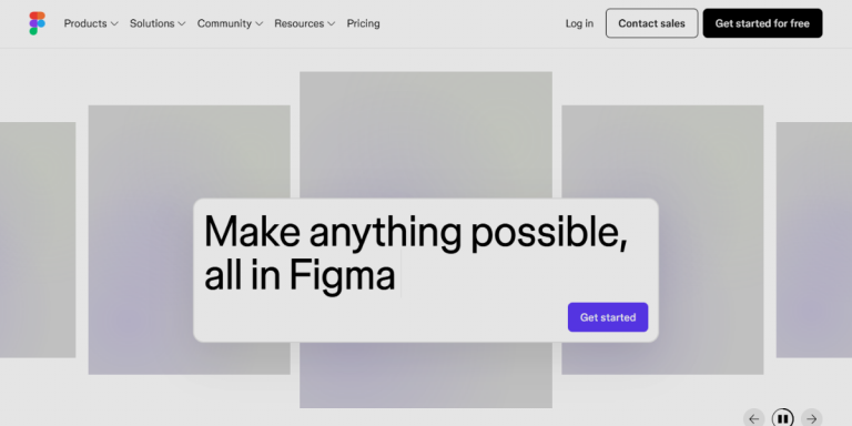
Use tools like Adobe Photoshop, Figma, or Sketch to create and resize your design.
3. Use Simple and Clear Text
No exaggeration, but ad copy can actually make or break a web banner’s effectiveness. There are various approaches to get this right, but it’s crucial to focus on three key elements:
Message clarity: No fluff! Keep your copy concise and action-focused. Each word should serve a purpose and motivate people to take action.
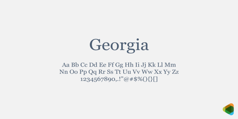
Fonts: Readability is key. Opt for appropriate typefaces that are readable. Font size 16-24px works best for headlines.
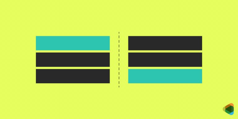
Visual Hierarchy: Structure the text with a clear hierarchy. Organize your content with a headline, supporting text, and call-to-action.
Think about a site banner design you remember seeing; we bet it didn’t have a large chunk of text that took ages to read. Your visual must be scannable in seconds. Make your message clear to let your audience take action on the spot.
Example:
Look at the website header of Dropbox. The text is concise and states the value proposition in one line, followed by the “Signup Free” CTA. This short and clear message motivates visitors to take action without giving it a second thought.
Pro Tip:
Test your text by reading it yourself or ask your friends. If they understand your message in under 3 seconds, then you have done it right. The sweet spot lies between 15 and 20 words.
4. Use High-Quality Royalty Free Images
You might have heard the phrase “a picture’s worth a thousand words,” but when it comes to website visuals, it‘s only true if you pick high quality and royalty free images. Avoid pixelated ones, as they look cheap and can damage your brand.
Picture quality makes a big impact on your header design. You need to make your images look purposeful. It is best to use professional photos, but we have seen many brands achieve results with in-house photos as well.
Here‘s something most people miss: the type of image really matters. For product-featured visuals, clean and simple shots work best as they help visitors focus on the product.
Example:
Fashion and lifestyle brands mostly use high quality and royalty-free images. Think of H&M; they use striking, in-house photographs of the models on their website header. This lets people focus on the product instead of getting lost in reading big text.
Pro Tip:
Use tools like Unsplash, Pexels, or Adobe Stock for high-quality royalty-free images. Choose images that match the energy and emotions you want to convey with your campaign.
5. Add a Strong Call-to-Action (CTA)
Call-to-actions (CTAs) are the most important elements on your website. They motivate people to take action. Even if you design the most visually creative website banner, if it doesn’t have a CTA, it won‘t drive results.
We can’t say there is a universal CTA that works for every industry. However, you can design high converting CTAs using human psychology and countless A/B tests.
It might seem simple, but most people get it wrong by using generic CTAs. Instead, you need to be specific and tell users exactly what they should do. We have found that action driven texts drive the highest results.
Example:
Take Netflix as an example. Their hero image is clean with a simple headline that says “Stream Unlimited Movies, TV shows and more!” and the “Get Started” button tells people what they need to do to stream unlimited movies. One more thing that makes the CTA stand out is the choice of bold red color that instantly grabs the attention.
Pro Tip:
Keep your CTAs to 2 to 3 words max. Short and punchy phrases like “Download Now” or “Start for Free” create urgency and drive more clicks than longer ones.
5 Don’ts of Website Banner Design
1. Using Too Many Colors
Colors influence moods and are powerful tools to attract attention when used correctly. However, many rookie marketers make the mistake of using too many flashy colors in their website headers.
Adding too many colors can distract people from your message, which means they will leave without taking any action.
Go with hues that provide enough contrast to make your message readable and maintain harmony. Use bold colors to make your design visually attractive, but do so sparingly to highlight sale or discount offers.
Example:
To see how adding too many colors in a banner design gives it a cheap and unprofessional look, let’s look at Shein’s website. The design is cluttered and has too many bright shades that don’t complement each other. It looks overwhelming and makes it hard to focus on the actual offer.
Pro Tip:
Ideally, you should stick to your brand’s logo and color palette. Use your brand’s primary and secondary colors and add an accent color to highlight your CTA.
2. Poor Placement
Okay, so you have designed a visually stunning banner for your website. Now what? Well, you have to place it somewhere visitors can see it. No matter how pretty the design is, if people can’t see it, they won’t perform your desired actions.
The result? Fewer impressions, lower click-through rates and big bucks wasted on ads.
If you place it in the cluttered sections, it may break the navigation flow and annoy your visitors.
To understand where to place your visual, you need to study human psychology and the audience’s online behavior. Place it where users naturally look first. Consider the top of the page or the hero section of your website.
Example:
Look at the website of Overstock; they have placed their site’s ad design in between the crowded product grids. Most visitors don’t notice it since it’s not placed in the primary display. As a result, people miss their key announcements or limited time discounts.
Pro Tip:
Use heatmaps to determine the best placement for website ad designs. Look for high-click zones. These are the sections where users interact the most.
3. Ignoring Mobile Optimization
If you stumbled upon this article, chances are pretty high that you are reading it on your smartphone. It proves that marketers need to adopt a mobile-first approach when designing all the elements of the website—including the website header.
Create a design that adapts to different screen sizes. Use optimal images and text for mobile devices.
We have already discussed different dimensions for mobile displays in this article; refer to that if you are not sure about the right size for mobile view.
Example:
Consider the mobile app of ASOS. Their mobile app banner has an image of a model with a text overlay. If you look closely, the text doesn’t fit the smartphone screen, and it gets cropped from the mobile view.
Pro Tip:
Use mobile-first design techniques like large and clear fonts, tappable CTAs, and vertical layouts.
4. Complicated Design
Let’s be real, no one likes a cluttered design. Minimalism is the new trend, and that’s why big brands swear by it. Aim for minimalism in your creatives when you design a website display ad and avoid cramming big texts into limited space. When people are bombarded with too much information, it creates confusion. Moreover, it reduces the chances of conversion.
One of the most important elements of a banner ad design is the call to action. If you add too much text, your copy becomes ineffective and your CTA becomes weak.
Example:
On Macy’s website, the hero section has a large chunk of text all crammed in a small space and no CTA button. As you have guessed, instead of guiding visitors to take particular actions, it leaves them more confused about where to go first.
Pro Tip:
Stick to a single, clear message. If you have multiple promotions, use rotating sliders or place the banners across different sections of the page.
5. Choosing the Wrong Fonts
We all have heard the saying, “It’s not what you say, it’s how you say it.” The same is true for your design. Fonts give a tone to your design. That’s why you need to be careful when choosing a font for your website header.
Make sure you stick to your brand’s fonts so that your banner stays consistent with your overall website. Then test whether your text is legible on a mobile display before you finalize the design. Always use clear fonts, as they are readable on small devices, and avoid fancy script fonts wherever possible.
Example:
Urban Outfitters uses mismatched fonts in their website’s hero image. The typeface is similar to street style and grunge fonts that may fit their style but don’t look good on the design. These fonts make it difficult to read the main message, which means shoppers don’t understand the offer.
Pro Tip:
Keep the number of font type, size, and weight to a maximum of three: one large font for the title, a smaller one for body text, and a bold font for CTA. This adds visual hierarchy to your text and guides visitors to take the next step.
Wrapping Up:
Now that we have reached the end of our discussion, it’s safe to say that the most effective web banners don’t have to be the flashiest ones.
Keep things simple and your message clear; no need to reinvent the wheel. You can start by picking any design ideas that we have shared in this article that fired up a creative spark and take it from there.
Last but not least, remember that testing different variations is the key to success. Focus on clarity, purpose, and what your customers want. Do this, and you’ll be well on your way to creating a design that converts!
The post 10 Do’s and Don’ts of Website Banner Design for Effectiveness appeared first on ZD Blog.