The gender equality movement has rebranded in collaboration with MEK studio with a bold and unapologetic identity, shifting from commentary to action.
Mavens, a gender equality movement dedicated to reshaping the creative industries, has revealed a striking new identity designed by Melbourne-based MEK Studio. What began as an online commentary and print publication has now evolved into a fully-fledged movement that demands action, challenges the status quo, and fosters community-driven change.
To reflect this evolution, the new branding embraces a ‘punk meets prestige’ aesthetic, balancing raw energy with authoritative elegance. Combining editorial sophistication with DIY grit, the new identity is designed to resonate across advertising, design, media, and tech while shifting perceptions of gender equality as a whole.
With women in Australian agencies still facing a gender pay gap exceeding 20%, the fight for equity in the creative industries is far from over. This rebrand moves Mavens beyond a platform for discussion to a powerful movement for change, amplifying underrepresented voices and creating space for new leaders to emerge.
For Mavens founder Leah Morris, who is also a lead copywriter at R/GA, the rebrand was an opportunity to move from talking to action.
“I think that we often do a lot of talking and not enough walking in the communications industry (after all, talking is our bread and butter), so the rebrand was an opportunity to show how we’re walking the walk,” says Morris. “Plus, gender equality isn’t a simple topic, so having a creative ‘wrapper’ to communicate its many nuances will allow us to educate the industry and help it progress in this space.”
According to MEK Studio creative director Mirella Arapian, branding a movement requires authenticity. If it feels disconnected or opportunistic, it risks alienating people and undermining the very cause it aims to champion.
“Being genuinely involved in the cause ensures the brand reflects real values and commitment, rather than just marketing content, trends, or clout,” says Arapian. “People are drawn to movements that feel organic and true to their personal values, so brands must reinforce that authenticity.”
At the heart of the rebrand is the ‘punk meets prestige’ positioning – a concept that merges editorial excellence with rebellious energy.
“We created a visual language that captures the spirit and energy of punk while incorporating the refined elegance and cultural authority of iconic publications like Vogue, Vanity Fair, and The New Yorker,” says Arapian.
This fusion of disruption and sophistication is embedded in every design element. The typography takes inspiration from classic editorial design, with fonts that communicate authority while maintaining a fresh, disruptive edge. While the typographic hierarchy mirrors high-end magazines, it also subverts tradition with unique proportions and layouts, making it feel both established and rebellious.
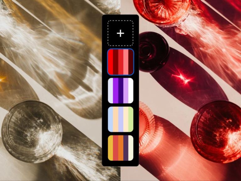
The colour palette follows a similar duality, pairing rich, sophisticated tones with unexpected vibrant accents. This contrast reflects the brand’s balance of professionalism and raw, uncompromising energy, ensuring that Mavens stands out while remaining adaptable across different applications.
At the heart of the identity is the wordmark, designed with unconventional character proportions that reference the Bauhaus movement. Historically, the Bauhaus school preached progress but sidelined women, restricting them to certain disciplines while men dominated design, architecture, and innovation. Reclaiming this historically male-dominated aesthetic for a gender equality movement subverts its legacy, turning a symbol of exclusion into a tool for change.
The punk attitude also extends into the tone of voice. Morris explains: “In our writing, we encourage contributors to use swear words strategically—not in a way that’s condescending or disrespectful, but in a way that feels direct and unapologetic.
“Our positioning line ‘Until equality is the new norm’ is an example of this.”
She adds that the Mavens style guide isn’t afraid to push boundaries, embracing provocative, humorous, and sharp-edged language to cut through the noise. “We iterate that we can be vulgar, yes – we’re all about that big pussy energy. We’d probably draw the line at ‘c**‘, though. Not sure if you’ve ccked up? Just check with the Editor.'”
More than just a visual transformation, the new identity reflects Mavens’ expanded mission—not just to support women entering the creative industries but to ensure they thrive within them.
“With our cohesive visual identity making us attractive to a broader audience, we can continue to grow our platform,” says Morris. “And our platform is effectively a mouthpiece that we can lend to anyone who is aligned with our gender equality mission and has something to say.”
The platform spotlights women who have achieved success in design, advertising, and media, creating visibility for emerging creatives.
“Because you can’t be what you can’t see,” Morris adds.
Mavens also regularly amplifies other industry initiatives driving meaningful change, such as Assisterhood, Never Not Creative, and The Aunties, which offer mentoring and mental health resources. But the fight for equality goes beyond just visibility—it’s also about changing perceptions.
“We need to rebrand ‘gender equality’ as a whole so it’s something everyone wants to get around, especially men who often perceive it as a very uncomfortable space,” says Morris.
“With Mavens representing gender equality—and looking as slick as we now do—we’re feeding into that outcome. It’s especially important given we’re talking to a collective of the most aesthetics-obsessed industries out there (creative advertising, media, marketing, design, and tech, to name a few).”
Morris argues that traditional approaches to gender equality in the workplace – think International Women’s Day cupcakes and corporate slide decks – are outdated and ineffective.
“Women are fed up with platitudes, and disruption is the ultimate antidote to that,” she says. “We’re past asking, and now we’re demanding better.”
Arapian believes that the new identity shifts Mavens from a content platform to an action-driven force. “This rebrand will shift the perception of Mavens from being a source of content to a dynamic, action-driven force that inspires and engages underrepresented people, allies, and industry stakeholders to take part in its movement for change,” she says.
“It will create a deeper connection with people and form stronger communities, amplifying the movement’s relevance and overall impact.”
For Mavens, this rebrand is just the beginning. The new identity lays the groundwork for deeper engagement, increased activism, and a more visible, influential presence in the creative industries.
“The Bauhaus-inspired wordmark symbolises something bigger than just a logo,” says Arapian.
“Reclaiming this visual language for Mavens rewrites the narrative on who gets to create the future.”
With a visually disruptive and editorially sharp identity, Mavens is ready to challenge, provoke, and push for a creative industry where gender equality isn’t a talking point but a reality.