This comprehensive design glossary brings together essential design terms in one alphabetical reference.
From foundational concepts like alignment, balance, and contrast to technical terms such as bleed, crop marks, DPI, and resolution, each entry explains the language behind effective visual communication. You’ll find branding terms like brand identity, brand mark, brand guidelines, and brand positioning, alongside detailed typography definitions including ascenders, descenders, kerning, leading, tracking, serif, sans serif, x-height, widows, and orphans.
The glossary also covers brand color systems (CMYK, RGB, HEX, Pantone), layout principles (grid systems, visual hierarchy principles, white space, proximity), file formats (SVG, EPS, PNG, JPEG, TIFF), and production terminology related to vector graphics, raster images, and scalable output.
Digital design terms such as UI, UX, responsive design, CTA, landing pages, accessibility, and user journey are included, along with marketing and branding language such as collateral, campaigns, sustainable packaging design, trademarks, and visual storytelling.
Whether you’re refreshing the basics, clarifying industry jargon, or preparing to collaborate with designers and clients, this glossary serves as a practical, easy-to-navigate reference for the language of design.
Let’s get started.
Adobe Acrobat
Adobe Acrobat is a program for working with PDF files. It lets you create, view, edit, and share PDFs easily. You can convert PDFs into Word, Excel, or PowerPoint files, and combine multiple documents into one PDF. Many features work directly in your browser for convenience and secure file management.
Aliasing
Aliasing, also called spatial aliasing, happens when image edges look jagged or stair-stepped instead of smooth. It occurs because pixels cannot perfectly represent curved or diagonal lines at low resolution. As a result, the outline of objects appears rough or uneven, reducing overall image clarity and visual quality.
Alley
An alley is the blank vertical space between columns of text on a page. It helps separate content and improves readability. An alley is not the same as a gutter, which is the inner margin space between two facing pages in a book or magazine layout.
Alpha Channel
An alpha channel is used in graphic design to control transparency. It stores information about which parts of an image are visible or hidden. This allows images or colors to blend smoothly when layered. In 32-bit graphics, the fourth channel is the alpha channel, which manages transparency.
Animated GIF
An animated GIF is an image file that contains multiple frames shown in sequence. These frames play automatically in a loop to create simple motion or animation. It does not include sound and is widely used online for short, repeating visuals and expressive content.
Animation
Animation is the process of showing a series of images in quick succession to create the illusion of movement. Each image is slightly different from the one before it. When played together at speed, they appear as continuous motion in films, videos, games, or digital media.
Anti-aliasing
Anti-aliasing is a technique that smooths jagged edges in digital images. It works by blending the colors of edge pixels with nearby background pixels to create smoother curves and lines. This reduces roughness, though it can sometimes make edges appear slightly softer or less sharp.
Aperture
In typography, an aperture is the open space inside a letter that is not fully closed. It is the gap that allows light or white space to enter the shape. Letters like “C,” “S,” and “e” have apertures that affect readability and overall type style.
Apex
In typography, an apex is the top point where two strokes of a letter meet. It is usually sharp or angled. For example, the uppercase “A” has an apex at its highest point, and the letter “X” has apexes where its strokes intersect.
Arm
In typography, an arm is a horizontal or diagonal stroke that extends from a letter without connecting at one end. It projects outward from the main stem. In some cases, it is also called a crossbar, depending on its position and function.
Ascender
An ascender in typography is the part of a lowercase letter, like b, d, or h, that rises above the main body of the text, known as the x-height. It helps distinguish letters, improves readability, and gives the typeface its unique visual rhythm and style.
Ascender line
The ascender line in typography is an imaginary horizontal line that marks the top of ascenders on lowercase letters, like b, d, or h. It shows how high these parts of letters extend above the main body (x-height), helping maintain consistent letter proportions and alignment in a typeface.
Ascent line
The ascent line in typography is an imaginary horizontal line above the baseline that marks the topmost point of the tallest glyphs in a typeface. It helps define the maximum height letters can reach, ensuring consistent spacing, alignment, and overall readability across text.
ASP (Active Server pages)
ASP, or Active Server Pages, is a Microsoft-developed software tool that allows developers to create interactive and dynamic web pages. It processes server-side scripts, generates HTML content, and delivers it to users’ browsers, enabling websites to respond to user input and display customized content efficiently.
Axis
In typography, the axis is an imaginary line around which the main strokes of a letter are arranged. It shows the direction of stress in a character, helping define its style, weight distribution, and overall appearance, especially in curved letters like o, c, or e.
Ball
A ball terminal in typography is the small, rounded, or circular end found on the stroke of certain letters, like a, c, or f. It adds a decorative touch, improves readability, and gives the typeface a distinct personality and elegant appearance.
Banner
A banner is the top section of a newspaper or magazine’s front page. It displays important information such as the publication name, volume, and date. The headline is usually in a larger font, while other details are smaller. In newspapers, a banner headline may also indicate the main story.
Baseline
The baseline is an imaginary horizontal line on which most letters in a typeface sit. It ensures consistent alignment of text. Some letter shapes, like rounded or descending letters (g, p, q), extend below the baseline, but it serves as the main reference for the text’s overall structure and balance.
Beak
In typography, a beak is a sharp, pointed extension at the end of a letter’s arm or stroke. It adds character and style to the typeface, enhances visual distinction between letters, and contributes to the overall design and readability of the text.
Bevel
In graphic design, a bevel is an effect that gives an image or object a 3D appearance. By highlighting its edges and inner surfaces, the beveled effect makes the object look raised or recessed, adding depth, dimension, and a more realistic or visually appealing appearance.
Bilateral serifs
Bilateral serifs are small decorative lines or strokes added to both ends of a letter’s main vertical or horizontal stroke. They enhance readability, give the typeface a classic or formal appearance, and help maintain visual balance and structure in printed or digital text.
Bit-mapped
Bit-mapped mode in image graphics refers to images made up of tiny individual pixels, each representing either black (on) or white (off). This mode is commonly used for detailed images without vector data, allowing precise control over each pixel’s appearance but limiting scalability.
Black (font)
A black font is a typeface style that is heavier and thicker than the bold version within the same font family. It has more visual weight, making text stand out strongly, and is often used for headlines, titles, or any content requiring maximum emphasis and impact.
Bleed
Bleed is a printing technique where an image or background extends beyond the page edges to reach all four corners. To achieve this, the design is first printed on a larger sheet and then trimmed to the final size, ensuring no white edges appear on the finished page.
Block quote
Bleed is a printing technique where an image or background extends beyond the page edges to reach all four corners. To achieve this, the design is first printed on a larger sheet and then trimmed to the final size, ensuring no white edges appear on the finished page.
Body height
In typography, body height refers to the total vertical space that a character occupies, from its lowest point to its highest point. It includes all parts of the letter, such as ascenders, descenders, and the main body, helping maintain consistent spacing and alignment in text.
Body type
Body type is the typeface chosen for the main text of a page. It is used in newspapers, magazines, blogs, and other publications to ensure readability and consistency. This typeface forms the bulk of the content, making the text easy to read and visually appealing.
Bowl
In typography, a bowl is the curved, enclosed part of a letter that connects to a stroke, as seen in letters like b, d, or p. It can also refer to fully circular letters, such as o, and helps define the shape, style, and readability of a typeface.
Bracket
In typography, a bracket is a small curved or angled connection between a letter’s serif and its main stem. It smooths the transition between the two, giving the typeface a more refined and cohesive appearance. Not all serifs have brackets, as some are straight or unbracketed.
Browser
A browser is software that allows users to access and view web pages on the internet. It interprets website data, including text, images, and videos, and displays it in a readable format. Common browsers include Chrome, Firefox, Safari, and Edge, enabling smooth navigation across the web.
Byline
A byline is a line or short phrase in books, magazines, newspapers, or other publications that names the author of an article or piece. It gives credit to the writer, usually appearing at the beginning or end of the text, helping readers identify who created the content.
Call out
A callout is a text label connected to an image with an arrow or pointer. It provides information or describes a specific part of the image, helping viewers quickly understand details or important features based on where the pointer is directed.
Camera-ready
Camera-ready copy is a publication or document that is fully prepared for printing without needing further changes. It can be a physical layout or a digital file, like from desktop publishing software, and is ready to be used directly to create printing plates for final production.
Cap height
Cap height in typography is the distance from the baseline to the top of a capital letter. It defines how tall uppercase letters are compared to lowercase letters in the same typeface, helping maintain consistent proportions and visual balance in text.
Caption
A caption is a short, clear description accompanying an image. It provides context or information about the picture, helping readers understand its meaning. Captions are commonly used in magazines, newspapers, and online media to grab attention and explain the content of photos, illustrations, or graphics.
Cast shadow
A cast shadow is the shadow that an object or image creates on a surface when light falls on it. It adds depth and dimension, making the object appear three-dimensional and more realistic, enhancing the overall visual effect in design, photography, or illustration.
Check box
A check box is a small square on web pages or computer screens that allows users to make selections. When clicked, it activates a feature or records a response. Check boxes are commonly used in online forms, surveys, and questionnaires to gather user input efficiently.
Clip-art
Clip-art is a pre-made image or illustration available in print or digital form. Unlike photographs, it is created by hand or with software. Easily accessible and widely used, clip-art serves both personal and professional purposes, providing quick visual elements for documents, presentations, and designs.
CMYK
CMYK is a color model used in printing. It stands for Cyan, Magenta, Yellow, and Key (Black). Colors are created by mixing these four inks. Black is called “Key” because it provides depth and contrast, completing the range of colors for accurate and vibrant print results.
Color separation
Color separation is the process of dividing an image into its four color components: Cyan, Magenta, Yellow, and Black (CMYK). Each color is printed on a separate plate, and when combined on paper, they create a full-color image, ensuring accurate color reproduction in printing.
Color spacing
Color spacing is the adjustment of space between words or letters that are too close together. By adding this space, text becomes more readable and visually appealing, improving the overall layout and making the publication look balanced, engaging, and easier for readers to follow.
Column gutter
A column gutter is the space between two text columns in a layout. Also called an alley, it ensures that text from adjacent columns doesn’t overlap, improving readability and visual balance. It is different from the general term “gutter,” which can refer to page margins or edges.
Comprehensive layout
A comprehensive layout is a detailed blueprint of a publication showing how text, graphics, and illustrations will be arranged on the page. It guides designers and writers by specifying content placement, font choices, and visual elements, ensuring the final publication is organized, visually appealing, and ready for production.
Concept
A concept is a general idea or understanding formed in the mind. It is created by observing examples, events, or illustrations and drawing connections between them. Concepts help organize thoughts, guide creativity, and provide a foundation for planning, problem-solving, or designing in various fields.
Condensed font
A condensed font is a typeface that is narrower than the regular version of the same font. It is used to save space, fit more text into a given area, or create a distinct visual effect, while maintaining readability and style in the design.
Continuous
Continuous tone refers to artwork or images that display smooth variations in shades of gray, without visible dots or patterns. Examples include black-and-white photographs or sketches made with pencil or charcoal. This technique creates realistic depth, shading, and subtle transitions between light and dark areas in the image.
Cookie
A cookie is a small piece of data sent from a website and stored in a user’s web browser. It remembers information about the user, such as previous visits or searches, allowing the website to personalize content, settings, and improve the browsing experience for that user.
Counter
In typography, a counter is the enclosed or partially enclosed space within a letter or number. Examples include the center of o, b, d, p, q, 6, and 8. Counters help define the shape of characters, improve readability, and contribute to the overall appearance of a typeface.
Creative brief
A creative brief is a document that provides designers with a clear understanding of a client’s requirements. It includes all essential information about the project, such as goals, target audience, and desired outcomes, guiding the design process and ensuring the final product meets the client’s expectations.
Crop marks
Crop marks, also called trim marks, are lines printed on a sheet to show where an image or page should be cut. They guide the printer, especially when printing bleeds, where images extend beyond the page edges and are trimmed to achieve a clean, finished layout.
Cropping
Cropping is the process of removing unwanted parts of an image to focus on the important area. It helps improve composition, remove distractions, and enhance the overall visual impact. Cropping is one of the most commonly used tools in photo editing and graphic design.
Cross stroke
A cross stroke in typography is a horizontal line that passes through the main stem of certain letters, such as lowercase f and t. It is often confused with a crossbar, but unlike a crossbar, a cross stroke cuts through a single stroke rather than connecting two.
Crossbar
A crossbar, also called a bar, is a horizontal line that connects two main strokes of a letter. Examples include the uppercase A and H. It helps define the structure of the character, contributes to the typeface’s style, and improves readability in text.
Crotch
In typography, a crotch is the inside space where two strokes of a letter meet, forming an acute angle. Examples include the meeting point in letters like V, W, and Y. The crotch affects the letter’s appearance, balance, and overall readability in a typeface.
CSS
CSS is a coding language used to style and format web pages written in HTML or XHTML. It controls the appearance of text, images, layouts, colors, and other elements, allowing designers to create visually appealing and consistent websites efficiently.
Cutline
A cutline, also called a photo caption, is a brief explanation accompanying an image. It provides context or information about the picture in just a few words. Unlike longer captions, a cutline is short and concise, giving readers a quick understanding of the photo or illustration.
Descender
In typography, a descender is the part of a lowercase letter that extends below the baseline, such as in g, j, p, q, and y. Some uppercase letters in certain typefaces may also have descenders. They help define letter shapes and improve readability and visual balance in text.
Descender line
The descender line in typography is an imaginary horizontal line located below the baseline. It marks the lowest point that the descender of a letter, such as g, j, p, q, or y, can reach. This line helps maintain consistent spacing and alignment in a typeface.
Descent line
The descent line in typography is an imaginary horizontal line below the baseline that marks the lowest point of the tallest descender in a typeface. It helps define the vertical space a font occupies, ensuring consistent alignment, spacing, and proportion across all characters in the text.
DHTML/Dynamic HTML
DHTML, or Dynamic HTML, is a web development technique used to create interactive and dynamic web pages. It combines HTML, CSS, and JavaScript to allow content, style, and page elements to change in real-time, enhancing user experience without needing to reload the entire web page.
Diactric
A diacritic is a mark added to a letter to indicate correct pronunciation. Also called an accent mark, it modifies the sound or meaning of the character. Diacritics are commonly used in languages like French, German, and Spanish to guide proper reading and pronunciation.
Diagonal stroke
In typography, a diagonal stroke is a slanted line that forms part of a letter’s structure. It appears at an angle, connecting different parts of the character, as seen in letters like A, K, N, and V. Diagonal strokes add style, movement, and visual balance to the typeface.
Dingbat typeface
A dingbat typeface is a font that replaces letters and numbers with symbols, ornaments, or decorative designs. Instead of standard text, it provides small graphic elements that can be used for decoration, bullets, icons, or visual interest in documents, publications, and digital designs.
Discretionary hyphen
A discretionary hyphen, also called a soft hyphen, is used to divide a word at the end of a line when it doesn’t fit. It indicates that the word continues on the next line, helping maintain proper text alignment and improving the layout’s readability and appearance.
Display type
Display type is a larger and often bolder font than body type, designed to attract attention. It is primarily used for headings, titles, or advertisements. Its size and style make text stand out, helping emphasize key information and create visual interest in print or digital layouts.
Dithering
Dithering is a process where the colors of an image are reduced to show a third color which is also present. It makes the image look even and the effect is achieved by adding noise to the picture. Therefore the images seem blur or distort.
DNS/Domain Name System
DNS, or Domain Name System, is a system that assigns human-readable names to websites and domains. It translates these names into IP addresses, allowing computers to locate and connect to websites easily. DNS makes navigating the internet simpler by replacing numeric addresses with readable domain names.
Dot
In typography, a dot, also called a tittle, is the small mark placed above the stem of certain lowercase letters, such as i and j. It helps distinguish letters, improves readability, and is an essential part of the character’s design in many typefaces.
DPI (dots per inch)
DPI, or dots per inch, measures the resolution of an image or printed material. It indicates how many tiny dots a printer or screen can place in one inch. Higher DPI means sharper, more detailed images. Common laser printers usually print at around 300 DPI.
Draft
A draft is a preliminary sketch or blueprint of an image, graphic, or design. It provides a rough idea of the final appearance, layout, or composition. While it serves as a guide for planning, the draft may differ significantly from the completed product once finalized.
Drop shadow
A drop shadow is a visual effect added to an image or object to create the illusion of depth. It simulates a shadow behind the element, making it appear raised or three-dimensional, enhancing visual contrast, realism, and overall impact in graphics, design, and digital layouts.
Drop-down menu
A drop-down menu is a list of options on a website or software interface that appears when a user clicks or hovers over a tab. It organizes choices neatly, saves space, and allows users to quickly navigate or select items without cluttering the screen.
Duotone
A duotone is an image created using two colors, typically black and another shade. This technique enhances visual interest, highlights specific areas, and adds depth to the image. Duotones are commonly used in printing and design to draw attention and create striking, artistic effects.
Ear
In typography, an ear is a small decorative stroke that extends from the top right of a lowercase g. It can also appear in certain styles of the lowercase r. Ears add character, style, and subtle detail to letters, enhancing the overall look of the typeface.
Egyptian type
Egyptian type, developed in the mid-19th century, is a typeface where the serifs have the same weight as the main strokes. Slab serif is the most common style, featuring bold, thick letters with heavy, rectangular serifs, making it highly visible and suitable for headlines and display text.
Em space
An em space is a typographic unit equal to the point size of a typeface. For example, if a font is 12 points, one em space equals 12 points. It is used for spacing, indentation, and layout, helping maintain consistent proportions in text design.
Emboss or embossing
Embossing is a graphic effect that makes a part of an image appear raised or engraved. It creates the illusion that certain elements are layered on top of the background, adding depth, texture, and a three-dimensional appearance to designs, illustrations, or printed materials.
En space
An en space is a typographic unit equal to half the point size of a typeface. For example, in a 12-point font, one en space equals 6 points. It is commonly used for spacing, indentation, and aligning text while maintaining consistent proportions in a layout.
Error 404
Error 404 is a common web error that appears when a server cannot locate a requested web page. It indicates that the page may have been moved, deleted, or the URL typed incorrectly. This error helps users know the page is unavailable and prompts them to check or navigate elsewhere.
Expanded font
An expanded font is a typeface where the characters are wider than the standard version. The letters are stretched horizontally, giving text a broader appearance. Expanded fonts are used to make text stand out, fill space, or create a bold, attention-grabbing effect in headlines and designs.
Export
Export is the process of saving a file in a format that can be used in other programs or platforms. Graphic designers use exporting to share, print, or repurpose their work, ensuring compatibility while preserving the design, layout, and quality across different software and applications.
Extended typefaces
Extended typefaces are fonts with a horizontally stretched body compared to regular fonts. Unlike expanded fonts, where individual characters are widened, extended typefaces make the overall text appear broader without altering the proportions of each character. Examples include Latin Wide and Egyptian Expanded, which differ in style and design.
Eye
In typography, the eye is the enclosed space within the lowercase letter e. It is formed by the curve of the letter and the horizontal stroke. The eye helps define the shape and readability of the character, contributing to the overall appearance and legibility of the typeface.
Facing pages
Facing pages are the two pages that appear side by side when a book, magazine, or similar publication is opened. They are positioned opposite each other, with one on the left and the other on the right, allowing readers to view and read both pages together at the same time easily.
Feather
Feather is the extra space added between lines, paragraphs, or headings in a page layout. This additional spacing helps adjust the position of text so that the baselines of lines in different columns line up evenly, making the page look neat, balanced, and visually organized for readers.
Final file format
Final file format refers to the type of file used to deliver the completed design to a client. Designers export their work in formats suitable for printing or digital use. Common examples include AI, CDR, EPS, PDF, PSD, JPG, GIF, and TIF, each supporting different purposes, quality levels, and software compatibility.
Finial
In typography, a finial is the small, thin, and curved ending found at the end of certain letter strokes. It usually appears in lowercase letters like “c” and “e.” This feature gives the letter a smooth and finished look, adding style and detail to the overall design of the typeface.
Flag
In typography, a flag is a small, sharp line or stroke that appears on the top right side of the number five in some typefaces. It is a tiny design detail added to the numeral, helping give the character a clearer shape and a more distinctive appearance.
Flash
Flash, also known as Adobe Flash, is a multimedia and animation software used to create vector graphics, animations, games, and interactive web content. It allowed designers to add graphics, videos, and effects to websites that worked across different browsers. However, its use on modern websites has greatly declined.
Flash logo
A Flash logo is a logo created using Adobe Flash software. These logos often include animation, movement, or interactive effects that make them more dynamic than static logos. They were commonly used on websites to attract attention, but their use has decreased as modern web technologies replaced Flash.
Flight check
Flight check is a software tool that examines design or document files before printing or final production. It checks files created in programs like Adobe Illustrator or PDF for possible errors, such as missing fonts, incorrect images, or formatting problems, helping designers fix issues before sending the work to clients or printers.
Folio
Folio refers to the page number in a document, book, or publication. It helps readers keep track of pages and navigate the content easily. The folio is usually placed in the header or footer of a page and is an important element in organizing printed or digital documents.
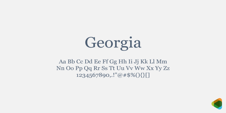
Font
A font is a set of letters, numbers, and symbols designed with a particular style, size, and appearance. Fonts are used to display text in documents and designs. Each font belongs to a font family and shares common design features with other fonts in the same family.
Form
A form is a section on a web page used to collect information from users. People can enter details such as names, email addresses, or messages into fields. These forms, often called web forms or HTML forms, help websites gather data and allow users to communicate or submit requests online.
Four color process
The four color process is a printing method used to create full-color images. It uses four basic ink colors: cyan, magenta, yellow, and black (CMYK). These colors are printed as tiny dots that overlap or appear close together, allowing different shades and colors to form when viewed from a normal distance.
Frame
In graphic design, a frame is a single image that is part of a sequence of many images. Each frame shows a small step of movement or change. When these frames are displayed one after another quickly, they create the effect of animation or motion in videos, GIFs, or digital media.
Galley
A galley is text that is arranged in columns before the final page layout is completed. In desktop publishing, galleys are printed from page layout programs so editors can review the text, check for errors, and adjust spacing or length before the document is finalized for printing or publication.
GIF
GIF (Graphic Interchange Format) is a type of compressed image file used to create bitmap graphics. It is widely used on the internet because the files are small and load quickly. GIF images can display up to 256 colors and are often used for simple graphics, icons, and short animations.
Glow
Glow is a visual effect used in graphic design where a soft light or dark highlight appears around an image, object, or text. It creates the impression that the element is shining or standing out from the background. Designers use glow to attract attention and add depth or emphasis.
Glyph
In typography, a glyph is the visual form of a character shown as a symbol, such as letters, numbers, or punctuation marks like H, 2, or ?. A typeface may include different glyphs for the same character. These alternate designs give designers more options for styling text.
Gradient
A gradient is a graphic design tool that creates a smooth transition between colors or shades. It slowly changes the color from dark to light or from one color to another. Gradients are commonly used in digital design to add depth, visual interest, and a more natural color variation.
Graphic design
Graphic design is the art of creating visual content using typography, colors, images, and layouts to communicate ideas or messages. It helps present concepts in a clear and attractive way. Graphic design is used in many areas such as web design, logo creation, brochures, posters, pamphlets, and marketing materials.
Grayscale images
Grayscale images, also called black and white images, are pictures made using different shades of gray instead of colors. They are bitmap images formed with tiny dots. Darker areas contain larger or denser dots, while lighter areas have smaller or fewer dots, creating variations in brightness and detail.
Greeked text
Greeked text is placeholder text used in page layouts when the real content is not yet available. It helps designers see how the text will look and fit on a page. A common example is “Lorem Ipsum,” a meaningless sample text used to display the structure and appearance.
GUI/ Graphical User Interface
GUI, or Graphical User Interface, is a system that allows users to interact with a computer through visual elements such as icons, windows, buttons, and menus. Instead of typing commands, users can click and navigate easily, making computers simpler and more user-friendly for performing different tasks.
Gutter
Gutter is the blank space between two facing pages in a book, magazine, or document. This space is left to allow room for binding so that the pages can be joined together properly. A well-sized gutter ensures the text near the center is not hidden or difficult to read.
Hairline
Hairline in typography is the thinnest stroke of a letter or character in a typeface. It appears in fonts where strokes have different widths. Hairlines create contrast with thicker strokes, helping letters look more elegant, balanced, and clear in the overall design of the typeface.
Halftone
Halftone is a printing technique used to create images with continuous tones by using many small dots. These dots vary in size to show different shades. Darker areas contain larger or denser dots, while lighter areas have smaller dots, allowing detailed images to appear when viewed from a distance.
Halftone screen
Halftone screen is a tool used in printing and publishing to create images using tiny dots. The number of dots per inch affects the image quality. More dots produce a clearer image. Dark areas have larger or denser dots, while lighter areas contain smaller dots to show different shades.
Hang indent alignment
Hanging indent alignment is a text formatting style where the first line starts at the left margin and the following lines are indented to the right with equal spacing. This format is often used in lists, references, or bibliographies to make items easier to read and clearly organized.
Hard hyphen
Hard hyphen is a hyphen that permanently joins two parts of a word and always remains visible. The word is not broken at another place during line wrapping. It differs from a soft hyphen, which only appears when a word splits at the end of a line.
Hard return
A hard return is the mark that ends a paragraph in a document. It is created when the user presses the Enter key on the keyboard. This action starts a new paragraph. In many text editors, it is shown with a pilcrow symbol (¶), which looks like a reversed letter P.
Head
A head is a short phrase or line of text that appears larger than the main body text in a document. It introduces or summarizes the content that follows. Heads help readers quickly understand the topic and attract attention to important sections of the text.
Hexadecimal
Hexadecimal is a number system that uses sixteen symbols: the numbers 0–9 and the letters A–F. It is commonly used in computers to represent binary numbers in a shorter and easier form. This system helps programmers and designers work with digital data more efficiently.
Hook
Hook in typography is the curved or bent part at the end of a stroke in a letter. It appears in some characters, such as the lowercase “f.” This small curved detail helps shape the letter and adds style to the overall design of the typeface.
HTML
HTML, or Hypertext Markup Language, is the standard coding language used to create and structure web pages on the internet. It uses tags to organize content such as text, images, and links. Web developers use HTML to build the basic layout and structure of websites.
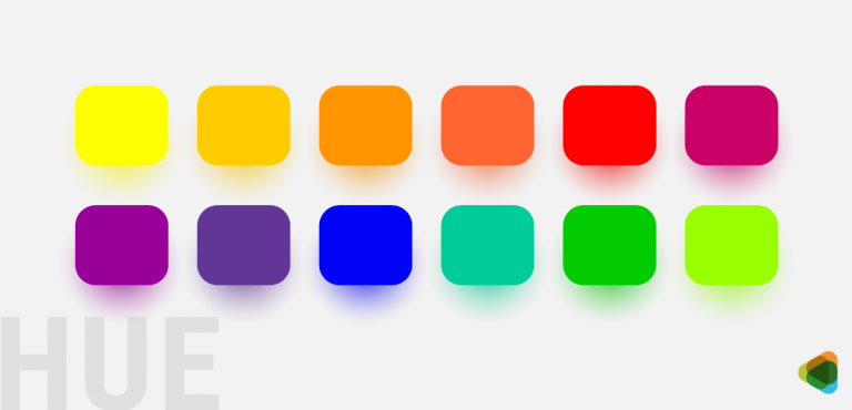
Hue
Hue is a term used to describe a color or the basic type of color we see, such as red, blue, green, or yellow. It refers to the different variations of a color that help distinguish one color from another in design, art, and digital graphics.
Hyperlink
A hyperlink is a piece of text, image, or element on a webpage that connects to another webpage, document, or location. When users click it, they are taken directly to the linked content. Hyperlinks help people navigate easily between pages and access related information online.
Hypertext
Hypertext is a type of digital text that contains links connecting it to other documents, pages, or sections. These links allow users to move easily from one piece of information to another. Hypertext is widely used on websites to organize content and help readers navigate related information quickly.
Hyphenation zone
Hyphenation zone is the space near the right margin in ragged-right text where words may be split with hyphens. It helps prevent large empty gaps at the end of lines. Designers may also use discretionary hyphens to break long words properly and keep the text layout neat and balanced.
Illustration
Illustration is artwork created by artists to visually represent an idea or concept. It can include drawings, paintings, sketches, or photographs. Illustrations make designs more interesting and attractive. They are often created using artistic or digital tools to add visual impact and help communicate messages clearly in books, advertisements, and media.
Image map
An image map is a single image on a web page that contains multiple clickable areas. Each area acts as a hyperlink and leads to a different page or section. It allows one image to provide several links, helping users navigate to different content by clicking specific parts of the image.
Interlace
Interlace is a technique used in digital images where a low-quality or rough version of the image appears first and then gradually becomes clearer. The image loads in stages, improving step by step until the full, detailed picture is displayed to the viewer.
Italic
Italic in typography is a style of text where the letters are slightly slanted to the right. It is based on handwritten forms and has smoother curves and shapes than regular fonts. Italic text is often used to emphasize words, titles, or special parts of the content.
JavaScript
JavaScript is a programming language used to create interactive features on web pages. It helps developers add elements such as graphics, images, animations, and dynamic content. With JavaScript, websites can respond to user actions, making web pages more interactive, functional, and engaging for visitors.
JPEG
JPEG (Joint Photographic Experts Group) is a digital image file format used to store photographs in a compressed form. It reduces file size using mathematical compression methods by removing less important image details. This allows images to take up less storage space while still maintaining acceptable visual quality.
Kern
Kerning is the adjustment of space between two characters in a word. It is used to reduce or increase the gap so the letters look evenly spaced. Proper kerning improves the appearance of text and prevents large or uneven spaces that can make the typography look unbalanced or unprofessional.
Keyline
Keyline is a thin outer line used in design and printing to show the exact size, shape, and position of an image or element. It acts as a guide for placement and trimming, helping designers and printers ensure the final printed image appears correctly and in the right location.
Kicker
A kicker is a short phrase or line placed above the main heading of a text or article. It is usually written in a smaller font than the headline but larger than the body text. The kicker introduces the topic and gives readers a quick idea of the content.
Knockout
Knockout is a printing technique where one colored element is removed from the area beneath another element. Instead of printing colors on top of each other, the background color is “knocked out” so the top color prints clearly. This prevents colors from mixing and keeps the final image accurate.
Landscape (orientation)
Landscape orientation is a page layout where the width of the page is greater than its height. In this format, the page appears wider than it is tall. It is the opposite of portrait orientation and is often used for presentations, images, charts, and wide designs.
Lap register
Lap register is a printing technique where colors are slightly overlapped to ensure they meet correctly. This small overlap prevents unwanted white gaps from appearing between different colors during printing. It helps maintain a clean, smooth look in the final printed image or design.
Leader
A leader is a row of small dots or lines used in a document to guide the reader’s eye from one piece of information to another. It often connects text to page numbers or sections, helping readers easily follow and locate related information in a publication.
Leading
Leading is the vertical space between two lines of text in typography. It is measured as the distance from the baseline of one line to the baseline of the next line. Proper leading improves readability and makes the text easier and more comfortable for readers to follow.
Leg
Leg in typography is the slanted or angled stroke that extends from the main part of a letter. It can be seen in characters such as “K” and “R.” This stroke gives the letter its distinctive shape and helps define the structure and style of the typeface.
Letterform
Letterform in typography refers to the specific shape and design of a character. It includes the curves, strokes, and structure that give each letter its unique appearance. Different letterforms add style and beauty to text and help create the overall visual character of a typeface.
Ligature
Ligature in typography is a special character formed by joining two letters together into a single symbol. It is used to improve the appearance and readability of text. Common examples include combinations like “fi” or “fl,” where the letters are connected and displayed as one unified character.
Light (font)
Light (font) is a typeface style that has thinner strokes than regular or normal fonts. It appears lighter in weight but is still thicker than very thin styles such as extra-light, ultra-light, thin, or hairline. Light fonts are often used to create a clean and elegant appearance in typography.
Line – art
Line art is a type of artwork created using only two colors, usually black and white. It uses clear lines to form images without shading or gradual color changes. Examples include pen-and-ink drawings and simple digital graphics, where the picture appears on a plain background with strong outlines.
Link
Link in typography is the small stroke in the lowercase letter “g” that connects the upper part of the letter to the lower loop. This connecting part helps form the structure of the character and keeps the two sections of the letter visually joined together.
Logotype
A logotype, often called a logo, is a visual symbol, name, or design used to represent and identify a company, brand, organization, or product. It helps the public recognize and remember the brand easily. Logos are widely used in advertising, branding, packaging, and marketing materials.
Loop
Loop in typography is the enclosed or circular part of the lowercase double-story “g” that appears below the baseline. It forms the lower section of the letter and connects to the upper part through a small stroke, helping create the complete shape and structure of the character.
Low resolution image
A low-resolution image is a picture that contains fewer pixels, so it lacks detail and may appear blurry or distorted. Because the image has limited visual information, it does not display sharp edges or clear features. Low-resolution images are usually smaller in file size but lower in visual quality.
LPI
LPI stands for Lines Per Inch, a measurement used in printing to describe the number of halftone lines or dots placed in one inch. It helps determine the quality and detail of a printed image. Higher LPI values usually produce smoother and more detailed printed pictures.
Majuscule
Majuscule in typography refers to uppercase or capital letters used in writing. These letters are usually larger and often used at the beginning of sentences, for proper names, or to highlight important words. Examples include A, B, C, and other capital forms in the alphabet.
Masthead
Masthead is a section in a publication that lists the people involved in creating it. It usually includes the names of editors, writers, designers, photographers, and sponsors. The masthead may also provide contact details, subscription information, and other important details about the publication and its team.
Measure
Measure in typography is the length or width of a line of text, usually measured in picas. It refers to how much horizontal space a line occupies, whether the line is full, partial, or empty. When text is arranged in columns, the width of each column is called the column measure.
Meta tag
Meta tag is an HTML tag placed in a web page’s code that provides information about the page’s content. It helps search engines understand what the page is about. Meta tags can include descriptions, keywords, and other details that improve how the page appears in search results.
Mezzotint
Mezzotint is a printing technique used to create images with soft tones instead of visible dots like regular halftones. It produces rich, smooth shading that gives the image a textured or dusty look. Mezzotint images often have a classic, vintage feel and are commonly printed in black-and-white or sepia tones.
Miniscule
Minuscule in typography refers to lowercase or small letters used in writing. These letters are smaller than capital letters and are commonly used in regular text. Examples include a, b, c, and other lowercase forms. Minuscule letters help improve readability and create a natural flow in sentences and paragraphs.
Moiré pattern
Moiré pattern is a visual effect that appears when fine lines or patterns overlap incorrectly in an image. It often happens when a bitmap image is resized, enlarged, or reduced. This creates unwanted wavy or ripple-like patterns that distort the image and reduce its clarity and quality.
Monospace type
Monospace type is a typeface where every character takes up the same amount of horizontal space. Unlike regular fonts, each letter, number, or symbol is equally spaced. This style was commonly used in typewriters and is often used in coding, programming, and technical documents for clear alignment.
Mouse over
Mouse over is the action of moving the cursor over an icon, button, or menu on a screen without clicking it. When this happens, the item may change color, show extra information, or display a menu. It helps users interact with websites or software easily and discover available options.
Negative space
Negative space is the empty area around or between the main elements of a design or image. When used effectively, it helps highlight the main subject and can even form hidden or secondary shapes. Negative space adds balance, clarity, and a creative visual effect to artwork and graphic design.
Neon glow
Neon glow is a visual effect that makes text or images appear to shine with bright, glowing neon colors. It creates a luminous, eye-catching look, often used to highlight or emphasize elements in designs, posters, or digital graphics, giving them a vibrant and modern appearance.
Nested stories
Nested stories are articles in newspapers or magazines that appear within different layouts, columns, or sections. They can vary in size and placement, often positioned inside or alongside main stories. This design helps organize content clearly while allowing multiple related or smaller stories to be presented on the same page.
Objected oriented (mode)
Object-oriented (mode) is a graphic method where images are created using geometric shapes and patterns. It relies on algorithms to define lines, curves, and regions, forming the complete picture. This approach allows precise, scalable graphics that can be easily edited, often used in computer graphics, design, and technical illustrations.
Oblique type
Oblique type is a font style where the letters are slightly slanted to the right. Unlike italic type, oblique keeps the same basic shapes as the regular font without changing curves or forms. It is often used for emphasis while maintaining the original structure of the characters.
Offset printing
Offset printing is a common printing method where an inked image is first transferred from a metal plate to a rubber blanket, and then onto paper. This three-step process produces high-quality, consistent prints, making it ideal for newspapers, books, magazines, and large-scale printing projects.
Open counter
Open counter is the partially enclosed space within a letter or character that is open on one side. Unlike fully closed areas, this gap gives certain letters, like “C” or “S,” their distinctive shapes. Open counters affect readability and overall appearance in typography and design.
Orphan
Orphan is the first or last line of a paragraph that appears alone at the top or bottom of a page. It is separated from the rest of the paragraph because the remaining text continues on the next or previous page. Orphans can disrupt reading flow and page layout.
Pantone Matching System
Pantone Matching System (PMS) is a standardized color system used in printing to ensure accurate color reproduction. Each color is assigned a unique Pantone number, allowing designers and printers to match and reproduce the exact shade consistently, especially when using spot colors for branding, logos, and professional print materials.
Paste-up
Paste-up is a technique in desktop publishing where text or graphics from different sources are combined into a single layout. Text can be copied or cut from one program and placed elsewhere electronically, while images and other elements are arranged together on a board to create a complete, ready-to-print design.
Pica
Pica in typography is a unit of measurement used to size columns, margins, and other spaces in page layouts. One pica equals 12 points. Designers and typographers use picas to ensure consistent spacing, alignment, and proportions, helping create balanced and visually appealing printed or digital documents.
Point
Point is a unit of measurement in typography used to define font size, spacing, and other page layout elements. One point is approximately 1/72 of an inch. Points help designers maintain consistency in text and layout, ensuring that type and spacing are precise and visually balanced.
Portable Network Graphics (PNG)
Portable Network Graphics (PNG) is an image file format that uses lossless compression, keeping image quality intact. It is widely used on the internet for web graphics, supporting transparency and high-quality visuals. PNG was developed to replace the older GIF format, offering better color support and clearer images.
Posterization
Posterization is a process in image editing where continuous tones are reduced to a few distinct shades. Instead of smooth gradients, the image shows abrupt transitions between colors or brightness levels. This effect creates a stylized, graphic look, often used for artistic purposes or to emphasize contrast in images.
Printer Font
Printer font refers to high-resolution fonts or bitmap outlines used by printers to produce text on paper. These fonts define the shape of each character precisely, allowing the printer to accurately stamp or render letters and symbols, ensuring clear, sharp, and readable printed text in documents and designs.
Process color separation
Process color separation is a technique used to reproduce color photographs in printing. It divides an image into four basic colors—cyan, magenta, yellow, and black (CMYK). These colors are combined in different amounts to create a wide range of hues, allowing accurate and vibrant color printing.
Proportionally spaced type
Proportionally spaced type is a font style where each character has a different amount of space based on its shape and width. Wider letters take more space, while narrower ones take less. This spacing creates a natural, balanced look in text, improving readability and making paragraphs visually appealing.
Pull quote
Pull quote is a phrase or sentence taken from an article and displayed separately from the main text. It is usually highlighted, enlarged, or bolded to draw attention. Pull quotes emphasize key points, break up long text, and add visual interest, making content more engaging and easier to read.
Punctuation block
Punctuation block occurs when lines of right-aligned text end with punctuation marks, causing the right margin to look uneven or jagged. This happens because the spacing adjusts to fit the alignment, creating a “craggy” edge. It is a common issue in justified text design and layout.
Quaint
Quaint in typography is a decorative connecting stroke between two letters. It links characters smoothly, giving the text an elegant or vintage appearance. This stylistic feature enhances the visual appeal of fonts, often making them look classic, artistic, or reminiscent of old-fashioned or antique typefaces.
QuarkXPress
QuarkXPress is a desktop publishing software used to create and design print and digital publications. It allows users to layout text, images, and graphics for magazines, newspapers, brochures, and books. The software provides precise control over typography, colors, and page design, making it a professional tool for publishing.
QuickTime
QuickTime Video is a multimedia software created by Apple that plays, records, and edits audio and video files. It supports a wide range of formats, allowing smooth playback and high-quality media handling. QuickTime is commonly used for streaming, video editing, and viewing digital content on computers and devices.
Ragged right alignment
Ragged right alignment is a text layout where lines start at the left margin and are left-aligned. The right margin is uneven because extra white space appears at the end of lines. This creates a “ragged” or jagged edge, giving a casual, informal, and readable appearance to the text.
Raster
Raster is an image format, also called a bitmap, made up of a grid of tiny pixels arranged in rows and columns. Raster images can be large in file size and may lose quality or become distorted when enlarged. They are stored in various image file formats for digital use.
Recto
Recto refers to the right-hand page in an open book or publication. It typically carries an even page number and faces the left-hand page, known as the verso. Recto pages are often used for important content, headings, or illustrations in printed documents and books.
Redrawing
Redrawing is the process of sketching or creating an image again with improvements or changes. It involves revising the original design to enhance details, correct errors, or update elements. Redrawing allows artists and designers to produce a refined, clearer, and more polished version of the initial image.
Resolution
Resolution is the measure of detail and clarity in an image. It is usually expressed in dots per inch (dpi) or pixels. Higher resolution means more tiny dots or pixels, resulting in sharper, clearer images. Lower resolution can make images look blurry or pixelated, especially when enlarged.
Reverse
Reverse refers to a design or text style where light-colored elements appear on a dark background, often using white or pale colors against darker shades. This technique highlights the content, creates contrast, and makes text or images stand out, adding visual impact and improving readability in graphic design or print.
Revision
Reverse refers to a design or text style where light-coloreRevision is the process of reviewing and improving an image or graphic. It involves identifying errors, making corrections, and applying modifications to enhance quality, accuracy, and appearance. Revisions ensure that the final design is polished, visually appealing, and meets the intended standards or requirements for print or digital use.
RGB
RGB is a color model that combines Red, Green, and Blue light to create a wide range of colors on digital screens. By mixing these three colors in different intensities or percentages, RGB can produce millions of shades, making it the standard model for monitors, TVs, and digital displays.
Right justified alignment
Right justified alignment is a text layout where lines are adjusted so that both the left and right edges of the text are even. Extra space is added between words to create a straight, uniform right margin, giving the text a clean, formal, and balanced appearance on the page.
Rivers
Rivers in typography are visually distracting gaps of white space that run vertically through a block of text. They occur when uneven spacing between words aligns across lines, creating irregular, flowing patterns. Rivers can disrupt readability and the visual harmony of a paragraph, making text harder to follow.
Roman type
Roman type is a widely used font style and one of the three main Western typefaces. Its letters are upright and usually have small decorative strokes called serifs, though some versions are sans serif. Roman type is popular for readability and is commonly used in books, documents, and print materials.
Rough
Rough is a detailed preliminary sketch or blueprint of an image or publication. It shows the design, layout, and approximate appearance at the intended final size. Roughs are typically shared with clients for review and approval before the final version is produced, ensuring the design meets expectations.
Rule (ruling line)
Rule (ruling line) is a straight geometric line used in page design and layout to organize and separate content. Unlike a regular text line, a rule serves as a guide or visual divider, helping structure the page, align elements, and create a clean, organized appearance in printed or digital layouts.
Run in heading
Run-in heading is a heading that appears on the same line as the body text instead of on a separate line. It is usually highlighted using bold or italic font to distinguish it from the main text, helping organize content while maintaining a compact and continuous layout.
Run-around
Run-around type is text that flows around an image, illustration, or photograph instead of appearing above or below it. This layout wraps the text closely along the edges of the visual element, creating a balanced and visually appealing design while integrating images seamlessly with the surrounding content.
Running heads/feet
Running heads/feet are titles or headings placed at the top (head) or bottom (foot) of each page in a publication. They usually include the publication’s title or chapter name along with the page number. Running heads and feet help readers navigate and identify pages easily throughout the document.
Sans serif
Sans serif is a typeface that does not have small decorative strokes or lines (serifs) at the ends of letters. Its clean, simple appearance makes it easy to read on screens and in print. Helvetica is a well-known example of a sans serif font widely used in design.
Scaling
Scaling is the process of resizing an image or artwork by enlarging or reducing its dimensions. In desktop publishing, scaling helps adjust the artwork to fit a layout correctly. It can also minimize visual issues like moiré patterns, ensuring the final design remains clear, balanced, and visually appealing.
Screen (tint)
Scaling is the process of resizing an image or artwork by enlargScreen (tint) in graphic art is a technique where an area is filled with evenly sized dots to create a uniform color or shade. By controlling the spacing and density of the dots, artists and designers can produce consistent tones, subtle gradients, and smooth color effects in printed or digital images.
Screen font
Screen font is a typeface designed to appear on computer or digital display screens. It is usually bitmapped, meaning it is made of pixels, which can result in lower resolution compared to printed fonts. Screen fonts are optimized for readability and clarity on monitors and other digital devices.
Script
Script in typography is a typeface inspired by handwriting. Its letters are usually slanted and connected with smooth, flowing strokes, giving the text an elegant and decorative appearance. Script fonts are often used for invitations, logos, and designs where a personal, artistic, or formal style is desired.
Serif
Serif in typography is a small decorative line or stroke added to the ends of a letter’s main strokes. These extensions improve readability and give text a classic look. Times New Roman is a well-known example of a serif typeface, widely used in books, newspapers, and printed documents.
Shoulder
Shoulder in typography is a curved stroke, often semi-circular, that connects to the main vertical stem of a letter. It is commonly found in lowercase letters like m and n, shaping the arches of these characters and contributing to the overall style, readability, and flow of the typeface.
Sidebar
Sidebar is a short article or story in a newspaper or magazine that accompanies a main article. It is related in topic but provides extra information, context, or highlights. Sidebars are often enclosed in a box or separate section to draw attention and complement the primary content.
Small caps
Small caps in typography are uppercase letters designed to match the height of lowercase letters, typically the font’s x-height. They look uniform with lowercase text while maintaining the form of capital letters. Small caps are often used for emphasis, acronyms, headings, or to create a balanced, elegant text appearance.
Solarization
Solarization in photography is a technique that creates a partially reversed image. Dark areas appear light, and light areas appear dark. In black-and-white photos, whites turn dark while midtones remain lighter. This effect produces a striking, surreal look, often used for artistic or experimental photographic styles.
Solid
Solid is a type of line spacing where there is no extra gap between lines of text. The ascenders of one line and the descenders of the line above are very close, which can make reading difficult because the eye has less space to move smoothly from one line to the next.
Spine
Spine in typography is the central curved stroke of the letter s, shaping its distinctive form. It appears in both lowercase and uppercase S and defines the letter’s flow and balance. The spine is an important feature in type design, affecting readability and the overall style of the font.
Spot color separation
Spot color separation is a printing technique used in offset printing where each solid color in a design is separated and printed with its own specific ink. It provides precise, vibrant colors, making it ideal for highlighting text or logos, but it is not suitable for producing full-color photographs or complex images.
Spread
Spread refers to two facing pages in a publication, such as a book, magazine, or brochure, that are viewed together as a single layout when the document is open. Designers use spreads to create cohesive designs across both pages, ensuring visual balance and continuity in text, images, and graphics.
Spur
Spur in typography is a small projection or edge that extends from the curve of a letter. It is often seen on letters like G or S. Spurs add detail and character to a typeface, contributing to its style, readability, and overall visual appeal.
Standing
Standing elements are components in a page layout that appear consistently on every page of a publication in the same position. Common examples include headers, footers, and page numbers. These elements provide structure, continuity, and easy navigation, helping readers recognize important information throughout the document or book.
Standoff
Standoff is the space maintained between text and a graphic or between two blocks of text in a layout. It ensures that elements do not touch or crowd each other, improving readability and visual clarity. Proper standoff creates a balanced, organized, and aesthetically pleasing design on the page.
Stationery designing
Stationery designing is the creation of business materials like letterheads, envelopes, and business cards that feature a company’s logo and essential information. It ensures a professional appearance and reinforces brand identity. Stationery design also serves as a marketing tool, promoting the company and maintaining a consistent visual image.
Stem
Stem in typography is the main vertical or slightly slanted stroke of a letter. It forms the backbone of characters like H, T, or L, providing structure and stability. Stems are essential in type design, influencing the overall weight, balance, and readability of a font.
Stress
Stress in typography is the visual emphasis or thickness variation in a letter’s stroke, usually oriented around an imaginary axis. It can be vertical, diagonal, or oblique, influencing the letter’s appearance and style. Stress helps define the character’s personality, readability, and overall aesthetic within a typeface.
Stroke weight
Stroke weight in typography refers to the thickness or mass of a letter’s individual stroke. Letters often have contrasting thick and thin strokes, which define the font’s style and appearance. Varying stroke weight affects readability, visual impact, and the overall balance and character of the typeface.
Style sheet
Style sheets are tools used in documents to apply consistent formatting to titles, headings, tables, lists, and other text elements. They save time and ensure uniformity throughout a document. By defining styles once, designers and writers can quickly maintain an even, professional layout across all pages and sections.
Subhead
Subhead is a line or phrase placed below the main headline. Its font is larger than the body text but smaller than the main heading. Subheads provide additional context or detail, helping to organize content, guide the reader, and highlight important sections while remaining secondary to the primary headline.
Subscript
Superscript is a character smaller than the main text and positioned slightly above the baseline. It is commonly used in mathematical equations, scientific notations, or footnotes, allowing important information, exponents, or references to be displayed clearly without interrupting the flow of the main text.
Superscript
Superscript is a smaller-than-normal character placed slightly above the baseline of regular text. It is commonly used in mathematical expressions to show exponents, in chemical formulas, or for footnotes and references. Superscripts allow additional information to be included without disrupting the main flow of the text.
Swash
Swash in typography is a decorative extension of a letter’s serif or stroke. It adds flourishes or elegant lines to characters, enhancing their visual appeal. Swashes are often used in headings, logos, invitations, or artistic designs to create a stylish, ornate, and eye-catching appearance in the text.
Tabloid sized page
Tabloid sized page measures 17 × 11 inches and is commonly used for newspapers or portrait-oriented layouts. This paper size is mainly used in the USA and Canada, as these countries do not follow ISO paper standards. Tabloid pages are ideal for compact, easy-to-read publications and print materials.
Tag line
Tag line is a short, memorable phrase associated with a company, brand, or product. It often accompanies a logo and serves as a slogan, conveying the brand’s message, values, or promise. Tag lines help make the brand recognizable, create an impression, and connect with customers effectively.
Tags
Tags in style sheets are coded elements applied to text or paragraphs to define formatting and functions. They control features like line breaks, indents, or alignment. By using tags, designers and writers can apply consistent styles, automate layout adjustments, and maintain uniform formatting throughout a document efficiently.
Tail
Tail in typography is a descending or sloped stroke added to a letter to make it decorative. It appears in uppercase letters like Q and R, and in the curved lower parts of lowercase letters such as g, j, and p, enhancing the style and visual appeal of the typeface.
Teardrop terminal
Teardrop terminal in typography is a rounded, drop-shaped end of a letter’s stroke that does not include a serif. It adds a distinctive, elegant detail to characters, often enhancing readability and aesthetic appeal. Teardrop terminals are commonly found in typefaces with soft, flowing, or classic design styles.
Template
Template is a pre-designed file that serves as a base for creating new files. It contains existing design elements, formatting, or layouts, which can be edited or customized. Templates act as master files, helping maintain consistency and saving time when producing multiple documents, designs, or projects with a similar style.
Terminal
Terminal in typography is the end of a letter’s stroke that does not have a serif. It can be straight, curved, or decorative, and helps define the character’s style. Terminals contribute to the overall look, readability, and personality of a typeface, giving letters a finished and polished appearance.
Text wrap
Text wrap is a word-processing feature that allows text to flow around an image, graphic, or object. The text can wrap in rectangular, regular, or irregular shapes, keeping the layout neat and visually appealing. Text wrap helps integrate visuals with text while maintaining readability and design balance on the page.
Thumbnails
Thumbnails are small, reduced-size images used by designers to quickly preview and organize concepts on paper or a screen. They allow for fast evaluation of layout, composition, and ideas without working on full-size artwork, helping designers plan, compare, and refine designs efficiently before creating final versions.
TIFF
TIFF (Tagged Image File Format) is a file format used to store high-quality raster images. It is compatible with both IBM and Macintosh computers and is widely supported by image editing, desktop publishing, and word-processing applications. TIFF files preserve detail and color, making them ideal for professional printing and graphic work.
Tiling (tile)
Tiling (tile) is a printing technique where an image is divided into sections and printed across multiple pages with overlapping edges. These pieces can then be aligned and joined to recreate the full image. Tiling allows large designs to be produced using standard-sized paper or printing equipment.
Tittle
Tittle in typography, also called a dot, is the small mark placed above the lowercase letters i and j. It helps distinguish these letters from others, enhancing readability and clarity. Tittles are an important detail in type design, contributing to the overall legibility and style of a font.
Tombstoning
Tombstoning occurs when two or more headings appear at the same horizontal position on a page, usually in adjacent columns. This layout often happens in newspapers or magazines when multiple stories are presented side by side. Tombstoning can create a visually balanced but attention-grabbing arrangement of content.
Track
Track in typography is the consistent adjustment of spacing between all characters in a line of text. Unlike kerning, which changes space between specific letter pairs, tracking affects the entire word, sentence, or paragraph. It helps improve readability, balance, and overall visual appearance of the text.
Trade marking logo
Trade marking a logo is the process of legally registering a logo as a unique and exclusive property of a business. This protects it from unauthorized use or copying. Once trademarked, the owner can take legal action against anyone who reproduces or uses the logo without permission.
Type alignment
Type alignment is the arrangement of text within a line or paragraph, controlling how it relates to margins and white space. Text can be aligned to the left, right, center, or fully justified. Proper alignment improves readability, organizes content, and creates a balanced, visually appealing layout on the page.
Type family
Type family is a group of related typefaces that share common design features but differ in style, weight, or width. For example, Verdana Regular, Verdana Italic, Verdana Bold, and Verdana Bold Italic all belong to the Verdana type family. Type families ensure consistency and flexibility in design.
Typeface
Typeface, also called a font family, is a set of characters that includes letters, numbers, and symbols, designed in a consistent style. It comes in different sizes, weights, and variations, forming the visual appearance of text. Typefaces are the building blocks used to create readable and visually appealing typography.
U&lc
U&lc is the abbreviation for upper and lower case letters. It refers to the combination of capital (uppercase) and small (lowercase) letters used together in text. U&lc is often referenced in typography and type design to describe fonts, lettering styles, and the use of mixed-case text.
Unit
Unit in typography is a measurement used to define the space between letters, helping control the spacing and layout of text. Desktop publishing and typesetting software use units to adjust letterforms precisely. Common unit values include 8, 16, 32, and 64, allowing designers to create consistent and readable text spacing.
Vector
Vector graphics are images created using mathematical points, lines, curves, and shapes on an X and Y axis. Unlike raster images (JPEG, GIF), they are not made of pixels, so they can be scaled to any size without losing quality. Vector graphics are ideal for logos, illustrations, and designs.
Verso
Verso is the left-hand page in an open book or publication, usually carrying an odd page number. It appears only when two pages face each other, opposite the right-hand page called the recto. Verso pages help organize content and maintain proper sequencing in printed documents.
Vertex
Vertex in typography is the outer point of a letter where two strokes meet, usually forming a sharp or pointed angle. It is commonly seen in letters like A or V. Vertices define the structure and style of characters, contributing to the overall appearance and readability of a typeface.
Weight
Weight in typography refers to the thickness of a letter’s strokes. It defines how light or heavy a character appears. Common weights include light, medium, bold, and black. Adjusting weight affects readability, emphasis, and visual impact, helping designers create contrast and hierarchy within text and overall layouts.
White space
White space in design is the area of a page or layout that is left empty, without text, images, or other elements. Also called negative space, it can appear against any background color. White space improves readability, highlights important content, and creates a clean, balanced, and visually appealing design.
Widow
Widow in typography is a line or short part of a paragraph that appears alone at the top or bottom of a page. It disrupts the flow of text and is similar to an orphan, which specifically refers to a single word or part of a line separated from the paragraph.
Width
Set width in typography refers to the horizontal space a character takes up in a line of text. It depends on the character’s shape and the surrounding letters or glyphs. Different typefaces are designed with different set widths, which affects spacing, readability, and how much text fits in a line.
Word wrap
Word wrap is a feature in word processors and text editors that automatically moves text to the next line when it reaches the right margin. This prevents text from going outside the page or screen. It helps keep paragraphs neat and ensures the content fits properly within the set margins.
WYSIWYG
WYSIWYG stands for “What You See Is What You Get.” It is a type of editing system where the content on the screen looks almost the same as how it will appear when printed or published. This allows users to see the final layout, fonts, images, and formatting while editing.
X-height
X-height in typography refers to the height of lowercase letters in a font, measured from the baseline to the top of the main body of the letter. It does not include capital letters or tall parts like ascenders. X-height affects readability and the overall appearance of text in a typeface.
The post The Ultimate Graphic Design Glossary: Terms Every Designer Should Know appeared first on ZD Blog.