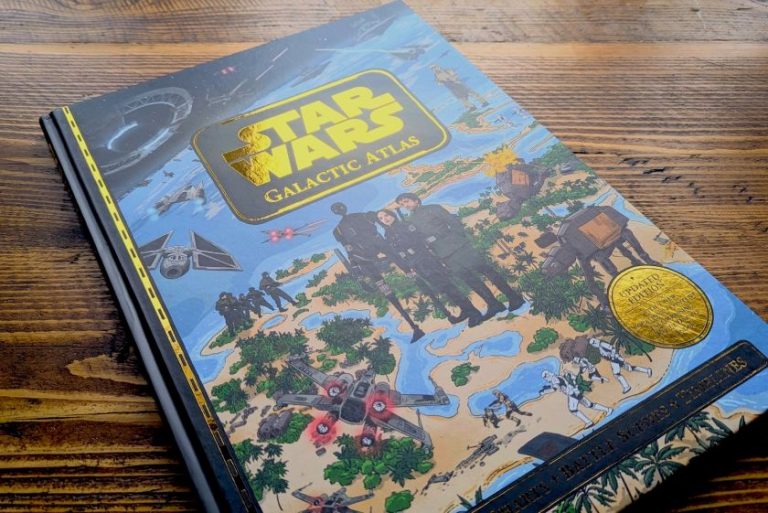
In the new and improved brand, expect graphics inspired by art books on Cold War propaganda, spy movie posters from the 1950s and ’60s, and vintage adventure and educational book covers.
New York City and New Orleans-based design studio The Collected Works has developed the branding and overarching design system for SNAFU Media and the cover art for season two of their flagship podcast.
Hosted by American actor and comedian Ed Helms, the SNAFU podcast delves into history’s greatest screw-ups. Each season focuses on significant yet often overlooked historical events marked by major blunders and their far-reaching consequences.
The Collected Works immediately saw the potential to take a concept that blends comedy, history, and cultural critique into something visually distinctive, playful, and meaningful.
“The chance to collaborate with FilmNation, whose projects we’re big fans of, and have our stamp on a popular podcast hosted by Ed Helms, was an easy ‘yes’ for us,” says The Collected Works partner Jose Fresneda. “FilmNation presented SNAFU as more than just another podcast – it was a rallying cry for the underdog, a celebration of glorious mess-ups, and an opportunity to subvert authority in a fun, thought-provoking way.”
While the studio has worked in audio spaces before, it has often been music-oriented, with artists like The National or designing systems for music festivals. “SNAFU presented a fresh challenge in that it blends humour with historical critique and, at the end of the day, is all about storytelling,” says Fresneda.
After studying other investigative or historical podcasts, the design team noticed that many of these brands play it safe visually, opting for clean, tidy, and minimal identities. This allowed SNAFU to fill that gap with something more dynamic, subversive, and tactile.
The combination of the SNAFU podcast’s rebellious and witty nature and its educational element made Ed seem a bit like the kind of teacher you wish you’d had in school. This gave the studio a sense of direction while leaving plenty of room for exploration.
Nailing the tone of voice was a challenge, though. FilmNation described the SNAFU brand as “not afraid of the messy mishaps” and, while messiness can be fun, it can be hard to get right. Fresneda says: “Too much, and the brand feels disjointed; too little, and it feels clean and controlled, which goes against the entire spirit of the show.
“Finding the balance between irreverence and professionalism took research, care, and intention to get right.”
It was equally crucial to ensure that the brand didn’t come across as too polished or sterile, reflecting both a comedic edge and expert storytelling to be able to carry serious historical topics. The podcast name is actually an acronym for ‘Status Normal: All Fucked Up’, which called for “a design language that embraced imperfection, where Ed serves as an anchor, both literally and figuratively, guiding you through the chaos”, according to Fresneda.
He adds that the final result is “a sort of controlled messiness, like a classified file that’s been heavily redacted, but still tells a profound story if you look close enough”.
The logo aimed to create something big and bold that could stand out in both small podcast icons and large out-of-home advertising. “It should also feel timeless, like an artefact you could pull from a vault of government secrets,” explains Fresneda.
For inspiration, The Collected Works looked at art books of Cold War propaganda, spy movie posters from the 1950s and 1960s, and vintage adventure and educational book covers. The team was particularly captivated by the typography from these artefacts, often in all caps, dramatic, and sometimes angular, which Fresneda says “hints at some danger or edge-of-your-seat excitement”.”
He adds that a 3D style was chosen to give it “a sense of physicality”. He explains how it looks similar to a monument casting a long shadow, “moving subtly, finally ready to reveal what had been unspoken for so long”. The shadow on the podcast cover art’s transparent red treatment is also reminiscent of decoder filters that can be used to find a secret message.
The Collected Works curated a colour palette that balances historical gravitas with modern boldness. It consists of nearly-black and creamy off-white tones – evocative of 1970s government files – and a ‘Top Secret Red’ to lend a contemporary edge and a bold pop. “The idea was to signal ‘”this is serious, but not that serious’, “with a blend of muted and bold colours,” says Fresneda.
Typography followed a similar logic, inspired by pulp novels, propaganda posters, and newspaper headlines. Marvin Visions by Atelier Triay – which Fresneda describes as “both authoritative and a little quirky” – was a firm favourite from the off, so much so that it’s being used beyond the logo as a headline font or is even used sparingly as body copy.
In Fresneda’s view, the cover art is where everything came together as the brand’s flagship piece. He says, “It might be the only visual component that listeners of the podcast ever see, so it had to do a lot of heavy lifting: stand out from other podcasts in its category, visually show that Ed Helms was the host, and describe a sense of what the storytelling is like.
“We think it achieves that in a pretty distinctive fashion while feeling at home with the rest of the design system, whether that’s social posts, large posters, or even a book.”
Since The Collected Works was developing the brand after Season 1 had already been launched, the team also had to consider how they could leverage the equitable components so as not to alienate current fans or throw away what was already working. “Everyone agreed that ‘Ed at the news desk’ was already feeling right and doing some heavy lifting, but we gave him a new coat of paint with some textural and colour changes and a scale adjustment,” Fresneda explains.
Other elements, like the background, which was a direct reference to the global nuclear warfare themes of season 1, were out-of-place for the second season and replaced with the studio’s collage of redacted documents.

