This article explores the evolution of the FIFA World Cup logo through major branding changes and analyzes key design trends. It examines how the tournament’s visual identity has evolved into one of the world’s most recognizable sporting brands.
Every four years, the FIFA World Cup captures the attention of billions of fans, making it one of the most-watched sporting events in the world. Since the inaugural tournament in 1930, the competition has grown to feature 32 national teams (expanding to 48 teams from 2026) representing countries from every continent. Organized by FIFA, the World Cup has become a global celebration of football, culture, and national pride.
Alongside the action on the pitch, the tournament has developed a visual identity that reflects the history, traditions, and aspirations of each host nation. At the center of that identity is the FIFA World Cup logo, which has transformed dramatically over the decades. From simple tournament emblems to culturally inspired brand identities, each logo tells the story of its time and place.
From the history of the FIFA World Cup logo to its defining branding eras, let’s explore what has kept this iconic symbol relevant for nearly a century.
FIFA Branding: Organization vs. Tournament Logo
The FIFA organization logo and FIFA tournament logos serve different purposes, which is why they have distinct identities.
The organization’s logo represents FIFA as the global governing body of international football. As a symbol of the institution itself, it needs to remain timeless, consistent, and recognizable across generations.
On the other hand, a tournament logo is created specifically for each FIFA competition and evolves every four years. It reflects the event’s unique identity, incorporating elements such as the host nation’s culture, the tournament’s theme, and key branding features like the trophy.
While FIFA’s organization branding remains constant to represent the authority and legacy of world football, each tournament logo brings a fresh identity that connects with fans and celebrates the spirit of the competition.
Let’s explore how these two logos differ and what they represent for football fans around the world.
• The FIFA Organization Logo
The FIFA logo represents the organization as the governing authority of international football and serves as the institution’s official symbol. It is designed to communicate global unity, professionalism, and the organization’s worldwide presence.
Since 1922, the logo has undergone four major updates, with the current wordmark introduced in 2009. The design follows a clean, simple approach, emphasizing the FIFA name, which has become globally recognized.
The monochrome blue color scheme represents trust, professionalism, and FIFA’s expertise as a leading international sports organization. Earlier versions of the logo featured additional elements that reflected FIFA’s mission to unite football across continents and cultures. Today, the minimalist design keeps the focus on the name itself, reinforcing FIFA’s identity as a consistent and recognizable global brand.
• The FIFA World Cup Logo
The FIFA World Cup logo has a unique visual identity for every tournament throughout history. Since a dedicated logo was introduced in the 1950s, each edition of the event has featured a new design that reflects the host nation’s culture, heritage, and flag colors.
A major shift in World Cup branding occurred during the 2002 FIFA World Cup in South Korea and Japan, when the tournament’s visual identity centered on the trophy. This approach has continued in subsequent tournaments, with different design elements added around the trophy to represent the host country and the spirit of the event.
The 2026 FIFA World Cup logo follows this approach by placing the World Cup trophy at the center of the design, combined with the number “26” to represent the year of the tournament. Using an image of the actual trophy as the foundation creates a direct connection to football’s most prestigious prize.
The logo represents the journey of national teams from around the world as they compete for the ultimate achievement in international football.
Why the Two Identities Are Different?
FIFA’s organizational identity is designed to represent a permanent global institution rather than a single event. The organization’s logo needs to remain recognizable and consistent across official communications, governance activities, partnerships, and football development programs worldwide.
The FIFA World Cup, however, is a global celebration that connects fans, players, and nations through a shared sporting experience. Since each tournament takes place in a different host country, its identity is designed to reflect the culture, heritage, and unique character of that location.
World Cup logos are created to build emotional connections with fans and capture the spirit of each tournament, while FIFA’s organization logo focuses on maintaining a consistent and authoritative global presence.
The Evolution of FIFA World Cup Logo Design
The evolution of the FIFA World Cup logo reflects nearly a century of advances in design, marketing, technology, and global communication. From hand-painted promotional posters to sophisticated brand logo systems, the transformation shows how FIFA’s visual identity has become a global business asset.
There are mainly four branding eras that have shaped what it is now. Each one has introduced new creative approaches and adapted to broader changes in sports branding strategies.
1. Posters (1930–1950)
The earliest FIFA World Cups were promoted long before the concept of standardized event branding existed. During this period, host nations relied primarily on illustrated posters rather than dedicated logos to represent the competition.
These posters were heavily influenced by the popular art styles of their time, including Art Deco and early modern illustration. Designers went with patriotic imagery, national flags, football players, stadium scenes, and local cultural symbols.
• 1930 – Uruguay
The 1930 FIFA World Cup poster features an Art Deco goalkeeper reaching for the ball, paired with bold geometric typography. The contrasting black, white, and brown lettering creates a striking composition that reflects the energy and historic significance of football’s first World Cup.
• 1934 – Italy
The 1934 FIFA World Cup poster introduced a more refined Art Deco style. It features a footballer in motion kicking the ball, creating a dynamic sense of action. The word “ITALIA” appears subtly within the composition, while the typography adopts a cleaner, more corporate look. Brown vertical text adds structure to the layout, giving the poster a balanced and modern visual identity.
• 1938 – France
The 1938 FIFA World Cup poster features a half-silhouette footballer balancing a ball on a brown-and-black globe. Tall teal geometric typography, a grey grid, and blue and orange accents create a bold, modern Art Deco composition.
• 1950 – Brazil
The 1950 FIFA World Cup poster features a footballer’s leg kicking a ball, with a sock displaying the flags of participating nations. Watercolor blue backgrounds, bold black “Futebol”, and red-and-black typography create a vibrant, optimistic post-war design.
2. Modernist Experiments (1954–1966)
As graphic design entered the modernist movement during the 1950s and 1960s, FIFA World Cup visuals became cleaner, simpler, and more structured. Professionals began replacing detailed illustrations with geometric shapes, bold typography, and minimalist elements.
• 1954 – Switzerland
The 1954 FIFA World Cup introduced the tournament’s first official logo, marking the beginning of a consistent event identity. It featured a wireframe globe with the tournament name wrapped around it, while a red circle with a white cross represented Switzerland, symbolizing the host nation at the heart of world football.
• 1958 – Sweden
The 1958 FIFA World Cup logo featured the bold initials “VM”, short for Sweden’s Världsmästerskapet (World Championship), outlined in yellow. A stylized yellow-and-brown globe, serif typography, and the slanted “Sverige Juni 1958” created a clean, modern identity rooted in Swedish design.
• 1962 – Chile
The 1962 FIFA World Cup logo introduced a cleaner geometric style, featuring a circular design divided between a light blue globe and a brown football. A stadium with the Chilean flag appeared at the center, while condensed sans-serif typography wrapped around the circle.
• 1966 – England
The 1966 FIFA World Cup logo featured the England flag as its backdrop, with a circular crest containing a football, the Jules Rimet Trophy, and England’s three lions emblem. Bold condensed sans serif text wrapped around the crest, highlighting the tournament year.
World Cup Willie, introduced in 1966, was the first official FIFA World Cup mascot. The lion character wore a Union Jack shirt, helping make tournament branding more engaging and memorable.
3. Corporate Identity Era (1970–1998)
In 1970, there was a major turning point in the history of FIFA World Cup logo design. By this time, television broadcasts had become global, international sponsorships were growing rapidly, and merchandising was becoming a major source of revenue. So FIFA shifted from designing promotional logos to building a consistent brand with a global association.
This period reflected the rise of corporate identity in sports, where logos became valuable business assets for organizations. It was important to consider consistency, versatility, and long-term brand recognition. Logos were created to work across stadium signage, broadcast graphics, tickets, apparel, display ads, and licensed products.
• 1970 – Mexico
The 1970 FIFA World Cup logo introduced a minimalist visual identity, featuring a geometric football formed through blue polygons and negative space. The stacked “Mexico 70” typography used bold, geometric sans-serif lettering, creating a clean, modern, and globally recognizable design.
• 1974 – Germany
The 1974 FIFA World Cup logo featured a green monochrome design with a circular football symbol and radiating lines representing movement and global connection. The WM 74 lettering, meaning Weltmeisterschaft 1974, completed the clean, functional identity inspired by German design principles.
• 1978 – Argentina
The 1978 FIFA World Cup logo featured blue and white stylized figures forming a football shape, reflecting Argentina’s national colors and the spirit of celebration. The bold geometric design, paired with modern sans serif “Argentina 78” typography, created a memorable identity representing unity and football’s global appeal.
• 1982 – Spain
The 1982 FIFA World Cup logo featured a stylized football with red and yellow strokes extending outward, representing movement and Spain’s national colors. The bold “España 82” typography used a clean sans serif style, creating a minimalist identity that connected football with Spanish culture.
• 1986 – Mexico
The 1986 FIFA World Cup logo featured three overlapping circular forms with a football at the center, symbolizing the tournament’s global reach and unity through football. The stacked “México 86” lettering used bold, geometric sans-serif typography, creating a modern and memorable identity.
• 1990 – Italy
The 1990 FIFA World Cup logo featured overlapping polygonal football forms created through negative space, symbolizing movement and a modern global identity. Red and green elements referenced Italy’s national colors, while the angular, slanted “ITALIA 90” typography added a dynamic contemporary feel.
• 1994 – USA
The 1994 FIFA World Cup logo featured a football moving across a stylized American flag, with red stripes and blue sections symbolizing the host nation. The dynamic composition, star detail, and expressive “World Cup USA 94” typography created a bold, commercial identity.
• 1998 – France
The 1998 FIFA World Cup logo featured a stylized football with blue, red, and black graphic sections over a blue globe silhouette, representing France’s role as host and football’s global connection. Bold italic sans-serif “FRANCE 98” typography added a dynamic, contemporary character.
4. Trophy Strategy Era (2002–Present)
Beginning with the 2002 FIFA World Cup in Korea and Japan, FIFA introduced a branding philosophy that continues to this day. People moved away from creating independent symbols and centered each tournament logo around the iconic FIFA World Cup Trophy.
This approach strengthened global brand recognition and also allowed each host nation to express its cultural identity through its chosen design elements. Colors, typography, and artistic influences were chosen to complement the cup, which was integrated directly into the logo itself.
• 2002 – Korea and Japan
The 2002 FIFA World Cup logo marked a major shift toward a more symbolic identity, featuring a circular form that combines a football, a trophy, and player movement. Inspired by harmony and balance, the integrated “00” formed an infinity symbol, representing football’s endless global connection, while customized “KOREA JAPAN” typography reflected the host nations’ identity.
• 2006 – Germany
The 2006 FIFA World Cup logo continued the symbolic style of 2002, featuring three smiling faces within a circular motif inspired by the slogan “A Time to Make Friends.” The design represented joy, friendship, and unity, while rounded “Germany 2006” typography and national colors created a welcoming identity.
• 2010 – South Africa
The 2010 FIFA World Cup logo featured a Black footballer performing a bicycle kick (overhead kick) against a backdrop of flowing yellow, green, red, and orange shapes inspired by South Africa’s identity. The dynamic composition symbolized energy, movement, and celebration, while bold “South Africa 2010” typography added a modern character.
• 2014 – Brazil
The 2014 FIFA World Cup Brazil logo featured three green and yellow hands forming the shape of the FIFA World Cup Trophy, symbolizing unity, passion, and Brazil’s welcome to the world. Inspired by “Inspiration,” the design faced criticism for resembling a facepalm gesture and appearing overly simple.
• 2018 – Russia
The 2018 FIFA World Cup Russia logo combined influences from football, Russian culture, and space exploration. Inspired by the FIFA World Cup Trophy, its red, blue, and gold design features ornamental details referencing traditional Russian art and cosmic elements, celebrating the country’s heritage, creativity, and global connection to football.
• 2022 – Qatar
Qatar’s 2022 FIFA World Cup logo featured an infinity loop shape inspired by the FIFA World Cup Trophy and traditional Arabic shawls. The woven patterns represented Qatari and Arab heritage, hospitality, and cultural identity, while the continuous form symbolized the connection between people and football.
• 2026 – Canada, Mexico, and the United States
The 2026 FIFA World Cup logo introduced a new identity system centered on the official trophy, with a bold “26” representing the tournament year. Designed for three host nations, Canada, Mexico, and the United States, the adaptable format allows host cities to express their unique cultures while celebrating unity and inclusivity.
Logos throughout the era have been for digital media, maintaining scalability across big screens, websites, mobile devices, and social platforms.
Here’s a chronological summary of how the FIFA World Cup logo has evolved over the years.
Year
FIFA World Cup
Host Nation(s)
Dominant Design Style
Key Visual Elements
Branding Significance
1930
1st FIFA World Cup
Uruguay
Illustrated Art Poster
Football, national flag, player
Beginning of FIFA World Cup branding
1934
2nd FIFA World Cup
Italy
Art Deco Poster
Footballer, national colors, classical illustration
Strong nationalist visual identity
1938
3rd FIFA World Cup
France
European Poster Art
Dynamic footballer, tricolor palette
More sophisticated international promotion
1942
—
Cancelled
—
—
Tournament cancelled due to World War II
1946
—
Cancelled
—
—
Tournament cancelled due to World War II
1950
4th FIFA World Cup
Brazil
National Identity Illustration
Trophy, football, Brazilian colors
Return of the World Cup after WWII
1954
5th FIFA World Cup
Switzerland
Modernist Graphics
Minimal shapes, football, bold typography
Beginning of simplified visual branding
1958
6th FIFA World Cup
Sweden
Scandinavian Modernism
Football, Swedish colors, clean illustration
More contemporary European graphic style
1962
7th FIFA World Cup
Chile
Minimal Illustration
Globe, football, national symbolism
Cleaner international visual identity
1966
8th FIFA World Cup
England
Mascot & Typography
World Cup Willie, bold lettering
First official World Cup mascot expanded tournament branding
1970
9th FIFA World Cup
Mexico
Modern Corporate Design
Bold typography, geometric football
Beginning of corporate sports identity
1974
10th FIFA World Cup
West Germany
Swiss Modernism
Abstract football graphic, minimalist typography
Functional international branding system
1978
11th FIFA World Cup
Argentina
Geometric Symbolism
Stylized human figures forming a football
Strong national symbolism and memorable icon
1982
12th FIFA World Cup
Spain
Cultural Illustration
Football, Spanish sun and national motifs
Increased use of host-country identity
1986
13th FIFA World Cup
Mexico
Cultural Minimalism
Aztec-inspired graphics, football
Regional storytelling through symbolism
1990
14th FIFA World Cup
Italy
Classical Modernism
Trophy, Italian tricolor, architectural influence
Elegant European branding
1994
15th FIFA World Cup
United States
Commercial Branding
Trophy, dynamic typography, stars
Marketing-driven global branding
1998
16th FIFA World Cup
France
Global Identity
Football, globe motifs, blue palette
International brand consistency
2002
17th FIFA World Cup
South Korea and Japan
Modern Trophy Identity
FIFA World Cup Trophy integrated into logo
Beginning of the official trophy-based logo era
2006
18th FIFA World Cup
Germany
Emotional Branding
Smiling faces forming trophy
Human-centered emotional storytelling
2010
19th FIFA World Cup
South Africa
African-inspired Graphics
Player silhouette, African continent, vibrant colors
Celebration of African culture
2014
20th FIFA World Cup
Brazil
Sculptural Symbolism
Trophy-shaped hands, green & yellow palette
One of the most recognizable and discussed World Cup logos
2018
21st FIFA World Cup
Russia
Space-age Inspiration
Trophy, stars, cosmic imagery
Blend of heritage, technology and Russian art
2022
22nd FIFA World Cup
Qatar
Infinity-inspired Minimalism
Infinity loop, Arabic patterns, trophy silhouette
Modern minimalist global branding with regional identity
2026
23rd FIFA World Cup
United States, Canada and Mexico
Flexible Global Identity
Official trophy with interchangeable host branding
First three-country tournament and modular branding strategy
Design Elements Behind FIFA World Cup Logos
The logo always tells a story, reflects cultural heritage, and creates a visual connection between the tournament and its host country. Every time the World Cup takes place, it’s design incorporates elements that celebrate local traditions and also remain recognizable.
1. Color: Creating Emotional Identity
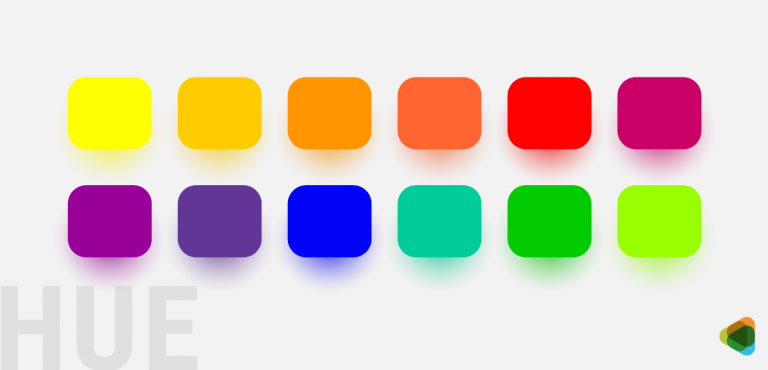
Color is one of the defining elements of every FIFA World Cup logo, helping establish an emotional connection between the tournament, its host nation, and fans around the world. Each edition typically draws inspiration from the host country’s flag, cultural heritage, landscapes, and traditions, creating a visual identity that reflects its unique character.
Beyond representing national identity, color in branding also shapes how audiences perceive the tournament.
Warm tones such as red, orange, and yellow evoke passion, energy, and celebration, capturing the excitement of football. The Spain 1982 (España ’82) logo used vibrant red, yellow, and orange inspired by the Spanish flag and Mediterranean warmth, reinforcing the country’s energetic identity.
Blue and green symbolize unity, trust, and the global spirit of the game, while gold conveys prestige, achievement, and the pursuit of championship glory. The Mexico 1970 logo paired a bold blue wordmark with black-and-white graphic elements, creating a modern, universal identity that reflected both football and international competition.
Together, these carefully chosen colors transform each World Cup logo into a memorable symbol of both competition and culture.
2. Shape and Composition: Building Recognition
Shape and composition play a central role in making each FIFA World Cup logo instantly recognizable. While every tournament adopts a unique visual identity, many logos incorporate trophy-inspired forms, football-inspired circles, and curved lines that represent movement, teamwork, and the unity of nations coming together through the sport.
These elements are guided by core design principles that ensure the logo remains effective across different applications.
Balanced and symmetrical layouts create a sense of prestige, stability, and harmony. The Argentina 1978 logo is a strong example, using a symmetrical geometric structure with radiating lines to create a bold and balanced emblem.
At the same time, simple and memorable compositions help logos remain recognizable across stadium signage, digital platforms, and merchandise. The Qatar 2022 logo demonstrates this approach with its flowing, curved form inspired by the traditional wool shawl, creating a modern yet simple design that reflects movement, unity, and cultural identity.
Together, these design choices create logos that are visually distinctive while remaining closely connected to the spirit of the FIFA World Cup.
3. Cultural Elements: Connecting Global Audiences
Cultural symbolism is one of the most distinctive elements in FIFA World Cup logo design. Instead of relying only on universal football imagery, designers often incorporate visual elements inspired by the host country’s history, traditions, landscapes, and identity. These can include national landmarks, traditional patterns, local artwork, wildlife, historical references, and architectural features.
These cultural elements help make each tournament logo visually distinctive while strengthening the connection between the event and its host nation.
For instance, the South Africa 2010 logo incorporated African-inspired imagery, including a stylized footballer silhouette and vibrant colors that reflected the continent’s energy, diversity, and heritage.
The Chile 1962 logo combined football imagery with architectural elements inspired by the host nation. It featured a football placed within a globe, positioned above a stylized stadium, representing both the tournament’s international nature and Chile’s role as host.
By blending football with local storytelling, World Cup logos become more than event symbols, they introduce global audiences to the host country’s culture, history, and traditions.
4. Typography and Lettering: Creating a Recognizable Identity
Typography has played an important role in the evolution of FIFA World Cup logo design. Early tournament logos often relied heavily on text, using straightforward lettering to communicate the event name, host country, and year.
The 1958 Sweden World Cup logo is an example of early typography-focused design. It featured a bold “VM” lettermark, with “VM” representing Världsmästerskapet (Swedish for World Championship). The lettering used a tall, condensed slab-serif style with heavy vertical strokes and prominent wedge-shaped serifs, creating a strong and authoritative appearance.
Over time, designers moved toward more customized typography and complete visual systems where letterforms work together with symbols, colors, and the overall brand identity.
Modern World Cup logos often feature custom lettering designed specifically for each tournament, helping create a unique personality while maintaining consistency across different applications.
The Brazil 2014 World Cup logo demonstrates this modern approach, combining clean sans-serif lettering for “FIFA World Cup” with a more distinctive stylized treatment for “Brazil,” creating a balance between global recognition and local identity.
Designers carefully consider readability, ensuring the logo remains clear across stadium signage, digital platforms, and merchandise. They also focus on international accessibility, creating letterforms that can be recognized by audiences around the world regardless of language or cultural background.
By balancing creativity with clarity, typography becomes a key element in building a memorable and globally consistent tournament identity
How FIFA’s Branding Build Emotional Connection?
A FIFA World Cup logo is much more than a tournament emblem—it is a powerful branding tool that creates lasting emotional connections with fans worldwide. Every edition combines visual storytelling with national identity to capture the excitement, pride, and unity that define the world’s biggest football tournament. Through carefully chosen colors, shapes, typography, and cultural symbols, FIFA World Cup branding transforms each tournament into a memorable global event.
• Dynamic Design Elements Add Movement
Successful FIFA World Cup logos use curved lines, flowing shapes, and energetic compositions to convey movement and action. These dynamic design elements reflect the speed, intensity, and unpredictability of football, helping fans instantly associate the logo with the excitement of the tournament.
Many football club logos use the same principle to create a sense of energy and motion.
Nottingham Forest FC uses a stylized tree with flowing, wavy lines beneath it to represent the River Trent. The curved lines create visual movement while reinforcing the club’s connection to its local landscape. Combined with the bold red color, the logo projects passion, energy, and forward momentum.
Juventus FC takes a more minimalist approach by using two sweeping black curves that form the letter “J” while subtly resembling the stripes of the club’s traditional jersey. The clean, vertical lines create a sense of speed and modernity, making the logo feel dynamic despite its simplicity.
• Symbolism of Unity Brings the World Together
One of the core objectives of FIFA World Cup branding is to represent global unity. Circular forms, interconnected graphics, and universally recognized football symbols communicate the idea of nations coming together through sport. This visual language reinforces the World Cup’s role as an event that transcends borders and cultures.
Many football club logos also use traditional symbols to express unity, history, and community.
Arsenal FC features a modern shield containing its famous cannon, paying tribute to the club’s military origins. The shield represents heritage and protection, while the simplified design creates a timeless identity that unites generations of supporters.
Palmeiras combines a circular crest with stars, a central “P,” and a surrounding laurel wreath. The stars reference Brazilian national symbolism, while the wreath represents victory and honor. Together, these elements reflect unity, sporting excellence, and the club’s deep cultural roots.
• The Trophy Symbolizes Excellence and Achievement
Many FIFA World Cup logos incorporate the iconic World Cup Trophy, either directly or through abstract interpretations. Featuring the trophy emphasizes ambition, victory, and sporting excellence, reminding players and fans alike of the ultimate goal—lifting football’s most prestigious prize.
Football club logos often communicate the same values through heraldic symbols and powerful imagery.
Chelsea FC uses a blue lion holding a golden staff, inspired by the coat of arms of Earl Cadogan. The lion represents courage, authority, and leadership, while the ceremonial staff reinforces themes of achievement, excellence, and prestige.
Crystal Palace FC features a blue eagle diving toward a football above the Crystal Palace building. The eagle symbolizes strength, ambition, and competitive spirit, while its outstretched wings create a sense of determination and the pursuit of success.
• Cultural Identity Strengthens National Pride
The FIFA World Cup logo reflects the heritage of its host nation through local colors, traditional art, architecture, landscapes, and cultural motifs. These design elements celebrate national identity while introducing millions of international fans to the country’s history, creativity, and traditions.
Many football clubs incorporate regional landmarks and historical symbols to strengthen their local identity.
Manchester City FC features a golden ship representing Manchester’s maritime and industrial history alongside the Red Rose of Lancashire. These historic symbols celebrate the city’s heritage while reinforcing the club’s strong connection to its community.
Al Nassr FC places the Arabian Peninsula at the center of its crest with the historic Masmak Fortress highlighted inside. By incorporating one of Riyadh’s most important landmarks, the logo reflects Saudi heritage and creates a powerful sense of national and regional pride.
•Nostalgic Logo Design Creates Lasting Football Memories
Over time, every FIFA World Cup logo becomes associated with unforgettable matches, legendary players, and defining moments in football history. As these memories accumulate, the logo itself becomes a lasting symbol of the tournament and the emotions it inspired.
Many football clubs preserve historic design elements to maintain the emotional bond between generations of supporters.
Ajax Amsterdam features a minimalist illustration of the Greek hero Ajax, constructed from eleven continuous lines representing the players on the pitch. While modern in style, the emblem preserves the club’s mythological identity and connects today’s supporters with its historic legacy.
Rangers FC retains a traditional circular crest featuring the Lion Rampant, one of Scotland’s oldest heraldic symbols. By preserving classic design elements instead of following modern trends, the logo reinforces the club’s rich history and evokes a strong sense of tradition and nostalgia.
The FIFA World Cup’s Influence on Football Logo Design
Every event influences how football is represented across communities, fan culture and businesses around the world. From grassroots clubs to fantasy football leagues, many football logos are inspired by the organization’s branding. You’ll find quite a few ideas have the same design principles like strong symbolism, bold colors and impactful typography. Here’s a deep dive into how the FIFA World Cup has influenced football logo designs.
1. Community Football Logos
Many of these logos take inspiration from FIFA World Cup branding by using shields, footballs, stars, mascots, national colors or regions symbols. They are designed to represent their teams and communities in the best way possible. The organization’s earlier logos had two interconnected globes which have inspired quite a few symbols as well. Community football logos or sports club logos might be local but they bring together people and that is what FIFA does.
So the influence do show in one way or the other, be it a clean wordmark, color or symbolism. The football community logos are commonly created for:
Local football clubs
Amateur and Sunday leagues
Youth football academies
School and college football teams
University football clubs
Fantasy football leagues
Supporters’ clubs and fan associations
Charity football tournaments
Corporate football leagues
Futsal and indoor football teams
Des Moines Menace is a local football club in USA. It’s logo features a fierce bulldog mascot with sharp details and an aggressive expression.The bold red, black, and white colors add energy and confidence.
Hashtag United football club’s logo is centered around the hashtag symbol. It has chosen a blue and yellow color scheme as well as clean typography. Both the elements seem inspired by FIFA’s design.
Gaffr has a logo that combines a wordmark with an icon. It features the name and a crown over an abstract ‘g’. The design is quite simple and grabs attention for it’s yellow color palette.
The Fantasy Laliga has kept things simple and opted for a typographic logo. It combines the energy of football with a digital gaming feel. With bold lettering and sporty style, this logo represents a competitive spirit.
2. Fan-Made Football Logos
Football fans are key to promoting it’s culture and creating a sense of community across the world. Many create original logos, concept redesigns and digital artwork inspired by the FIFA World Cup, national teams, and club football. Creative platforms like Behance and Dribbble have thousands of fan-made football logo concepts that recreate existing club designs or show inspirations.
This FC Barcelona 2026/27 Concept Kit is a fan-made jersey concept shared by designer Bars Stepanyan. It reimagines Barcelona’s iconic look with a modern, creative approach but stays true to the club’s classic identity.
PSG’s Experimental Logo is a conceptual redesign from Mathias Temmen that is a simplified version of the crest. It’s a more minimal and geometric variation of the Saint-Germain identity for digital mediums.
The Celtic Football Club logo concept by designer Alex Constantin is a modern crest redesign.It combines the iconic four-leaf clover with a Celtic cross, creating a badge that shows the club’s legacy.
FC Tsarsko Selo’s rebranding by Evgeni Velkov reimagines the identity of the Bulgarian football club. Inspired by the club’s royal heritage, it includes a crown motif and geometric forms to create a memorable crest.
3. Football Business Logos
Many small and even established businesses within the sports industry have professional logos to build credibility and attract supporters. Some may even adopt the same design principles found in FIFA’s logo through the years. You could find globes and clean font styles being used by businesses specializing in the sport. Now, some designs do go with mascots for fantasy sports logos or elaborate illustrations, it really depends on what the business has to offer.
You can find minimalism in football business logos too. Most are commonly designed for fans, experts and potential players as well.
Football academies
Coaching businesses
Fantasy football platforms
Football podcasts
Sportswear and apparel brands
Football blogs and media websites
Betting and prediction platforms
Football cafés and sports bars
Merchandise stores
Football apps and startups
The Coerver Coaching logo represents one of the world’s leading football skills development programs. It has bold typography and a variation with a football-inspired emblem. This reflects discipline and new coaching styles.
Men in Blazers has grown from a popular podcast into one of North America’s largest independent soccer media networks. Its logo is contemporary, featuring typography with thick letters and blue and red colors.
This logo for GOAL logo has minimalist design and appears in uppercase typography. It reflects the brand’s commitment to clarity, and professionalism in sports journalism. The black-and-white color makes it stand out.
FourFourTwo’s typographic logo references the 4-4-2 football formation, making it quite recognizable among football fans. The wordmark has a monochrome color palette which adds to it’s versatile appearance.
This logo highlights the name of The Football Factory NYC in uppercase letters. It’s one of New York City’s most iconic football venues. And the branding shows that with unique typography and a stylized appearance.
Forza Football uses a simple wordmark to communicate speed, accuracy, and passion for the sport. It works very well for the football-focused digital platform that keeps fans connected with the game.
Inspired by the FIFA World Cup? Create Your Own Football Logo
Whether you’re launching a football club, building a fantasy football platform, starting a sports business, or creating a fan community, a distinctive logo helps establish your identity from day one.
Our logo crowdsourcing platform connects you with designers from around the world, allowing you to receive multiple custom football logo concepts before choosing the design that best represents your brand.
Explore the football logo case studies below to see how businesses, clubs, and football entrepreneurs have created memorable identities inspired by the world’s most popular sport.
Case Studies
STENHAMRA FC makes an impact with a Football Crest
Industry: Sports / Football Club
Platform :ZillionDesigns Logo Contest
Contest Prize: $199
Design Concepts Submitted: 82
Winning Designer: vinodh
Problem
STENHAMRA FC launched a logo design contest on ZillionDesigns. The creative brief was about wanting an illustrative sports logo with a modern and professional feel. It’s color palette had to have red, blue, and black with yellow used as an accent. It specified that the logo would primarily appear on football kits and team apparel.
Process
Designers submitted 82 unique concepts, exploring different shield shapes, typography styles, football-inspired symbol and crest layouts. Throughout the contest, the client reviewed submissions, compared concepts side by side and provided feedback.
Patriotic Logo for Sports Fans: LowCountry Football
Industry: Youth Sports / American Football
Platform: ZillionDesigns Logo Contest
Concepts Submitted:172
Contest Prize: $200
Winning Designer: rezaray
Problem
LowCountryFootball needed a logo for it’s youth American football program that aimed to work with children aged 6 to 14. The organization wanted a brand that felt energetic and memorable, appealing to young athletes, parents as well as coaches.
Process
It launched a contest to get a design for an American football logo on ZillionDesigns with a detailed creative brief outlining exactly what it wanted and what to avoid. Designers were asked to create an original sports logo featuring American football imagery, such as player silhouettes or football-inspired graphics. They were to stay away from elements like avoiding generic shields and clip art.
The contest attracted 172 logo concepts from designers around the world, giving the client a wide range of creative directions to compare.
New Identity for Meridian Club Logo
Industry: Sports / Soccer Club
Platform: ZillionDesigns Logo Contest
Winning Designer: decentdesign
Concepts Submitted: 75
Contest Prize: $200
Problem
Meriden Soccer Club wanted to replace its existing logo with a new crest that reflected the professionalism of established soccer organizations. The logo needed to represent the expertise as well as an important part of its heritage, a local landmark, Castle Craig.
Process
They kickstarted a contest where designers were asked to create an illustrative soccer crest inspired by professional clubs. It was supposed to reference Castle Craig in the design too. The preferred color palette centered on navy blue and silver.
Conclusion: The World Cup Logo as Football’s Visual History
The FIFA World Cup logo has evolved from a simple tournament identifier into one of the most recognizable cultural symbols in global sport. Every edition captures a unique moment in football history, reflecting the spirit of its time while celebrating the identity of the host nation.
The most successful World Cup logos strike a careful balance between heritage and innovation. They preserve the legacy of the tournament while embracing contemporary design trends, weaving together national culture with the universal appeal of football. This consistency, paired with fresh creative expression, has allowed the FIFA World Cup brand to remain timeless across generations.
Ultimately, the World Cup logo represents far more than a sporting competition. It serves as a visual record of football’s extraordinary ability to connect nations, cultures, and generations, turning each tournament into a lasting chapter in the shared story of the world’s game.
Frequently Asked Questions
1. Why does the FIFA World Cup have a different logo for each tournament?
Each FIFA World Cup features a unique logo to reflect the identity, culture, and heritage of the host nation while maintaining the tournament’s global brand. This allows every edition to have its own distinct visual identity.
2. Which are the best FIFA World Cup logos of all time?
This is quite subjective, but the Mexico 1970 logo is celebrated for its bold typography and artistic influences. France 1998 is known for its vibrant colors and dynamic football imagery, as well as South Africa 2010 for reflecting African heritage through movement and energy. Qatar 2022 logo also got a lot of attention for its elegant infinity-inspired emblem.
3. Which FIFA World Cup logos are considered the worst?
The Germany 2006 logo divided fans for its cartoon-like smiling faces. Brazil’s 2014 logo was referred to as having a ‘facepalm,’ and the Russia 2018 emblem was seen by some as relying too heavily on ornamentation.
4. Who designs the FIFA World Cup logo?
It’s a collaboration between FIFA, the tournament’s Local Organizing Committee (LOC), and professional branding or design agencies. Designers conduct extensive research into the host country’s culture, history, architecture, and traditions before developing concepts.
5. Has the FIFA World Cup logo always included the trophy?
No. Earlier FIFA World Cup logos focused on footballs, flags, typography or abstract graphics. In 2002, the trophy became a central element for future logos.
6. Are FIFA World Cup logos protected by copyright?
Yes, they are protected by copyright, trademark and other intellectual property laws. FIFA owns the exclusive rights to these official tournament marks, meaning they cannot be reproduced, modified, or used commercially without authorization.
7. What are the main elements included in a FIFA World Cup logo?
Most FIFA World Cup logos include symbols such as a football, the World Cup trophy, national colors, cultural motifs, and custom typography. They include design elements that represent the host country’s traditions and values.
8. Why is cultural symbolism important in FIFA World Cup logo design?
Cultural symbolism helps showcase the host nation’s history, art, architecture, and traditions. This aspect gives each logo a unique identity and also promotes cultural diversity, creating a stronger emotional connection with fans around the world.
9. How does the FIFA World Cup logo contribute to sports branding?
The logo serves as the tournament’s visual identity and is used across merchandise, advertising, stadium branding, digital media, and broadcasts. It enhances brand recognition, supports marketing efforts, and creates a memorable image for each edition of the World Cup.
10. How have FIFA World Cup logos evolved over time?
From simple football-themed designs to sophisticated visual identities that combine modern graphic design, cultural symbolism, custom typography, and innovative branding techniques. This evolution reflects advances in design trends and the growing global significance of the tournament.
The post The Evolution of the FIFA World Cup Logo: A Journey Through Football History appeared first on ZD Blog.