The studio set out to reframe one of Cambridge’s oldest colleges for a generation shaped by activism, algorithms, and ambition, blending centuries of heritage with a clear, contemporary voice.
Rebranding a place as storied as St John’s College, Cambridge, is no small task. Founded in 1511 by Lady Margaret Beaufort, mother of Henry VII, the College has long been a centre of academic excellence and a magnet for some of the brightest minds in the world.
But with a global reputation to uphold and a new generation of restless, critically minded students to attract, the College’s brand was struggling to keep pace. Its existing visual identity and website simply didn’t portray St John’s as a place brimming with curiosity, ambition, and progressive thinking.
London-based studio SomeOne was tasked with creating a new strategic and creative system that would preserve the College’s legendary past while making it more meaningful, engaging, and authentic to those encountering it for the first time. Simon Manchipp, founding partner of SomeOne, says: “The previous work did not speak to the restless, curious, critically-minded students of today. St John’s didn’t need a new coat of paint; it needed a new position.”
That new position centres around one bold but accurate idea: St John’s is the home of big ideas. It’s a place where seismic thoughts are debated over lunch, tested in labs, and shaped in seminars, and the College’s brand needed to clearly show that.
For SomeOne, the journey began with a rigorous research phase involving site visits, deep dives into the College archives, and hours of conversation with students, fellows, and staff. They walked the grounds of St John’s, documenting unique carvings, architectural details, and typographic inscriptions – evidence of a living tradition.
Beyond the imposing heritage, what struck the team was a sense of unexpected modernity woven into the College. “Parts of the College felt contemporary, open, and warm in a way we didn’t expect,” says Simon. That introduced a collegiate spirit we wanted to capture.”
The studio also gained privileged access to historical materials rarely seen beyond the archives, ensuring the new visual language would honour centuries of heritage while confidently stepping into the future.
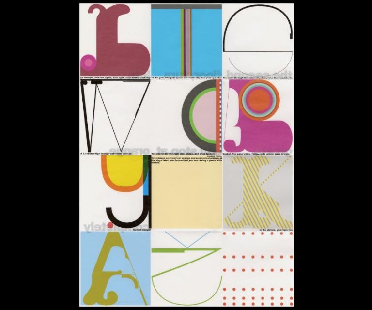
One of the most striking aspects of the project was reworking the College’s crest. Loaded with centuries of symbolism, the original crest features mythical creatures known as Yales, whose antelope bodies, swivelling horns, and elephant-like tails may appear eccentric to modern eyes but remain an important anchor to the College’s history.
Instead of ignoring these complex elements, SomeOne embraced them. “Heraldry isn’t a constraint; it’s a code,” says Simon. “We chose to understand it before we altered it.” Working with illustrator Anthony Millard, the team carefully recut each detail without removing its soul. t
They focused on clarifying it, giving it cleaner lines, stronger posture, and better proportions for today’s channels.
The team also produced multiple versions of the crest, ranging from detailed applications to simplified marks that retain clarity on everything from academic certificates to social media posts.
Typography plays a pivotal role in how a brand speaks. For St John’s, SomeOne selected GT Ultra, a typeface that subtly bridges calligraphic and structured forms. It echoes the historical letterforms etched across the College but conveys a modern confidence.
“GT Ultra’s alternate glyphs recall the court markings and carved signage we saw around campus,” explains James Bell, senior designer at SomeOne. “It bridges worlds: heritage and contemporary, tradition and innovation.”
Paired with a confident black-and-white palette, the typography brings a sophisticated clarity that supports full-colour photography and film, allowing St John’s to feel proudly individual while also future-facing.
One of the project’s most compelling innovations is the ‘Court Grid’, a layout system inspired by the plan of Second Court, one of St John’s most iconic physical spaces. This grid unites the College’s physical architecture with its digital presence, providing a flexible but recognisable framework for everything from printed brochures to interactive online experiences.
The Court Grid acts almost like a stage: a flexible canvas to showcase big ideas, current students, and the dynamic conversations taking place at St John’s. It can hold video, photography, headlines, and interactive content, creating a cohesive ecosystem that supports the College’s identity wherever it appears.
In an increasingly digital-first world, SomeOne recognised that St John’s needed to communicate with emotional resonance, not just visual coherence. Motion graphics and interactive elements became crucial.
The rebrand uses subtle but meaningful animation to reflect the sense of progress and transformation inherent in big ideas. “Motion was used not as decoration, but as metaphor,” Simon explains. “Ideas in motion, minds in progress.”
This approach is mirrored in the revamped website, which shifts from dry administrative content to a layered, story-driven platform. Drone photography provides cinematic views of the College, while interactive menus enable current students to quickly access timetables, events, and services. For prospective students, the website presents a compelling and authentic portrait of the College as a place to belong, grow, and shape the future.
For a place that is 500 years old, respect for history is essential. SomeOne’s redesign ensures tradition is treated not as a relic but as a living, breathing part of the College’s ongoing story.
Simon describes this as working “with scalpels, not sledgehammers”. Rather than stripping away details, they clarified and modernised them. The Yales are still there but drawn with more confidence. The typography is fresh but deeply rooted in the College’s story. The grid is modern but echoes the spaces where students meet, argue, and learn.
This balance is crucial because today’s audiences – raised on activism, AI and global networks – want places that feel both meaningful and progressive. As Simon says, “The world’s best minds don’t want more of the same – they want a place that’s brave enough to think differently.”
A striking principle in the project was SomeOne’s insistence on keeping the work human-made. In an era when generative AI is often used to create hundreds of design variations, St John’s identity was crafted with purpose and precision.
“AI is great at going fast,” Simon reflects, “but this wasn’t about speed. It was about substance. You can’t outsource intuition.” For a College built on original thought, the team felt that authenticity mattered more than automation. Every motion graphic, every illustration, and every typographic choice was shaped by human hands.
A fresh editorial approach was also crucial. St John’s needed a tone of voice as intelligent and confident as its students. SomeOne delivered clean, adaptable layouts with a modern zine-like feel, giving the College’s printed materials a new sense of pride and collectability.
From prospectuses to research journals, the new system ensures consistency while celebrating the stories of current students and staff. The aim is to help prospective students picture themselves within the College, not as passive recipients of tradition but as active contributors to its future.
Above all, the new identity is designed to encourage curiosity and engagement. It breaks with the often static, traditional branding seen in higher education and instead invites participation.
Instead of empty images of grand halls, the rebrand highlights people, ideas, and the lived experience of studying at St John’s. The Court Grid frames conversations and stories, while a bold black-and-white colour system creates a sense of clarity and confidence.
It is a brand system made to move, not sit still, reflecting how education itself should work in a fast-changing world.
“If you’ve got something big in mind, this is where to build it,” says Simon.
For future generations of students, the new identity sends a clear message: you belong here, not because of what you already know, but because of what you could go on to shape.
That idea that progress is built on fresh thinking, open debate, and a willingness to push boundaries feels as relevant today as it did in 1511. Now, thanks to SomeOne’s meticulous, human-centred design, St John’s can confidently share that message with the world.